A Happy Thanksgiving Video Card!

Happy Thanksgiving friends! Here is a little start-to-finish video demo of a recently completed studio piece entitled "Snowfall in Ashland". May this painting video of my hometown bring you cheer as you prepare for your own festivities celebrating the blessings of home, family, and friends. 

Studio oil painting landscape demonstration from start-to-finish by Jennifer E. Young. See Jennifer's complete catalog of available paintings at www.jenniferyoung.com

VIDEO- Art Talk; A Maine Experience

Happy Fall everyone! I have spent so much time traveling and painting this summer that I have hardly had any time to post except on the fly on social media. So these next few posts may actually be a bit of a summer recap. First up, Maine. As you may have read here and on social media, I spent a couple of delicious weeks in June painting the Maine Coast during an artist's residency on the island of Vinalhaven. 

Gallery Flux was kind enough to have hosted a pop-up exhibit of my work for this trip, as well as an artist's talk about my experience painting there. Even though it was a nice and intimate setting, I'm not all that comfortable with public speaking, but I actually had a good time, and the attendees were all very gracious and patient. Thank you to Gallery Flux for hosting me and making this little film. 

The paintings in this exhibit represent my impressions and experiences from the island of Vinalhaven, Maine, where I was fortunate to have spent a fortnight in June as an artist-in-residence. This video, taken at Gallery Flux in Ashland, Virginia is an artist's talk I gave in conjunction with my September show featuring paintings from my residency.  

Life in the Meadow; Start to Finish

Today I thought I'd share the  progressive steps for my newest painting of the beautiful Blue Ridge Mountains. (My usual disclaimers and apologies about the quality of these in-progress photos apply due to lighting conditions in my temporary work space.) This view is near the little B&B where we have stayed on a couple of occasions while visiting Bedford, Virginia.

I'm starting as usual with a sepia-toned sketch thinned with Gamsol to work out the main elements of my composition. This is very loose and general, but it helps me to determine placement. At this early stage I am not overly obsessed with exactness of the forms. Unlike with watercolor, in oil painting I like to carve and refine shapes as I go along. 

meadow1.jpg

In the next steps I concentrate on massing in areas in the shadow family. This doesn't take too long because in contrast to my prior painting of the Blue Ridge which was predominantly in shadow, this new painting is predominantly sunlit, with a light source that is nearly overhead.

work-in-progress-jenniferyoung

Next steps are massing in the meadow and the rest of the tree shapes, as well as the distant mountains

work-in-progress-Jenniferyoung

Followed by the sky

wip_jenniferyoung

With the canvas nearly covered I work out the finer details of my primary focal area (the horses). 

LifeintheMeadowDetail_jenniferyoung

At the final stages I add some suggestions of wildflowers to the field. I also add highlights and soften edges here and there, until I achieve the illusion of depth and light I'm after. 

Voila! The final: 

"Life in the Meadow", Oil on linen, 20x24" ©Jennifer Young

"Life in the Meadow", Oil on linen, 20x24" ©Jennifer Young

In Harmony

Last week as I was working on my latest James River painting, I ran into a little conudrum. So I decided to put the question out to my followers on my Facebook page to get some feedback. First, here's a few shots of the painting's progression.

The foreground was definitely what was holding most of my attention. Those roots and the light spilling over on the trees, was where it was at. That's fine, but my worry was that once the eye was finished there, it would exit the painting rather too quickly. So I experimented by adding a couple of birds in the middle distance, perhaps as a way to rest the eye before taking flight. I liked the idea, but I was a little worried that an additional element would split the focus or detract from the foreground too much. 

I knew which way I was leaning, but I thought it would be fun to put the question out there in Facebook land. The overwhelming feedback was YES to birds. So birds it is...simple ones, just shapes, really. It's been raining for days, so it's been really difficult to get a good shot of the completed painting, but finally, here it is!

"In Harmony" Oil on linen, 24x30" ©Jennifer E Young

"In Harmony" Oil on linen, 24x30" ©Jennifer E Young

This is another painting of the James River's Pony Pasture. I've done a couple of other small plein air studies of this exact view in the past, and have always wanted to do a larger one. I'm not sure why it took me so long to get around to it, but I'm glad I finally did. You can see more info, plus a couple of detail shots of the painting by clicking on the final image above.

Venetian market demo, continued

Today before I continue with my painting demo, I thought I would mention the colors I'm using on my palette. For many years I stuck with a fairly limited palette of about 5 or six colors (cad. yellow light, cadmium red, alizarin, ultramarine blue, pthalo green and white.) This was great for me as it really pushed me to learn how to mix color and not become reliant on pre-mixed colors from the tube. It also really helps lighten the load when I am packing my gear to take my studio outside and paint en plein air.

But these days in the studio, my time is more limited. I have a finite amount of hours each week to paint, blog, frame, ship, not to mention cook, eat, sleep, and care for my family. So I have allowed myself the luxury of an expanded palette to speed things along in certain areas. For instance, while I know how to mix secondary colors and some decent earth tones with a limited palette, things can move a bit faster if I have some premixed secondary colors (a.k.a. "convenience colors")  in my toolkit. So, for instance, red+yellow= orange., but cadmium orange is still a nice color to have both for it's purity and intensity and its convenience. In any case, whether I am using primaries or secondaries or pre-mixed earth colors, there is still plenty of color-mixing along the way, and  I don't ever use any color straight from the tube on my canvas.

Aside from the convenience, I am just enjoying playing with new colors. I've had less time to get out to doplein air painting, and I have missed it. So adding something new to experiment with in the studio keeps things fresh for me. On the palette I'm using right now I've introduced a few earth colors, plus some colors from Gamblin's radiant line. Aside from the colors listed with the asterisk *, I may not keep all of these colors out on my palette every time. But they have made an appearance in the studio often enough over the last few months that they are worth mentioning. All of these colors are Gamblin unless otherwise noted:

  • *Titanium white (Gamblin or Winsor Newton)
  • *Cadmium Yellow Light
  • Cadmium Yellow Deep
  • Indian Yellow (Winsor Newton)
  • *Cadmium Orange Deep
  • *Napthol Red
  • Radiant Red
  • *Quinacridone Violet
  • *Ultramarine Blue
  • Severes Blue-sometimes (Rembrandt)
  • *Radiant Turquoise
  • *Pthalo Green
  • Permanent Green Light
  • *Payne's Gray
  • *Brown Pink
  • Gold Ochre (Rembrandt)

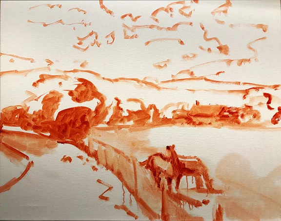
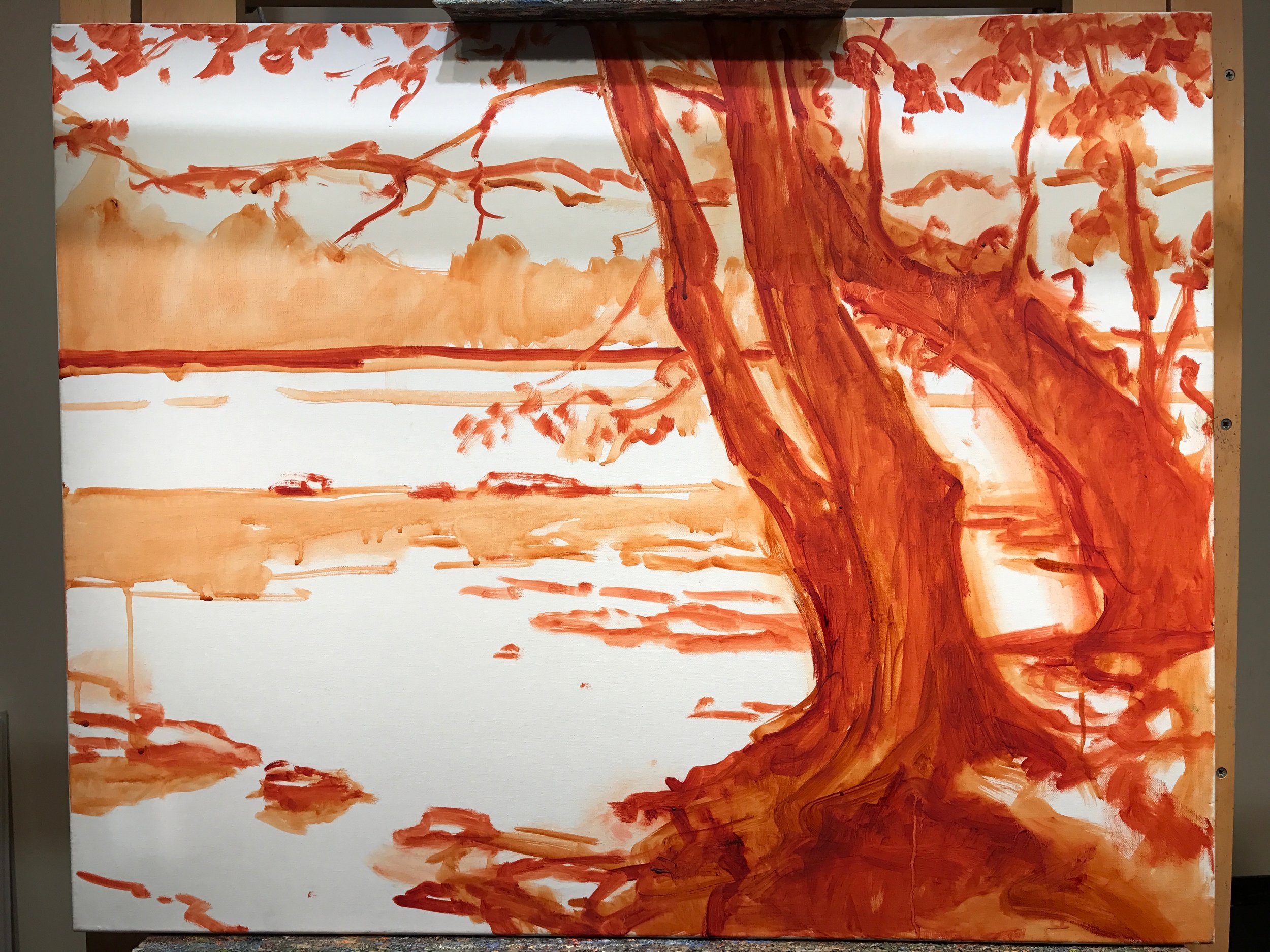
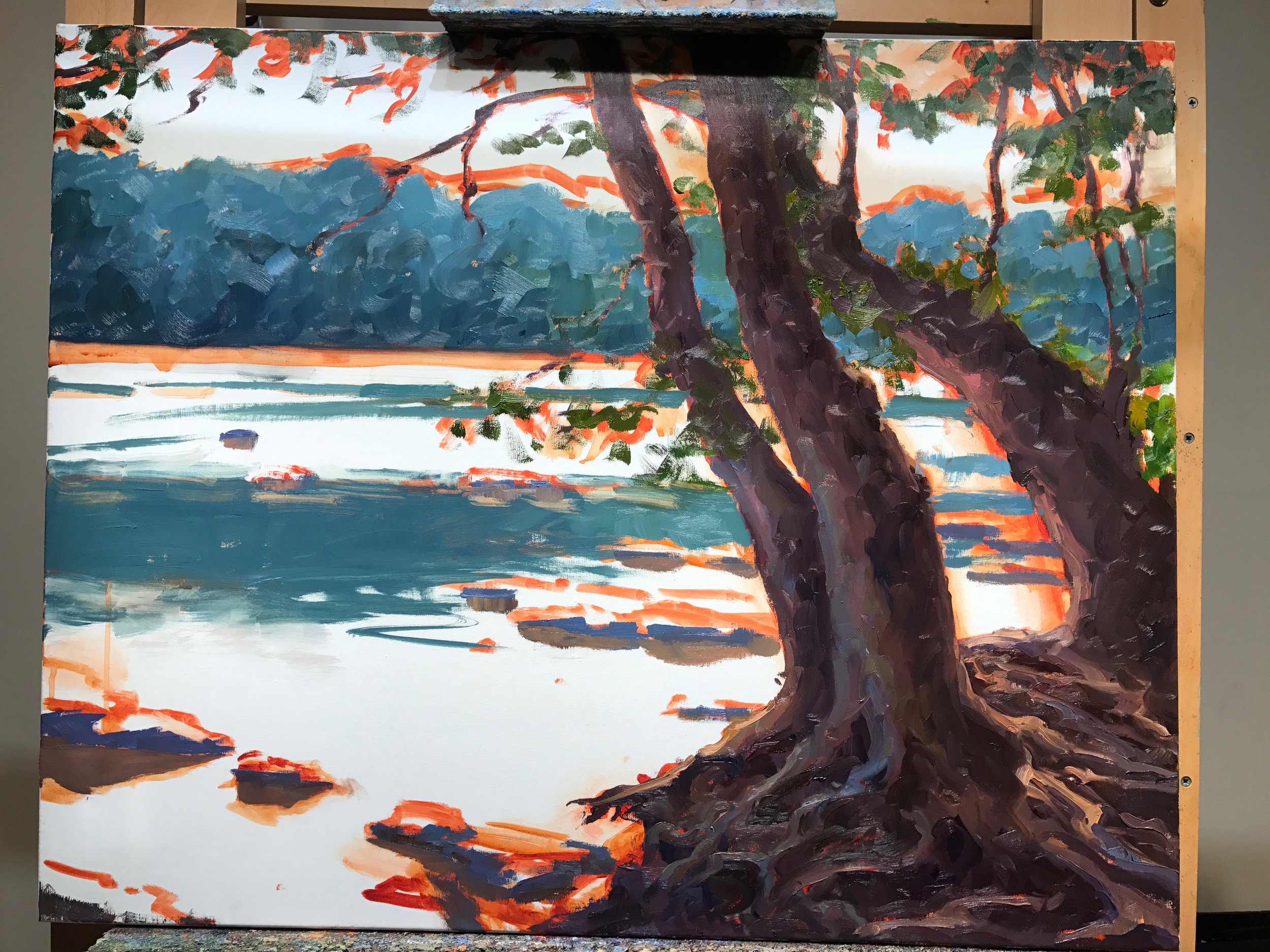
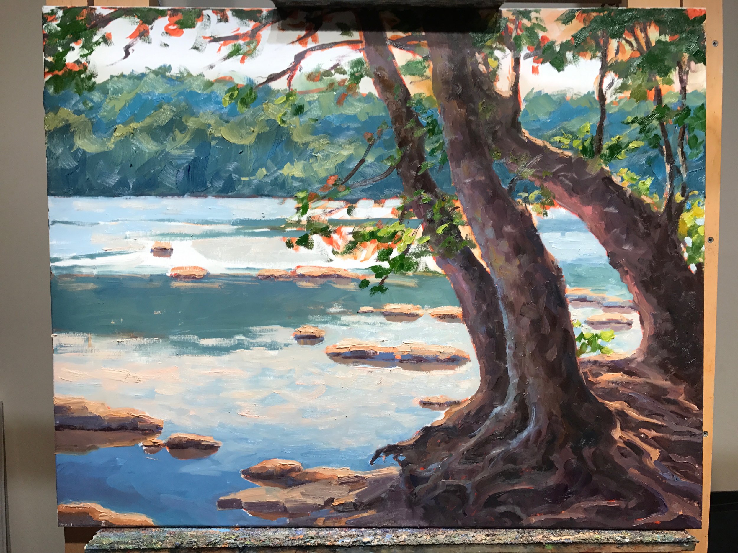
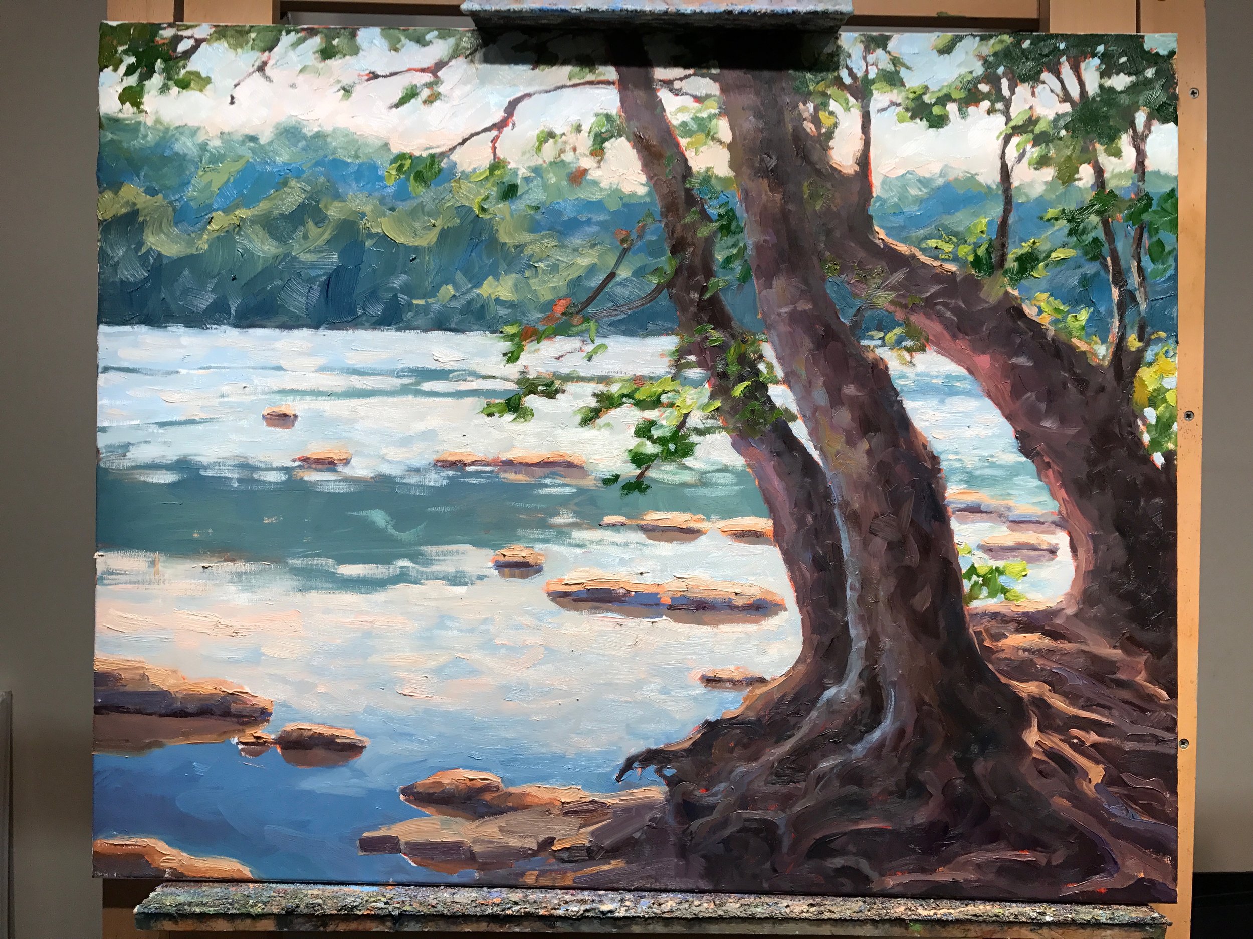
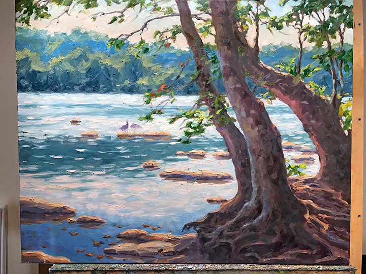
 Now that I've gotten that bit of housekeeping out of the way, let's get back to painting! I spent my last post addressing the "shadow family" in this scene. In this picture you can see that much of the busy market scene is now at least suggested. But light is needed to delineate the forms and bring the scene alive.

venetianmarket_wip4_jenniferyoung

These images are a bit dark as I did not take the time to color correct the in-progress shots. But hopefully you can see that my approach has been to just focus on the general shapes of things without getting too bogged down in details. There are basically three large shapes of light spilling over this painting: the sky, the pavers, and the white awning, with lesser highlights on the figures.

Here is the final stage. I have kept things fairly loose because I wanted to keep the focus on the foreground figure, while still maintaining unity throughout the painting. Notice the difference in the color of the final piece below, taken under better lighting conditions to show the true nature of the colors in the painting.

"Il Mercato Veneziano", Oil on linen, 14x11" ©Jennifer E Young

"Il Mercato Veneziano", Oil on linen, 14x11" ©Jennifer E Young

Thanks for following along on my little painting journey to Venice! This piece is heading to City Art Gallery in Greenville, NC for their 30th Anniversary Celebration September 22nd. 30 years! Wow! Come join us for the party and see this painting (and yours truly)  in person! :-)