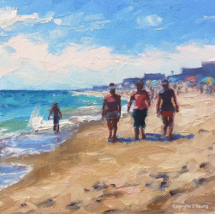
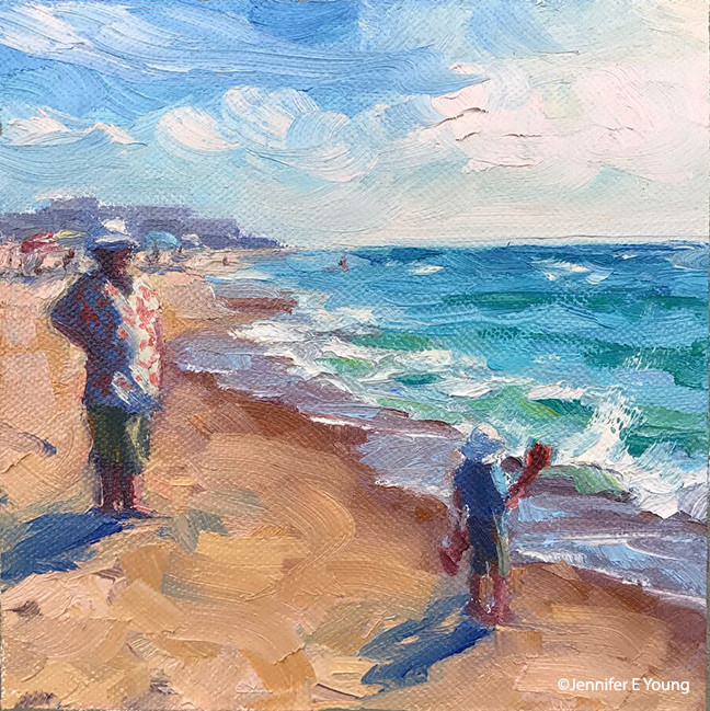
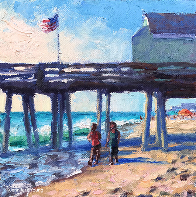
Happy Thanksgiving!

Happy Thanksgiving everyone! Before we head over the river and through the woods to commune with our family, I thought I share this little series of beach paintings I completed last week for the Annual Miniature Show Opening December 1st at Gallery Flux. Each image is just  6x6". While they are a little "off season" for us here in Virginia, the overarching theme that was at the forefront of my mind was one of family and friendship. So in that sense, they seem a good way to herald in the Thanksgiving holiday.

These are some crazy and tumultuous times we are experiencing right now in America, which makes our bonds and connections with each other all that much more important. Enjoy your time with loved ones today, in what ever way you observe Thanksgiving. I know I am incredibly thankful for my own personal relationships, which includes each of you who have connected with me through art. In friendship- Jennifer
 

Venetian market demo, continued

Today before I continue with my painting demo, I thought I would mention the colors I'm using on my palette. For many years I stuck with a fairly limited palette of about 5 or six colors (cad. yellow light, cadmium red, alizarin, ultramarine blue, pthalo green and white.) This was great for me as it really pushed me to learn how to mix color and not become reliant on pre-mixed colors from the tube. It also really helps lighten the load when I am packing my gear to take my studio outside and paint en plein air.

But these days in the studio, my time is more limited. I have a finite amount of hours each week to paint, blog, frame, ship, not to mention cook, eat, sleep, and care for my family. So I have allowed myself the luxury of an expanded palette to speed things along in certain areas. For instance, while I know how to mix secondary colors and some decent earth tones with a limited palette, things can move a bit faster if I have some premixed secondary colors (a.k.a. "convenience colors")  in my toolkit. So, for instance, red+yellow= orange., but cadmium orange is still a nice color to have both for it's purity and intensity and its convenience. In any case, whether I am using primaries or secondaries or pre-mixed earth colors, there is still plenty of color-mixing along the way, and  I don't ever use any color straight from the tube on my canvas.

Aside from the convenience, I am just enjoying playing with new colors. I've had less time to get out to doplein air painting, and I have missed it. So adding something new to experiment with in the studio keeps things fresh for me. On the palette I'm using right now I've introduced a few earth colors, plus some colors from Gamblin's radiant line. Aside from the colors listed with the asterisk *, I may not keep all of these colors out on my palette every time. But they have made an appearance in the studio often enough over the last few months that they are worth mentioning. All of these colors are Gamblin unless otherwise noted:

  • *Titanium white (Gamblin or Winsor Newton)
  • *Cadmium Yellow Light
  • Cadmium Yellow Deep
  • Indian Yellow (Winsor Newton)
  • *Cadmium Orange Deep
  • *Napthol Red
  • Radiant Red
  • *Quinacridone Violet
  • *Ultramarine Blue
  • Severes Blue-sometimes (Rembrandt)
  • *Radiant Turquoise
  • *Pthalo Green
  • Permanent Green Light
  • *Payne's Gray
  • *Brown Pink
  • Gold Ochre (Rembrandt)

 Now that I've gotten that bit of housekeeping out of the way, let's get back to painting! I spent my last post addressing the "shadow family" in this scene. In this picture you can see that much of the busy market scene is now at least suggested. But light is needed to delineate the forms and bring the scene alive.

venetianmarket_wip4_jenniferyoung

These images are a bit dark as I did not take the time to color correct the in-progress shots. But hopefully you can see that my approach has been to just focus on the general shapes of things without getting too bogged down in details. There are basically three large shapes of light spilling over this painting: the sky, the pavers, and the white awning, with lesser highlights on the figures.

Here is the final stage. I have kept things fairly loose because I wanted to keep the focus on the foreground figure, while still maintaining unity throughout the painting. Notice the difference in the color of the final piece below, taken under better lighting conditions to show the true nature of the colors in the painting.

"Il Mercato Veneziano", Oil on linen, 14x11" ©Jennifer E Young

"Il Mercato Veneziano", Oil on linen, 14x11" ©Jennifer E Young

Thanks for following along on my little painting journey to Venice! This piece is heading to City Art Gallery in Greenville, NC for their 30th Anniversary Celebration September 22nd. 30 years! Wow! Come join us for the party and see this painting (and yours truly)  in person! :-) 

Irons in the Fire

It's been a busy week here at the Young/Webb household and I have lots of irons in the fire. I've been hustling this week to provide work for an interior design project, as well as finalizing a commission and framing and shipping for the upcoming Coral Bay Club show at City Art Gallery in Greenville, NC. (One of the paintings I'm sending is featured below.)

"Sunny Provence", Oil on linen, 12x12" ©Jennifer E Young

"Sunny Provence", Oil on linen, 12x12" ©Jennifer E Young

In addition, my most exciting news of the week is that we are in the drawing/planning stage of building a new art studio on our Ashland property! Hurrah! After operating my art business out of closets and storage sheds and the garage, plus a small rented work space, it will be so, SO nice to have all of my art stuff under one roof!

Right now the plan is to start breaking ground in August, but if you've ever had anything built, you know how that goes. Meanwhile I have to get all of my ducks in a row to identify and order fixtures, figure out the flooring and lighting, windows, etc. etc. So today is a bit of a #TBT as I find myself mining my own research, beginning with the all-important question of studio lighting. This post, written at the inception of my last studio build, is a good starting point for consideration, though I have a few more options to throw in the mix this time around. 

Back in the day I had a lot more time on my hands than I do currently, so I doubt I will be able to journal in a manner that is quite so in-depth. But rest assured I will be just as obsessed inside, and  I will be sure to post as best I can about the progress as things unfold.

Small works invitational

There's been a lot happening around here so unfortunately the blog neglect has continued! I do hope to ramp up to more regular posting (and painting!) by early next week. Meanwhile, here are two new little Key West pieces I've done for a small works holiday invitational that opens at the Miller Gallery on November 20th in Cincinnati.

key west oil painting by Jennifer Young

"The Shady Side" Oil on Canvas, 6x8" (SOLD) ©jJennifer Young

Key West oil painting by Jennifer Young

"Towering Bougainvillea" Oil on Canvas, 6x8"  (SOLD) ©jJennifer Young

I am so honored to show my work in such a lovely looking gallery alongside artists of such fine caliber.