Fall Harvest

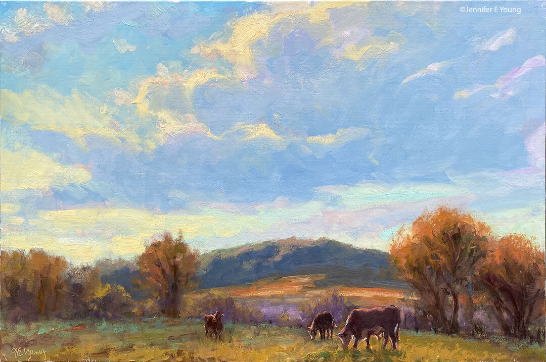
autumn landscape painting by Jennifer Young

Well, my workaround for posting to my blog while painting in the mountains was short-lived. In fact two of my previous posts were lost in the internet ethers, so I'm having to "retro-post" after the fact. This is one of the paintings I completed en plein air while at the workshop. I felt like I was finally finding a groove with this one, and thankfully we had a lovely mild day to work with!

The model posed only in brief intervals for us, so we had to work fast to get her "attitude" AND get the color notes and values that surrounded her. It was fun and challenging, but I am really happy with my results. There is something about painting en plein air that really helps to inform the light. I love backlit scenes like this one, even though it can be hard on the eyes if working in this way for a while. Ken's only critique when I was done was to say that the background trees might compete with the figure, leading the eye away from the center of interest. While this may be true, my feeling was that the fall colors helped to "set the tone" of the painting. Plus I am a color fiend and that fall foliage was too seductive to overlook. I did end up toning it down a little though.

This painting was done in oils on canvas-mounted hardboard. It measures 11x14". For more information please click on the image or contact me.

Model in Green

I finally figured out a workaround for posting pictures! Here is the model we painted couple of days ago, still wet and on the easel:

We only had about 45 minutes to work with him in this pose. The assignment was to lay in the larger shapes and values as quickly but as accurately as possible. On top of that we had to get the proportions down and make a statement about what we wanted the point of interest to be. For me it was the direction of the light in this pose. The model was nearly full frontal from where I sat, so it made getting the perspective a bit difficult. Even so, the time limit was great because it made me focus on what I felt was important,much as I would have to do when painting en plein air.

Asheville- days two and three

It has been an interesting and educating two days here at the workshop. Unfortunately the weather continues to be problematic, so we worked inside from the model on Tuesday. I will say that we had a terrific model who looked like he could have come out of an Italian Renaissance painting. Since Ken Backhaus' segment of the workshop deals with painting the figure within a landscape, we spent our time studying proportions, drawing, and values. I worked from the figure a lot in college but it has been a while since I've worked from a live model and I'd forgotten how challenging and rewarding it is. I think I will definitely continue this pursuit when I get back home, because even though I am a landscape painter, understanding the challenging human form instructs you on many levels. I wish I could post some picutres but alas my camera software has refused to download any pictures from my camera. I'm not sure what is going on with it, but as it is, I only have a limited amount of time that I can use the computer and I just haven't been able to mess with it.

Ken has had us work mainly in one-hour sessions. One of his main challenges to us has been to get us to commit to an idea (what do we want to say in this painting? what is our point of interest?) and then lay in the major shapes and values in broad strokes. Broad strokes doesn't mean just slapping the paint on hapazardly though. Every stroke must have meaning and intent. It was really helpful to me to work in this way. Having the time limit challenges the artist to make informed decisions and commit to them, and not to just futz and noodle endlessly with the painting. It gives a decisiveness to the work rather than having it look too worked over. This is the way with plein air painting also. The challenge is to commit to a statement of light, even if it shifts and changes as the painting progresses. So while I may have preferred to be painting outdoors on location, the figure studies really helped me to have some "ah-ha" moments.

Day three- The weather finally cooperated! We went outside to hickory nut farm and painted a beautiful autumn scene in a pasture. Some of the farm horses wandered up to where we were so that they could check us out. Ken placed the model at a distance in the landscape so that we could incorporate her into a broader scene. Even though the figure was small in comparison to the rest of the scene, her proportions had to be right or else it threw off your entire painting. I must say I was very happy with my results. I chose an angle that gave me the most beautiful backlighting on the model, the surounding shrubs, and the autumn foliage of the trees.

Since this may have been our only opportunity, weather-wise, I and one of the other painters also went out after class and painted on our own. We found a beautiful rolling vista with dramatic colors and cows and horses in the pasture. It was around 5 p.m. by the time we set up and I knew the light would change very rapidly at this time so I chose a small 6x8 pochade. It was plenty big, really, as the sun quickly dropped behind the mountain.

Day one at the Asheville workshop

Well it has been an interesting time here in Asheville so far. Yesterday it was beautiful and sunny, but C-O-L-D and very windy. The combination made it almost unbearable for most of us.  We stuck it out though!! The way they've organized this workshop is to split the group into two, so that one instructor gets half for half of the week, and the other gets the other half and then they switch. Ken Backhaus was teaching the first half of my workshop. His focus for the class was "the figure in landscape painting".

Okay, so I didn't read the prospectus that well and I had no idea we'd be doing figure painting. Being so excited about painting the landscape here, I was a bit taken aback and somewhat put off by having to paint from the model. I kept looking at this gorgeous land and thinking that if we were going to paint outside in the freezing cold, why not paint the landscape and work from the model indoors any time?

But having taught workshops before I also understood how hard it is to have control over a class and offer something that pleases everyone. In fact, it is nearly impossible! So having remembered "what it's like" I relaxed and decided to just enjoy the teaching, knowing that this was a time to learn and be challenged, not to worry about coming away with any "finished" paintings.

In fact the figure is the most challenging subject a representational painter can attempt. There is a reason why the the old masters started their training by painting and drawing the human figure. If you don't get the proportions right, it is obvious for all to see! And the figure is a great instructor of proportion for any other manner of painting that one might attempt.

Ken started out the workshop with a very interesting and informative session on color mixing. He uses the following limited pallette:

  • Ivory black
  • Alizarin Crimson Permanent
  • Permanent Rose
  • Ultramarine Blue
  • Raw Sienna
  • Cadmium Lemon
  • Titanium White

His "color" demo showed how he can mix a myriad of colors from his palette. This palette was somewhat "earthier" than I am used to, but I enjoyed experimenting with it. The one component that I really do not use in my own palette is the Ivory black paint. I'm not really sure it will find its place on my own palette when I return home, but I  think it always helps to learn more about color by limiting the palette. Plus, it is a good way to provide color harmony in your paintings.

After the color demo, Ken showed us how he designed a painting using the figure. He spoke much about how to design the painting using large planes and notes of color. His approach was a bit like composing using puzzle pieces. Everything was about comparison. Comparing one proportion to another, and one value to another. It was very helpful and very informative!

Afterwards, we were able to start a painting of our own using the figure. Unfortunately by that time it was about 30 degrees and the winds were at 20 mph. Most of us were woefully underdressed for the occasion! We all finally had to stop due to the extreme temperatures. Many of us were shaking so bad from the shivers that we couldn't even draw any more. I went out immediately afterwards and bought boots and long johns.

This was a difficult day even for a seasoned plein air painter. Ken is from Minnesota and even he admittedly struggled. I felt for him during his demo, but not as much as I felt for his model! Nevertheless, the days lessons were very instructive.

I've taken some photos but I have yet to figure out how to upload them withouth my usual setup. Once I figure this out I will post some images!

Jennifer Young; Vibrant Landscapes Oil Paintings and art prints online www.jenniferyoung.com Contact

Art Books

I have begun to compile a list of Art Books that I have enjoyed or gotten a lot out of. I went to art school, but landscape painting was NOT the focus there. So after I started painting landscapes I went about furthering my own education, primarily through art books and experimentation. I also took a workshop here and there as I got more involved, but books have always been an important componenet in my art studio. Follow this link to see my art library. I only just begun, but will be adding more to this as time allows. Tags: art painting landscape painting art books plein air 

Mixing Greens

I live in Virginia, and one of the most beautiful things about this area in the milder months is the vast arrays of greens.  As a landscape painter this is also one of the most challenging aspects about painting in this area! Virginia landscape paintingIn my opinion it is a good idea to try and mix your own greens as much as possible. It is easy to spot a painting that uses a lot of out-of-the-tube greens. It's not that tube greens are bad (and I definitely carry at least one when I paint en plein air because of the need for speed.) But painters can become over-reliant on them to the point where the same green is used for everything (trees, grass, shrubs, etc.) and the painting lacks nuance or variation.

The possibilities for mixing greens are seemingly endless. Here are some of the combinations (for oil painting) that I use often:

  • Warm blue (like pthalo)+ cool yellow (lemon) gives you a strong, kelly green
  • Cool blue (ultramarine) + warm yellow (cad. yellow) yields a duller, muted green
  • Cobalt blue is a true blue, and will yield a little cleaner green than ultramarine because ultramarine blue has red in it.
  • Experiment mixing warms and cools and you'll get greens that fall in the middle of these two extremes!
  • A good replacement for Sap Green: try mixing Prussian Blue or Pthalo Blue with Indian yellow. This will give you a similar dark, transparent green.
  • Lightening your greens can get a little tricky. Add too much white and your greens appear chalky. White also cools your colors considerably. Add too much yellow and your greens get brighter and warmer, which may not be what you're going for. The key is balance and a lot of experimentation (a.k.a trial and error!)
  • For distant greens, like at the horizon line of a distant field, try mixing white with a touch of blue and orange, and blending that into your greens as the field recedes.
  • Alternately, you could gray your greens down ever so slightly with a touch of a complimentary color like Alizarin crimson plus white.

Mixing greens is definitely a practiced skill, so my best advice if you are a landscape painter is to practice! It helps to create your own color charts with all of the various combinations of greens that you can mix, labled with the paints used to achieve each mixture. Within this chart, also try and mix a value scale, to see what the green mixture would look like lighter or darker.

Here's an idea if you want even more of a challenge: Try limiting your palette to Permanent Alizarin, Ultramarine or Cobalt Blue, Cadmium Yellow Light, and Titanium White, and see if you can execute the whole painting with just those colors. When you've practiced this for a while, add Phtalo or Windsor green to your palette. This is what Kevin Macpherson suggests in his excellent book Fill Your Oil Paintings With Light and Color.

Do you have a favorite green color mixture for your landscape paintings? Share your ideas by leaving a comment!

Tags: art painting landscape painting artist Virginia landscape paintings plein air 

Landscape Values- Part III

Here are some things to consider when working with values in a landscape. Sometimes when observing the play of light it can be hard to decipher subtle value differences. These are  not hard and fast rules, but hints that may be helpful in creating the illusion of light and shadow. First, I'll start with a simple illustration:

  1. The sky is the source of light, so it is usually the lightest area of the painting.
  2. The flat plane of the ground is usually the 2nd lightest value in the landscape, because it is the earth element most exposed to the light source (except when in cast shadows.)
  3. Slanting planes (like the slopes of mountains) are typically the 3rd lightest value. They still get a lot of light, but they are more upright than the flat earth planes.  Mountain values can have undulating cast shadows as well. They are still fairly light in value however. They are also cool in color temperature, due to normally viewing them from greater distances.
  4. Cast shadows on a flat earth plane will be the 4th lightest value. Shadows generally appear cooler and lower in value than lighted areas, but be wary of painting shadows too darkly (a common problem when painting from photographs.) Cast shadows in nature will still have light and color in them because in most cases they are reflecting the light from the sky.  Also note: Overcast days when the light is generally cooler and more diffused tend to have shadows that appear warmer and more diffused. Sunny days when the light is warmer tend to have shadows that appear cooler.
  5. Upright structures, such as tree trunks and certain trees like cypresses will generally show some of the darkest values because there is less surface area for the light to hit. Be aware though that most trees will still have some slanting planes in the foliage on the side where the sun shines. There may also be darker values than the upright ones occurring on the undersides of your trees and bushes. 
  6. Values can get tricky once you start working with color, so it can sometimes help to squint your eyes in order to check your values. Making quick thumbnail value drawings is extremely helpful as well, as a preliminary to your painting. These “hints� are especially helpful when working from photographs. Note that there are always exceptions (like rising and setting suns), so use your observing eye! Nature often has her own ideas. When working from Nature, be open to exceptions, but also be prepared to use your “hints� if you find it helps you to make a more convincing painting!  

Tags: art painting landscape painting artist plein air Italy travel

Landscape Values

My mom was here visiting with me recently and I asked her about a watercolor class she had signed up for not long ago. "It wasn't so hot," she said. "We didn't learn much of anything. The teacher just kept saying 'remember your values'. We didn't know what we were doing, and we didn't know what 'values' she was talking about!"  

I had to laugh. Family values? Stock values maybe? I guess it's understandable that someone who has been involved in art and painting for a while would assume that everyone knows what "values" are in painting. But not everyone has that clear understanding, so I thought I'd write some of what I know about values here and in a subsequent post or two. (Mom, if you're reading, take notes. Pop quiz later!)

Values in painting are essentially the range of lights and darks in a composition. Seeing values in black and white is somewhat easier than seeing values in color, so a lot of times it is beneficial to create a value sketch of your subject first if you are having trouble discerning how light or dark something should be.

The trouble with values in color is that you now have color temperature thrown into the mix and judging values can be somewhat more confusing, especially when painting en plein air.  What's lighter, the sky or the ground? The rooftops or the side of that bright yellow building?  Understanding a little bit about how the light plays across a landscape can help to create a more convincing scene. 

That is why creating value studies before you jump into painting can be very helpful. Here is a very quick value study I did of a Lake Como scene I am getting ready to paint. I don't always do this, but for more complicated scenes it can be helpful:

This little study will help me to internalize my lights and darks so that I can "remember my values" when I start my work with color.

Tags: art painting landscape painting artist plein air Italy travel

Back from the Workshop

The Friday workshop was a lot of fun. I was impressed by the talent and friendliness of the entire group, and it sure made my experience a real joy. I look forward to giving more workshops in the future! I will post more pictures of the class on in my "photo journal" on my website when I have time, but here are a few images in the meantime. The class began with a little talk and a demonstration. Here is a shot of the classroom. I'm standing in the front of the room (wearing a black shirt and green apron).

Giving the demo... 

An action shot of the painting process; I'm laying in my lightest and darkest areas first to establish my values. 

I got about half way done with this little painting before the participants broke out and started working on their own projects. I should have the finished painting up on my website soon.

Read about Jennifer's current and upcoming workshops here!

Multi-tasking

I have a lot going on this week so I have kind of hit the ground running since my trip. I am working on two commissions and also preparing for the oil painting workshop I am conducting this Friday in Greenville, North Carolina. I'm also doing some sketches to plan for a number of new paintings, but they will wait until I get these other things finished (or at least well under way.) I am looking forward to the workshop! It's focus: Painting the Landscape in Oils. Read about Jennifer's current and upcoming workshops here!

New workshop forming in Greenville, NC

I'm delighted to announce that I will be conducting a day-long workshop in Greenville, North Carolina on March the 10th. Painting the Landscape in Oils- The workshop will focus on the following topics:

*Materials and techniques for the unique challenges of landscape painting

*How to take and work from your own photo references

*A discussion on taking the next step (painting en plein air!)

*Painting demonstration

*Time for participants to work on their own paintings

Read about Jennifer's current and upcoming workshops here!

Painting Demo Part III

Things are really starting to take shape now. I've started to add more of the "local" color greens to the highlight side of my distant trees, allowing the deep blues and blue grays to act as the shadowed underside. I also begin to indicate the lines of the vineyards and the silvery olive trees that dot the distant countryside.  


The painting is looking close to being finished (at least in my mind). Just a few details to address now. I've given more dimension to the olive trees in front and have begun to restate the trunks, adding some of the bluish highlights just in places where the sun hits the gnarled forms. I keep my distant buildings soft and sketchy because they are farther away. Highlights on the distant trees are duller than the richer green colors that I put on the highlights in the foreground. I also add detail strokes to my cypresses. Now I take a nice long look at the painting to see what adjustments need to be made before I start finishing. Placing a mirror on the wall just opposite of your painting is an excellent tool for this purpose. It reflects the painting back in reverse, giving you a fresh viewpoint from which to see the painting anew. Sometimes when you've been staring at a painting for hours it's hard to see what needs to be changed.


Viola! Here is the painting in its finished (or nearly so) form. I've touched in the slight suggestion of windows on some of the buildings, taking care not to do too much of that in the distant ones. I've also developed my vineyards a little more and restated my tree branches. One adjustment I made with my reverse viewing/mirror technique was in the foreground trees. I didn't like how the tree line stopped just short of the edge of the picture plane. It made the composition feel too boxed in. So I extended the tree line out to the edge, which I think gives it a nicer sense of fluidity.


"Gli Olivi della Crete," Oil on Canvas, 30 x 40"

As you may have surmised that "Gli Olivi" means olive trees, and La Crete is the region in Tuscany that is depicted. Over the next week as I work on other paintings, I will prop this painting up in a visible spot in my studio and just keep looking at it. I may make minor adjustments to it if something really jumps out at me after a while, or I may deem it "finished" and put a coat of retouch varnish on it when it dries to the touch for protection.

Thanks for tuning in! If you'd like to see the entire demo again, please view the following links:

Painting Demo Part I Painting Demo Part II

To see more of my Italian Landscape paintings, click here.

Painting Demo Part II

I begin to block in some of the color here, laying in the foreground so that I can gauge the values and temperature of the rest of the color. I want to emphasize these wonderful olive trees and the sloping hill. The olive trees are so distinctive in the Tuscan countryside. At different distances and in different light they take on shades of green, silver, and even blue/violet. But back to the painting; the ground is too dark. The light from the sky is shining directly on the places that are not in shadow from the trees, so I will try to bring out some more highlights as I progress with the painting.

Here I am giving a little more form to the foreground trees, and I lay down the color for where I will show some of the bare land. All of the ground is still too dark in my opinion, but I begin to lighten it up a little.   


Blocking in more of the painting, the distance is starting to take shape. I lay in very cool colors in the far distance, using blues and cool greens. In general warm colors come forward and cool colors recede, so I will start with relatively cooler, lighter colors in the distance and stronger, warmer colors as the eye moves forward in the painting. I still use slightly darker blues, (ultramarine, plus a dab of cad red light and white/ or ultramarine plus a dab each of cad. orange and alizarin crimson and white) even in the middle ground, as I can always add more local color later. I've also lightened up the ochre ground colors throughout the painting, which I think looks better and more convincing.

I start to feel more comfortable once the canvas is covered with paint and there aren't any unaddressed areas. Even if the value or color isn't quite right, it helps me to "see" the painting better if I can have everything more or less laid out. I have now indicated the buildings, more of the distant trees, and have added detail to the olive trees in the foreground, including giving them some more shadow areas. As I have worked in more color, you can see I've painted out some of the tree trunks and branches that were indicated before, so I will have to restate them again at some point.

As you can see, this is very much a push and pull exercise for me. Some artists start with the distance and work forward, and I used to try and do that too, but I always tend to want to lay in some of the foreground so that I can better determine what the distance will need.

Painting Demonstration: Part I

I thought I'd share some information here about my painting process in the studio. It has been raining and snowing for what has seemed like weeks here, so the photography may not be the best. The colors may not appear exact but hopefully these pictures will be sufficient to give you some idea of how the image looks.

Here is my inspiration photo. This is a picture I took with my digital camera when I was in Tuscany in the springtime. We stayed in Montalcino, in the southern part of Tuscany, and we drove all over this and neighboring areas. I think I must have taken about 1000 photos in all. I like using digital pictures because you can delete on site and don't need to worry about film. Plus, back home I can zoom in on details and see them directly in my computer monitor without having to go through the expense of printing the images unless I really want to. My photos are pretty amateurish, but I use them more as digital records to jog my memory of what I saw and sketched while I was there. The actual digital file for this photo is much larger, allowing me much more detail in the studio:

What I like about this scene: I love the lines and the layers of textures. What I want to emphasize. The buildings on the right and the olive trees in the foreground. What I will want to change: I'll reverse the direction of the lines in the front vineyard so that they don't lead your eye straight out of the painting. I will also simplify the buildings, both in the foreground and in the distance; leaving in what I feel to be important and taking out what I feel is distracting.

Here is a quick sketch of the scene that I will use to work out what I'm thinking about:

Okay, before you say anything, I can draw better than this! This is just a quickie sketch - a throw away drawing to cement in my mind what I want to focus on in the painting. It would be better if I had drawn a more rectangular shape, as this is the format I will use for my painting, but I just grabbed what was on hand at the moment of inspiration. As you can see from this drawing, I am still working out the composition. That grouping of cypress trees is right in the middle of the photo, but I will experiment with some other placements. My objective is to make an interesting painting that expresses my impressions and feelings about this beautiful land that I visited, not to make an exact copy of a photograph. While I want to be true to the subject, my first commitment is to paint a dynamic and harmonious landscape.

Starting: Nowadays I mostly paint on white canvases, though some times I still tone them with a quick wash of raw sienna or alizarin crimson. I mix alizarin crimson and ultramarine blue, and with this I draw with a round bristle brush just a quick layout of my composition.


I'll lay in the sky because this is usually the lightest/brightest part of the picture. I don't get into a lot of detail here because I want to keep it loose and things are still subject to change. However, I do want to have a road map in place, so to speak. My next step will be to start blocking in the painting and laying out my color. In the coming days I will post my progress on this painting...stay tuned!