French pastoral WIP and art studio WIP, cont'd

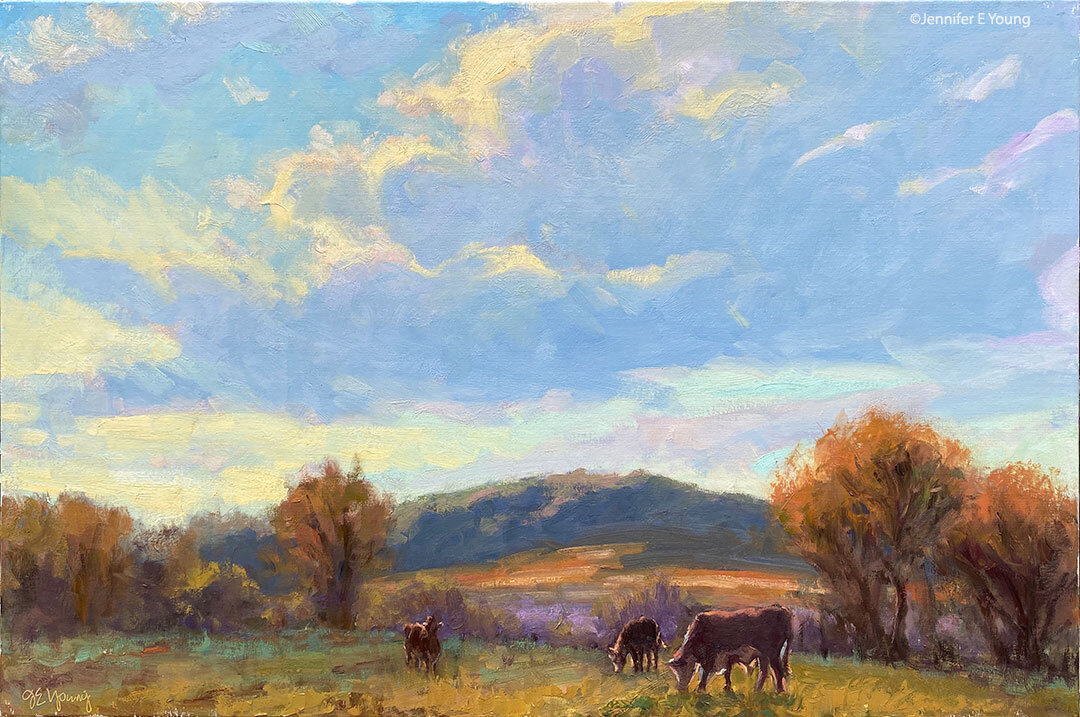
The misty painting of the Lot Valley continues....

Lot valley france landscape painting

Still trying to keep things soft, but articulate them at the same time. Today I'm working on the sheep. Meanwhile, I've been told that it's okay to continue my obsessive postings about the new studio ;-) . So here's a little mini tour:

First of all, so much of the furniture in this space came from IKEA that you'd think I had an interest in the company or something (none exists--other than a serious interest in shopping there. ) In fact, we put so many of my "IKEA finds" together that Dave started calling it "I killya" because of how much this stuff weighs. Still, there's no denying that they have some intelligent designs to outfit an office and art studio (and the price is right too!)

Here's a view of my painting area and the sink. At first I was going to go with a regular utility sink and cabinet, until I found the "Udden" sink at IKEA.

artist's studio jennifer young

That sink nearly DID kill us, actually--trying to lift the coordinating cabinet up to screw it into position in it's nifty little slot. For a while after that little ordeal I seriously thought I had nerve damage in my hand (my "painting hand, too!)

Below is a view from my little sitting/library area looking toward the art bins that Dave built for me. There are some more bins on top temporarily, but they will go up in the loft area when we're finished with them. At this writing, we're still working on studio storage, so I'll write more on that in a future post. A bookcase blocks the view, but the sink sits across from the bins, and my main easel stands across from the full-length mirror pictured, so I can check my work in reverese.

artist's studio jennifer young

And now flipping my position, here is a view of my sitting/reading area from beside my art bins (still populating the shelves with my many art books!)

artist's studio jennifer young

I have divided my sitting and office area from the painting/sink area with a large 6 foot room divider with storage cubbies from IKEA's Expedit storage series. I like that it divides the space while still giving me a feeling of openness. What is hard to see is that I've bolted this unit at a right angle to a white bookcase that faces the French doors for added function and stability.

The ladder is actually an old telephone ladder like this one that I bought cheap on Craigslist. We're still working to make it a moving ladder on a track...almost there.

Now we're on the other side of the room divider looking at my table where I do my framing, plein air panel prep, and flat art-mounting. All those little drawers are great for my framing tools and fasteners.

artist's studio jennifer young

In this same "room" sits my office. Can you tell how much I like paperwork? I've rather been avoiding going through my files, but since it's tax season, it's the task before me:

art studio jennifer young

Note those big squares of light from the windows and how far they come into the room. This is why I opted not to have east-facing windows also on my painting side. I will likely put up some kind of sheer window treatment soon to diffuse this light so it won't be so harsh.

Conspicuously absent from these pictures are my paintings that will in future be on the walls and in the bins. We have yet to get them out of my temporary storage space until we have finalized our art storage solutions....but more on that in a future post.

French pastoral WIP and new studio sneak peek

Like everything else these last several months, it has taken longer than I expected to get myself set up in the new studio space. But I love how it has come along; and I'm happy to say that I am at least set up enough where I am working again. I must admit I feel a bit rusty with my painting. At least I've done a little bit of drawing during the chaos, so in that way I have been able to keep my hand in it, so to speak.  But for me, the discipline of painting is a bit like the discipline of physical exercise. It seems to take a while to get "in the flow", but it's oh so easy to get out of shape. (What's up with that?!) The only thing I know to do is just get started and work through the awkwardness.

I thought I'd start up again where I left off--by working on another studio painting based on a plein air study from my trip to the Dordogne. Here is the study:

french countryside plein air painting Jennifer Young

When I originally posted about this piece I called it a "Work-in-Progress", as it was my intention to finish it. But ultimately I would reap greater benefit from it by keeping it as a study. In misty, foggy scenes, the values are so close together and it can be a real challenge to achieve this effect. So even though this is not a "complete" piece, it had a lot of information for me to reference in terms of accurate values and edges captured on site.

Here is the larger piece (24x30") currently under way:

landscape painting of southern France by Jennifer Young

At this point I've kept everything pretty much as flat shapes and used very limited color, as I work out a general pattern and design. I'll need to keep adjusting the values as I know they are stronger than the study overall, but particularly in the middle distance. I also plan to use a lot more paint and more color variations, all the while keeping color subtle and the edges very soft. That's my aim, any way. It was challenging on a small scale and even more-so on a larger one! But I'm game. (I think!)

As for my other "WIP" (my new studio), I do have some more pics to share, as I've begun moving in setting up workstations. But I'll give my readers a break from "construction-speak" and save that for another post. Meanwhile, just a sneak peek at my painting area:

artist's studio setupÂ

Studio building project- the final stretch

My online presence has been a little quiet lately because we are getting down to the "finishing touches" of prepping my new art studio for move-in. After my lights were installed, I finally came to a decision about the color of the walls, and I've spent the majority of my time in the last couple of weeks painting the walls and trim, installing picture moulding, painting more trim, and touching up walls and trim some more.  (Just one more door to go!) Not only am I body-weary, but I am also decision-making weary. So it is a good thing that most of the big decisions are now behind us. I really had a time trying to decide on wall color. I knew I wanted a color (as opposed to white/off-white). But having had yellow walls in my last studio, (great color for the gallery walls, not great for art-making) I also knew I wanted something that was neutral enough so as not to cast the wall color onto my paintings and palette.

While the color that's so popular right now with many portrait painters (mentioned in this previous blog post) was waaay too dark for my taste, I did like the idea of a neutral gray/green. So I decided to start my quest by playing with a sample of the portrait painters' color (Benjamin Moore's "Mohegan Sage", #2138-30) to see if I could figure out the underlying base color by tinting it with a bit of white.

It may look a little more "colorful" on the computer monitor, but the lightest tint was a fairly dead-looking gray. Benjamin Moore lists Mohegan Sage as a "black", and having tinted it I can see why. It probably is a combination of black with just a touch of yellow. It's very rich in its full strength, but none too inspiring in my tinting experiment! Still, tinting up to an almost elephant gray, I couldn't deny that it is a very neutral color, and thought I could use my tinted sample against some other color swatches to find a related color that was both lighter and more inspiring but still neutral for my studio walls.

What I found was a beautiful rich color that seemed to be in line with the darker sage, though perhaps a tiny bit cooler. It's a color called "Storm Cloud Gray" (also by Benjamin Moore, # 2140-40.)

art studio building wall color

While this color is a good deal lighter than the dark sage, I was still a little concerned that it would be too dark. So I decided to use it on just one wall as an accent and do the rest of the walls in an even lighter shade that I also liked-- again a gray green called "Paris Rain," (BM color #1501). Here is the result:

art studio wall color Jennifer Young

Here are the lighter walls running into the deeper accent wall, complete with sleepy husband reporting for cleanup duty last Saturday morning (what a guy!)

art studio wall color Jennifer YOung

I find both of these colors really lovely and pleasing. Sometimes they look more gray, sometimes more green; though in either instance they still remain neutral enough not to overpower.

In the above picture you can also see the picture moulding we installed so that I can hang artwork. Unlike the trim moulding, I decided to paint the picture rail the same color as the walls, both because I wanted to keep the high walls looking "high" and because the picture moulding was fairly plain and nothing special.

Since Dave (and friends) installed both the floors and the trim moulding, I wanted to do all of the painting myself to give the poor man a break. I totally underestimated how much time it would take. I guess it was those high walls that fooled me, but at last it's more or less done and we've had the "SmartBox" delivered (portable storage box). Over the next few we can actually start the process of moving in, assembling furniture, and piecing together my various work stations. This too will take a while (and likely a few more trips to IKEA) but it's actually starting to feel like a real art studio now. I'm excited about the prospect of being in there and getting back to painting again (as in ART) on a regular basis!

The next big challenge will be figuring out some storage solutions that make sense for the new space. Much of that will have to be dealt with after I've gotten my main workstations set up, but I will be sure to blog about it as I go along. Meanwhile, I doubt I'll do much blogging over the next few days, as we will be moving and dismantling my office for a bit.

Too cold for plein air...? So I'll write about it instead!

Note: This post picks up on a conversation that started in the comments section of my post from a couple of days ago about painting outside in "the elements"....or not. My first plein air painting experience was a disaster. In fact, I don't think I was really won over with the whole idea of painting on location until about the 5th time out. It took many more outings than that, however, before I created anything I considered to be remotely approaching a "success".

There were definitely days when I found myself wondering why I bothered with it at all. Even now that I really love plein air painting, I still find I don't do it as often as I would like. It is certainly a lot easier to paint in a nice cozy studio at any time of day or night without having to haul a bunch of gear around. It's a hassle. You have to deal with bugs, sunburn, wind, rain, or the freezing cold. In some cases you also have to deal with constant interruptions from passers-by (from dogs to people to timed sprinklers coming on unexpectedly to boats parking right in front of your view!)

But even with all of that, there is something exhilarating about it. It can often be the best sweaty, bug-bitten, exhausting, driven, compelling, and highly focused couple of hours I've ever spent. And even in the "wipers" or those that end up in the "circular file" there was often enough of an element-- maybe just a square inch or two-- that hinted at some special understanding and called me forward. In short, there was something this experience was teaching me that I wasn't getting by working in the studio alone.

In order to really enjoy my plein air painting experiences I think I first had to finally let go of the need for a particular outcome. Of course ultimately I want to become a better painter! But just as I'm trying to do now with my life-drawing, I gained the greatest benefit from this practice when I finally started viewing it in terms of what I could learn rather than what I could produce. The shift in perspective helped, because what I found from nearly the beginning was that whatever the immediate outcome, these experiences helped to inform and improve my knowledge and understanding overall, including the work I did in the studio.

Since my work is based on the natural world, there is no better reference than nature herself; and one of the main benefits of plein air painting for me is that I am painting from life.  Plein air painting isn't the only way to achieve that of course. I can also set up a still life  or do some figure drawing and painting (which is one reason why I've gotten back into life drawing myself this winter when I can't seem to get myself outside in the cold for more than 5 minutes!)

But the difference with plein air is that not only are you dealing with painting your response to a "live" subject, you are also having to concern yourself with the changing light and many other things that move and change and can't be controlled the way you can do in the studio environment. It's limiting, but not in a bad way. It pushes you to think about simplifying and making the bold statement without having to articulate every little detail, and doing so with a great deal of accuracy at the same time.

That is not to say that by their nature all plein air paintings are "better" than studio paintings. I'm sure anyone who has spent time looking at landscape paintings has probably seen a good deal of strong AND weak paintings produced by both methods. Ultimately, a painting has to stand on its own.

Both methods have their advantages and their limitations, which is why I like to "mix it up". In some respects the two practices could be compared to short-pose gesture drawing vs. longer, more studied sittings done in life drawing. In either case, I'm sharpening my skills of sight and understanding, but using different muscle groups, so to speak. Hopefully with regular practice the dexterity and skill will grow. That's not all there is to art. To be sure, it's not art without individual creativity and expression. But skill and dexterity in the execution sure make it a lot easier for me to better articulate my creative vision.

Reclining nude II- WIP

I started this drawing on Friday in Robert Liberace's "Exploring the Figure" drawing class at the Art League School:

reclining nude figurative drawing by Jennifer Young

The upper portion is the least resolved so far, but the whole drawing is to be developed further by a kind of push/pull method of adding and subtracting layers of charcoal, followed by highlights in white conte chalk.

Rob started the class with a beautiful demonstration inspired by the techniques of a 19th century French academic artist named Pierre Paul Prud'hon. I had not heard much about this artist, but enjoyed seeing the exquisite  reproductions that Rob shared by way of this book.

Rob made particular note of the way in which Prud'hon defined form, and his unique method of shading and highlighting. As this article by artist Rebecca Alzofon explains very well, Prud'hon had a unique method of shading--in part by creating hatch lines that followed the direction of the form, then stumping and hatching again in a similar manner with highlighting chalks. So in our class, our challenge (should we choose to accept it) is to experiment with working in a similar manner from our model. From my understanding we will work on the same pose for another two or 3 sessions.

In Rob's demonstration he used a Canson gray tinted paper (at about a value #4) which worked well, as it created a light-mid value to contrast with highlighting with white Conte. I again found myself without the proper materials to perform the task. I must have gotten an incomplete or outdated supplies list or something, but all I had was an off-white Rives BFK paper, with which I just made-do by shading with vine charcoal to give me somewhat of a "tone".  I'm not sure at this point how far I can continue developing the current drawing or if it will produce the desired effect. At some point I may just start again with the proper paper, but I'd like to at least take this a little further to see what more I can do.

It has occurred to me that this method of very refined drawing is somewhat more polished than what I'm normally drawn to. Even in the Prud'hon reproductions in the book, I found myself lingering in the passagesof his drawings that were less "finished" and showed more gesture, more of the decision making process, and more of the hand of the artist.

In my own drawing, I notice myself secretly wanting to stop before I lose too much of the gesture. This is probably because in my landscape painting I've set a goal for myself to find ways of stating things more simply...to say "more with less", so to speak and to do it a bit more loosely. At the same time, the whole reason I signed up for this class is to experiment and maybe even learn something new in the process! You can't do that if you are too beholden to your own agenda.

I've been reading a great little book right now by George Leonard called Mastery: The Keys to Success and Long-Term Fulfillment. Leonard is an aikido master so a lot of his analogies in the book are drawn from the martial arts and Zen philosophy. According to the author, one of the keys of mastery is entitled "Surrender":

"The courage of a master is measured by his or her willingness to surrender. This means surrendering to your teacher and to the demands of your discipline. It also means surrendering your own hard-won proficiency from time to time in order to reach a higher or different level of proficiency."

Hmmm. I suspect it probably also means surrendering your own agenda from time to time as well.