Sharpening the Saw: The value of a quick study

Last month I completed a weekly class with David Tanner, a painter well-known locally for his portraiture. I believe the best artists, and especially the best teachers, are also lifelong students. Thus I am a true believer in the periodic practice of focused study to “sharpen the saw” and to discover new ways of seeing and working.

My current obligations and time constraints make it difficult to invest in a week-long workshop out of town. So I was really interested when a fellow painter-friend recommended David’s class down at the Visual Art Center in Richmond. I have known and enjoyed David’s paintings for his sensitive portraits, his impressionist style and beautiful color sense, so I was delighted when his class, “Increase Your Speed & Capture the Color in Oil” jived with my daughter’s school and after-school schedule.

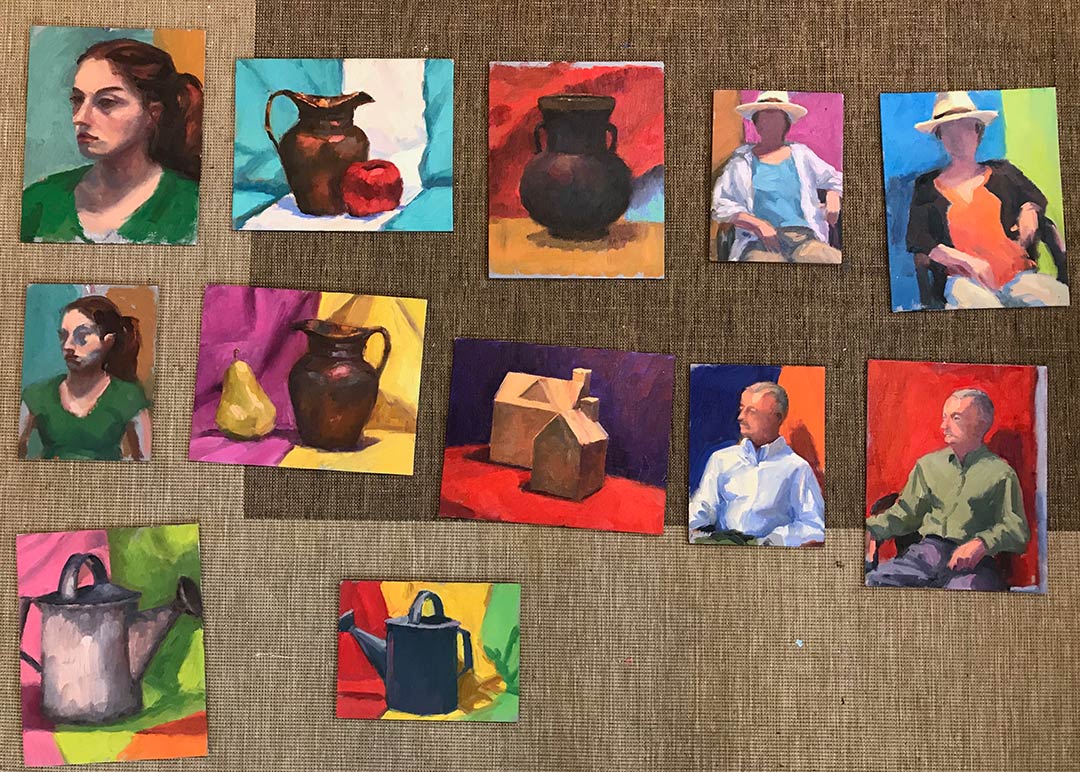
I loved the concept of this class, which was to distill the subjects, whether still life or the live model, to essential planes, light and shadow, and color, in quick small oil studies. Each class was roughly divided into two 1 1/2 hour sessions, beginning with one or two objects (a vase, a watering can, a piece of fruit) and various combinations of colorful backdrops. Gradually through each class the level of difficulty increased, until switching at last to the live model.

Quick studies done in class, 8x10” and 6x8”

Quick studies done in class, 8x10” and 6x8”

My biggest takeaway from this class was the importance of regular practice, with quick studies as a sort of artistic calisthenics. These little paintings, no matter how mundane the subject, were created with the INTENTION of allowing them to just be studies and nothing more. So often with my time constraints I feel a great pressure to create finished pieces— something I can sign and put a frame on. This class was not about that—at all—and I loved it! Frankly, I needed it.

Putting a time limit on the sessions helped me avoid jumping into the fussy details too soon. This occurs also with plein air painting practice, though I tend to spend more time on those, establishing correct proportion and a pleasing composition. I can really see using this approach as a compliment to my plein air painting practice, on rainy days when I can’t get outside. It’s also just a good a regular practice to work into my studio time, to improve and sharpen the saw.

Plein Air Westhampton

Plein Air Westhampton was my final major plein air event for the summer. This one was much closer to home, in Richmond, Virginia, which normally would have made it a cinch logistically. However, with a child in primary school and a new puppy at home, I still wasn't able to do morning-to-night painting because Westhampton was about an hours' drive round trip from where I live in Ashland. 

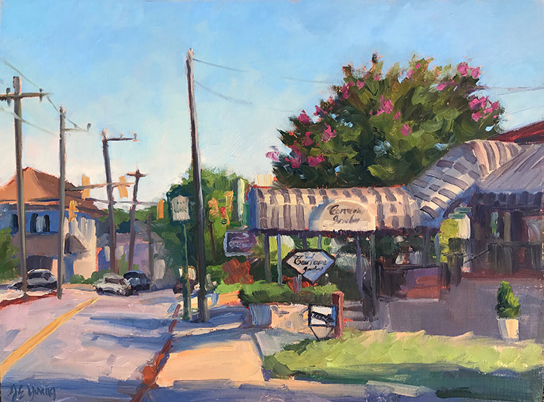
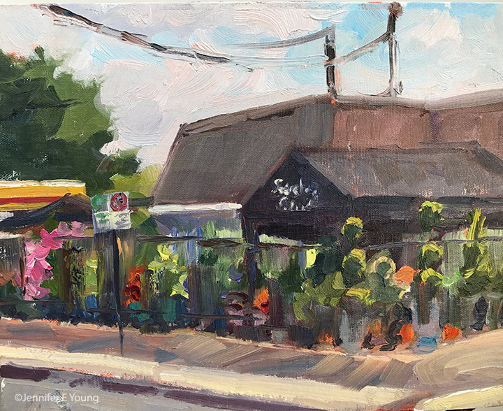
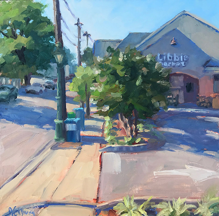
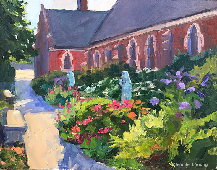
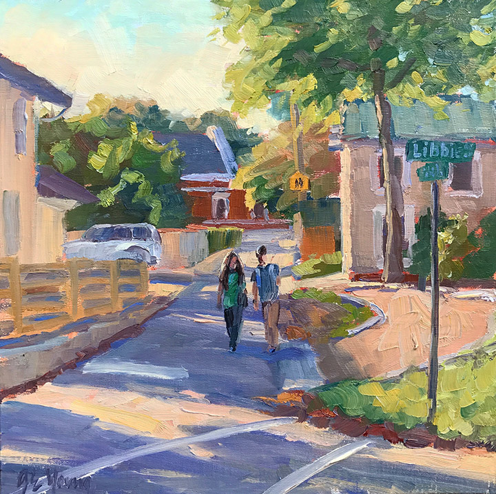
Nevertheless, I got five good paintings out of the week. I felt really lucky to be a part of this inaugural plein air festival. I had the best time painting at this event. The vibe was imbued with excitement and comradery, but it was also low pressure at the same time, which I think helped my painting overall. This event took place in a really lovely part of old Richmond in a neighborhood filled with stately homes, old churches and charming shopping areas. Works painted by the 20+ participating artists during the week were exhibited in an outdoor tent during the street party called Party On the Avenues held on the final Sunday.  It was a well attended show that seemed to garner a lot of interest from the local press and public, and I had a great time painting in this charming district. Being primarily a landscape painter, I really surprised myself by how much I enjoyed painting the street scenes, and the experience left me feeling like I really want to do more with this subject matter. Three of my paintings sold during the event, and one of them was an award winner! It was such a harried week with my back and forth schedule that I regret not getting better photos of my paintings before the show, but I'm including some shots I was able to snap of the paintings I completed during the event. The two remaining paintings are on display at a local Westhampton gallery called Palette Paint and Home .

Upcoming show, demo, and more

Too many irons in the fire makes Jen a lame blogger. However, I hope you'll still welcome this post and the news I have to share. First off, I announced some of this in my last newsletter, but if you don't subscribe to that, I'm pleased to announce that I have been invited to be the Featured Artist at Cabell Gallery in Lexington, Virginia. The gallery will hold an opening reception from 5:00 - 7:30 PM, this Friday, June 2nd. I will be in attendance, and it would be so, so great to see some friendly faces there. Here is one of the new pieces I just brought down there for the show:

"The Nubians", Oil on linen, 16x12" ©Jennifer E Young

"The Nubians", Oil on linen, 16x12" ©Jennifer E Young

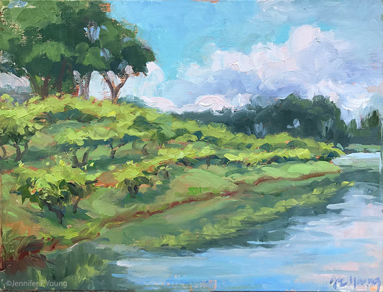
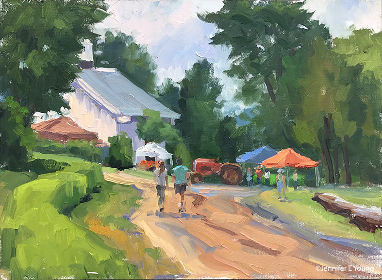
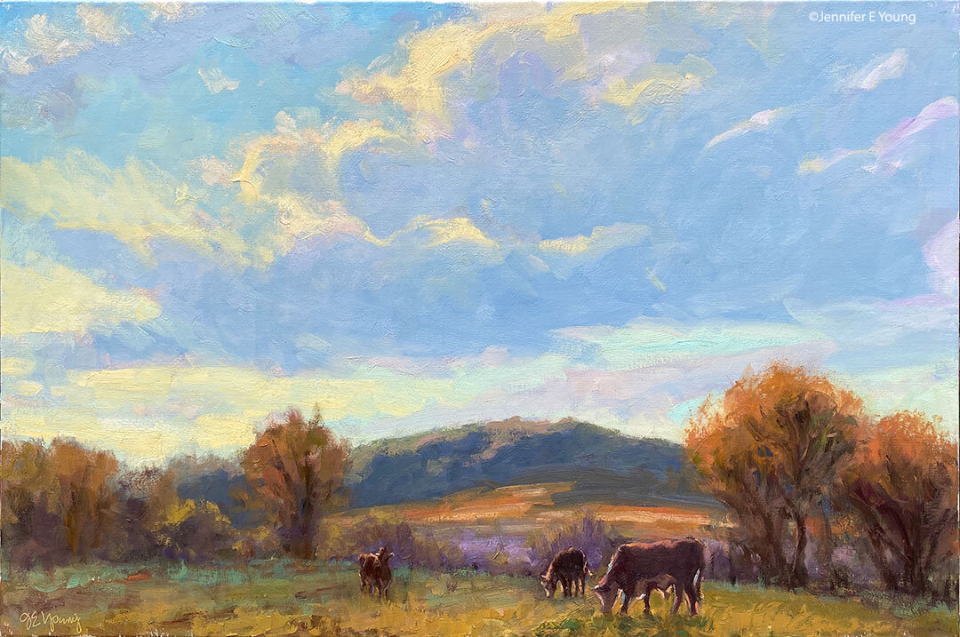
If I happen to miss you at the art opening on Friday, I'll also be painting alongside other Gallery Flux artists on Sunday during the Rassawek Spring Jubilee at Rassawek Vineyards. I painted with Gallery Flux during this event last year and it was loads of fun. They'll have music, food, a variety of demonstrations from animals to art, and of course, wine! The event runs throughout the weekend, but I will be there on Sunday, June 4th, at 11 a.m. Here are a couple of pieces I did at last year's event. Come by and see them at the Gallery Flux display, plus whatever else I create at the event this year.

Lastly, the garage conversion is done and I am finally moving into my permanent studio space. It's been quite a process and I admit pretty stressful trying to get ready for a show with no real studio space to work in, but Hallelujah! It's all a thing of the past now. I did not post progress pictures as promised because I was too overwhelmed with everything that's been going on, but I'll have some images of the final space to share by next week if not before.

Venetian market demo, continued

Today before I continue with my painting demo, I thought I would mention the colors I'm using on my palette. For many years I stuck with a fairly limited palette of about 5 or six colors (cad. yellow light, cadmium red, alizarin, ultramarine blue, pthalo green and white.) This was great for me as it really pushed me to learn how to mix color and not become reliant on pre-mixed colors from the tube. It also really helps lighten the load when I am packing my gear to take my studio outside and paint en plein air.

But these days in the studio, my time is more limited. I have a finite amount of hours each week to paint, blog, frame, ship, not to mention cook, eat, sleep, and care for my family. So I have allowed myself the luxury of an expanded palette to speed things along in certain areas. For instance, while I know how to mix secondary colors and some decent earth tones with a limited palette, things can move a bit faster if I have some premixed secondary colors (a.k.a. "convenience colors")  in my toolkit. So, for instance, red+yellow= orange., but cadmium orange is still a nice color to have both for it's purity and intensity and its convenience. In any case, whether I am using primaries or secondaries or pre-mixed earth colors, there is still plenty of color-mixing along the way, and  I don't ever use any color straight from the tube on my canvas.

Aside from the convenience, I am just enjoying playing with new colors. I've had less time to get out to doplein air painting, and I have missed it. So adding something new to experiment with in the studio keeps things fresh for me. On the palette I'm using right now I've introduced a few earth colors, plus some colors from Gamblin's radiant line. Aside from the colors listed with the asterisk *, I may not keep all of these colors out on my palette every time. But they have made an appearance in the studio often enough over the last few months that they are worth mentioning. All of these colors are Gamblin unless otherwise noted:

  • *Titanium white (Gamblin or Winsor Newton)
  • *Cadmium Yellow Light
  • Cadmium Yellow Deep
  • Indian Yellow (Winsor Newton)
  • *Cadmium Orange Deep
  • *Napthol Red
  • Radiant Red
  • *Quinacridone Violet
  • *Ultramarine Blue
  • Severes Blue-sometimes (Rembrandt)
  • *Radiant Turquoise
  • *Pthalo Green
  • Permanent Green Light
  • *Payne's Gray
  • *Brown Pink
  • Gold Ochre (Rembrandt)

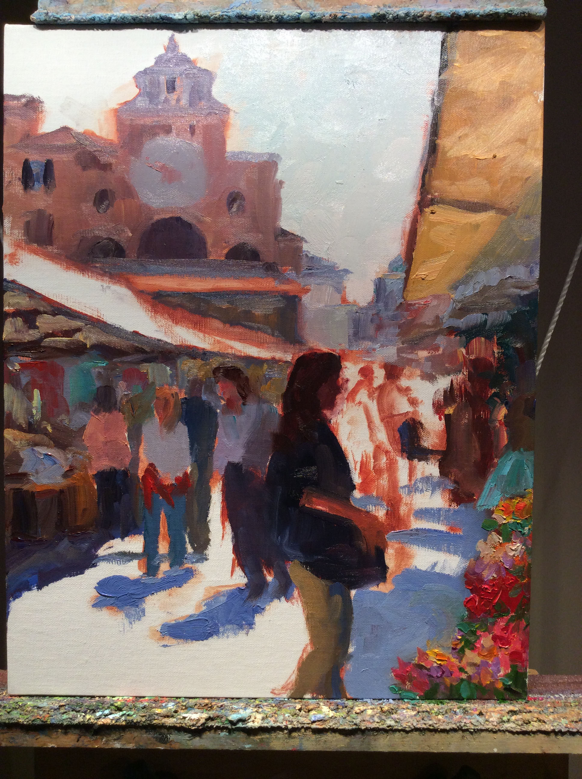
 Now that I've gotten that bit of housekeeping out of the way, let's get back to painting! I spent my last post addressing the "shadow family" in this scene. In this picture you can see that much of the busy market scene is now at least suggested. But light is needed to delineate the forms and bring the scene alive.

venetianmarket_wip4_jenniferyoung

These images are a bit dark as I did not take the time to color correct the in-progress shots. But hopefully you can see that my approach has been to just focus on the general shapes of things without getting too bogged down in details. There are basically three large shapes of light spilling over this painting: the sky, the pavers, and the white awning, with lesser highlights on the figures.

Here is the final stage. I have kept things fairly loose because I wanted to keep the focus on the foreground figure, while still maintaining unity throughout the painting. Notice the difference in the color of the final piece below, taken under better lighting conditions to show the true nature of the colors in the painting.

"Il Mercato Veneziano", Oil on linen, 14x11" ©Jennifer E Young

"Il Mercato Veneziano", Oil on linen, 14x11" ©Jennifer E Young

Thanks for following along on my little painting journey to Venice! This piece is heading to City Art Gallery in Greenville, NC for their 30th Anniversary Celebration September 22nd. 30 years! Wow! Come join us for the party and see this painting (and yours truly)  in person! :-) 

Venetian market painting- a progression

It's taken me a while to get to blogging about this painting because after a disastrous automatic update to Windows 10 my computer died. It has actually been grinding to a halt for a while but it finally kicked the bucket for good last week and I have spent the past however many days trying to relocate my data and reinstall my applications. I am still operating on the bare minimum but at least I can blog again! I won't go on about it but just imagine to appropriate amount of ranting and hair-pulling and insert it here. Aaany-hoo, back to art!

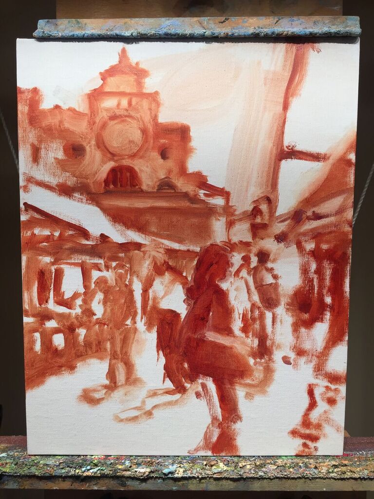
I thought I'd post a little step-by-step demo of this piece because I actually had the forethought to take some progressive shots along the way. This one had a lot of figures and architecture in it, both of which might seem a bit overwhelming at first. But my reference photo also had a really nice value pattern, so by focusing on that first it made my job a lot easier. Here is the composition under way, put to canvas in monochrome with a brush and Gamsol:

mercatovenezianosketch_jenniferyoung

Next, I want to think in terms of light and shadow by separating out which parts of the painting are in the light (the light family) from which parts are in shadow ( the shadow family). I will start with the shadow family first. I learned this terminology from Kevin Macpherson, one of my teachers and a phenomenal painter. Phrasing it this way helps me to organize my thoughts and approach, beyond just saying "lights and darks". It's so helpful to see it this way because in actuality some things in shadow are quite light, though they are never lighter than what's in the light family.

mercato_veneziano_wip_jenniferyoung

I spend a lot of time working in the shadow family because so much of the strength of the painting is here. Only then do I start working in the light.

More stages next time. I hope you'll tune in as I work on lighting this bad boy up!