For Everything, A Season

It’s been a difficult year. I guess I’m now at a point where I can finally write it down, but based on the June date of my last real blog post,😳 (aside from the occasional quick announcement) maybe it was already evident. June was when the reality settled in for me and my siblings that it was time to say goodbye (for now) to our beautiful, sweet, smart, creative mother, who had struggled with her illness in an acute form for over a year. I thought I was prepared, but no matter how well you understand the “reality” in front of you, there’s nothing that really prepares you for such a loss. With a little distance and time, I am still realizing how much it knocked the wind out of my sails, and I’ll admit that I am struggling to get my energy and my painting “mojo” back.

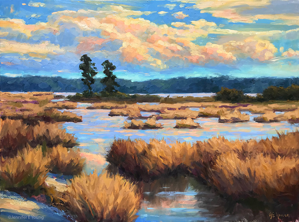
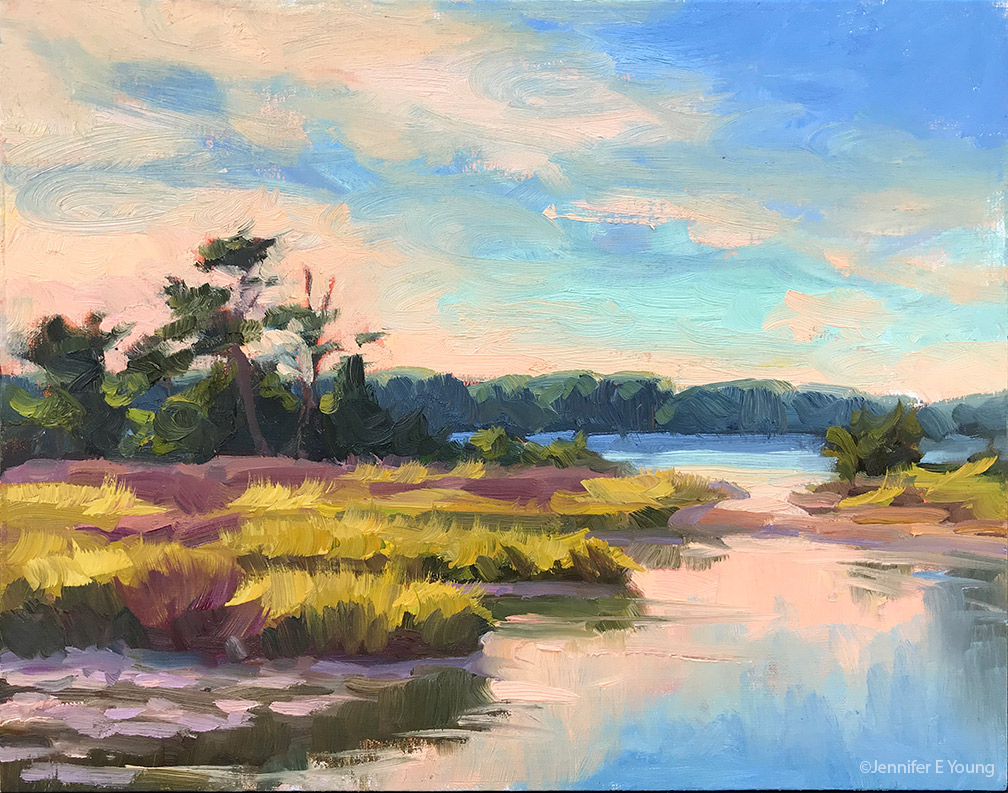
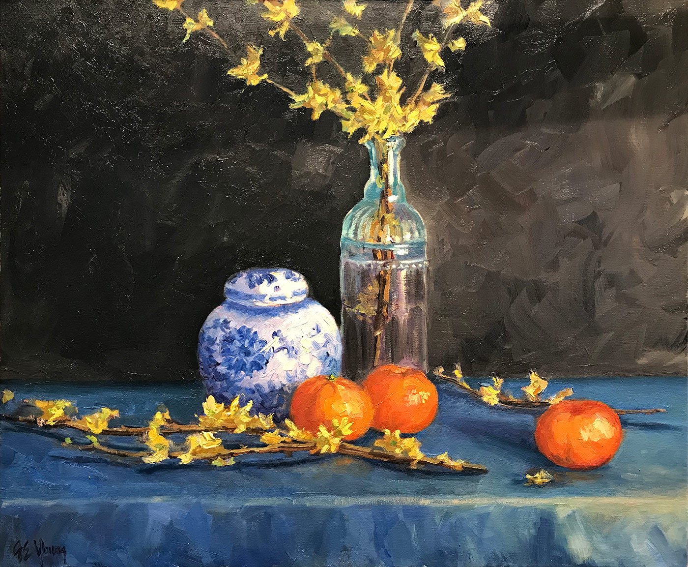
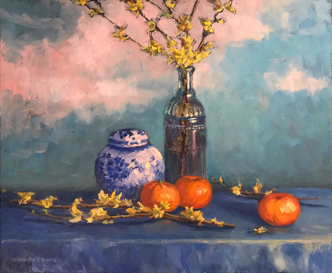
If you, yourself, are a creative of any kind, I’m sure you know that feeling of creative flow. It’s so great when it’s present and really kind of miserable when it isn’t. That’s not to say that I haven’t painted at all. In fact, the paintings I’m sharing in this post are from commissions and projects I worked on over the past few months. But it’s been hard to get that momentum going where gears are all greased and the ideas and inspiration just keep flowing and I’m chomping at the bit with my next idea.

I suppose there are art marketing gurus out there that say that you should never admit such things and always put your most successful foot forward. “Fake it ‘til you make it,” so to speak, and only share your successes and never the struggle. That can sometimes be helpful, but it’s not particularly authentic. Let’s face it, the struggle can be real and I would venture to say I am not the only artist who has been in this place.

If you are in this place also, my advice is to be gentle on yourself. Do the work that is in front of you, do what you can, but don’t beat yourself up that it’s just “not happening” for you every time you step in front of the easel (or the potter’s wheel or the computer). Celebrate the moments of inspiration in whatever form and for however long they come. This too will pass, but in the meantime, the only way past it is to get through it the best way you know how.

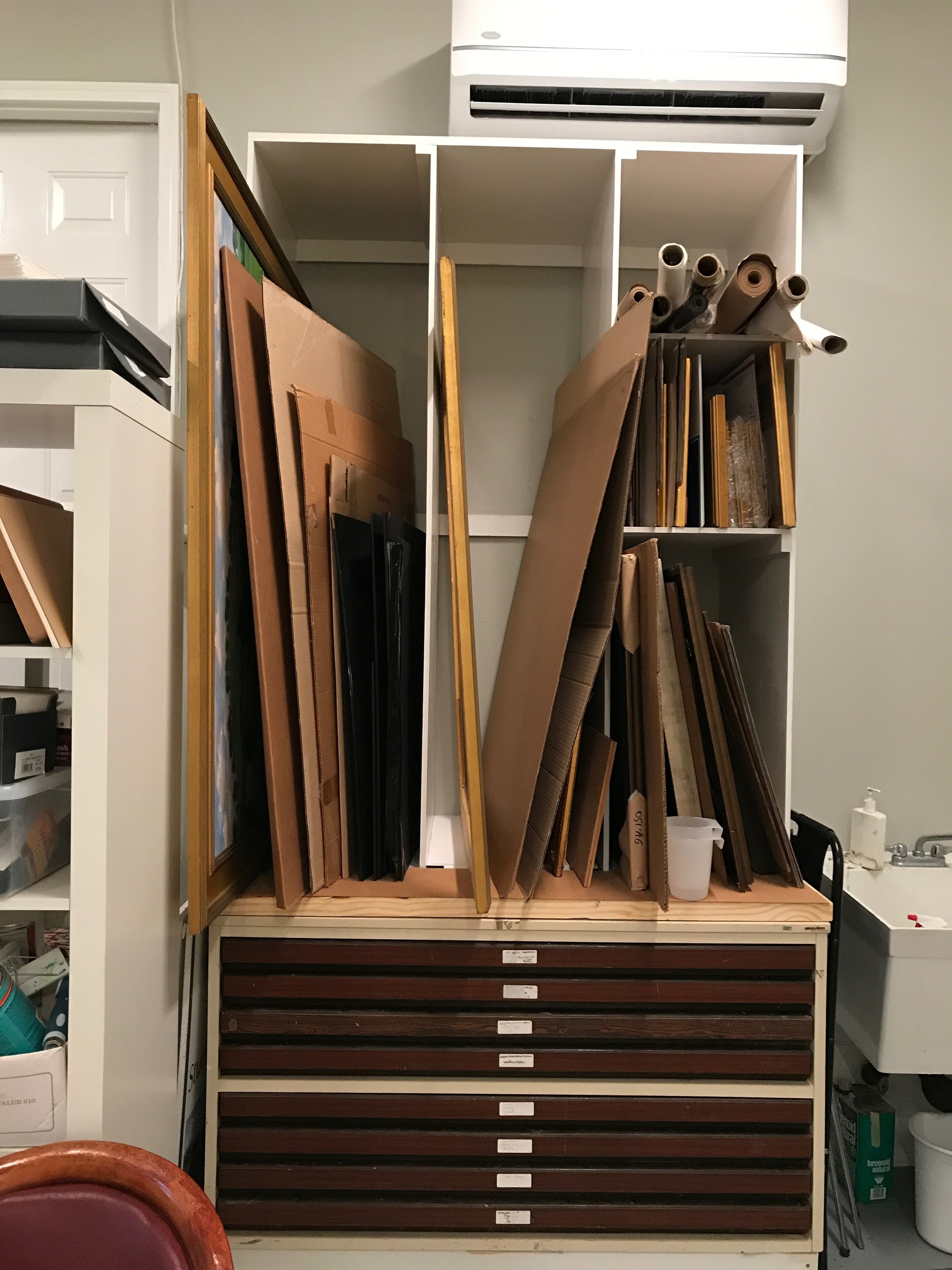
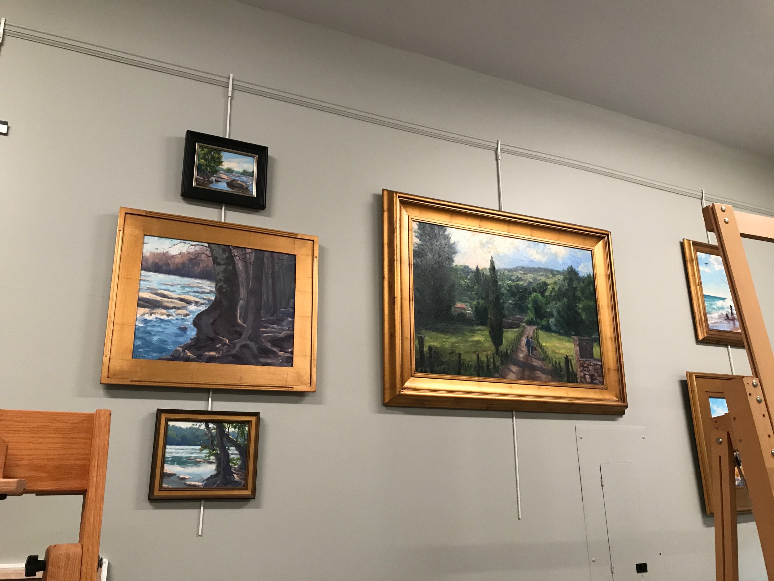
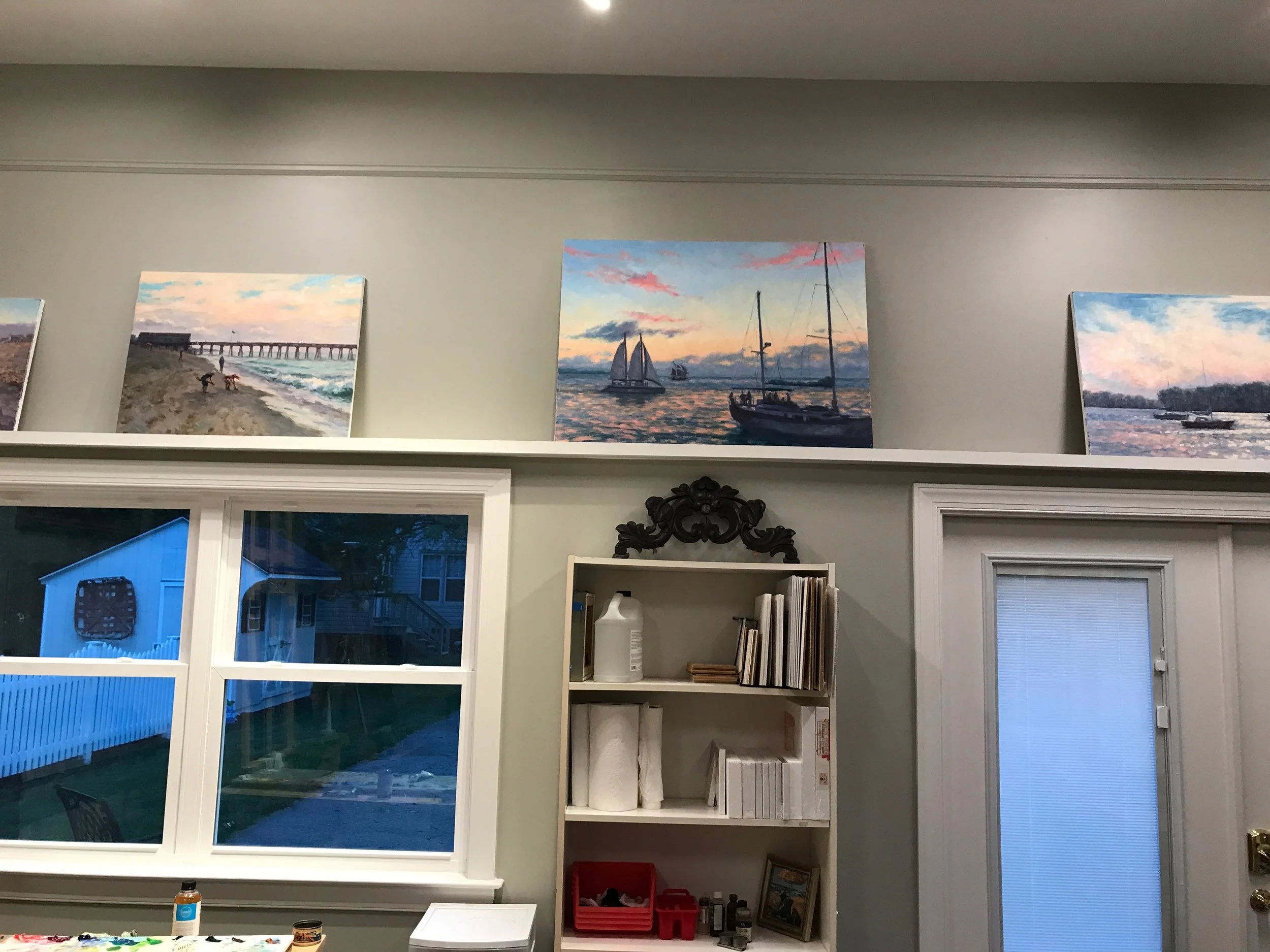
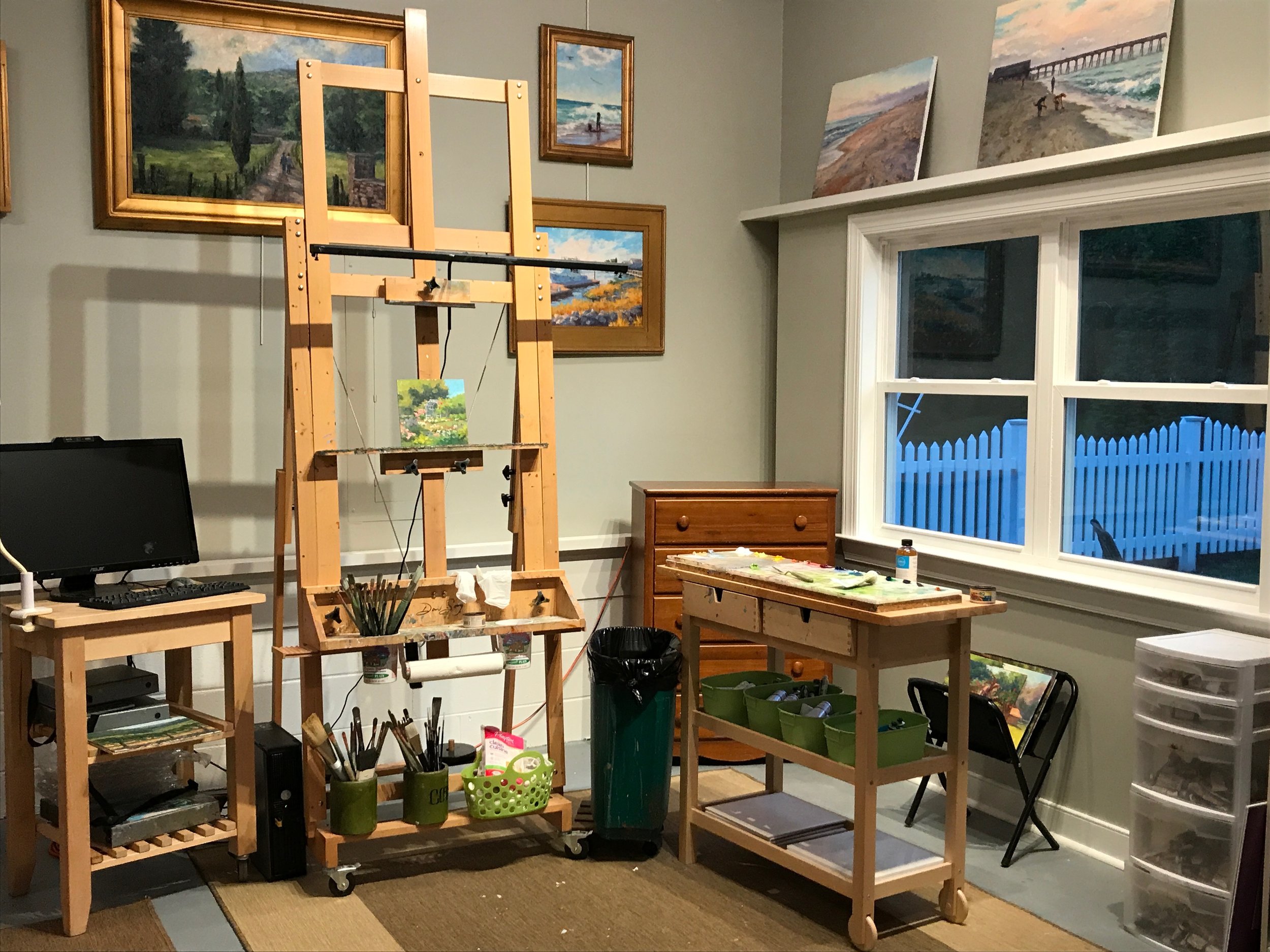
For me, I’m reorganizing my studio, working on an new inventory management system, and cleaning up the office as a way to clear out both the mental and physical clutter. As a result, I’m holding a holiday sale of smaller (mostly plein air) paintings with some great savings in hopes that I can manage my limited storage space and also hopefully send a few more pieces out into the world. I’m also working on a series of still life paintings, as they are less dependent on time of day and weather. More about that in future posts.

Change is Good (Part II)

In my last post I explained how I go about making changes to a previously completed painting that may need some minor tweaking to improve it. Today’s post deals with more drastic measures. This still life isn’t really that old, but almost since its completion I felt I wanted to do something different to the background. Both the shawl on the left and the angles on the right bothered me, as did the color combinations as they related to the foreground. All of these elements served to distract more than enhance the still life arrangement. 

Still life, version I

Still life, version I

So, after sanding, scraping and oiling out (as described in my previous post) my first thought was to create a very simple dark background, which is a classical approach to still life painting employed by a lot of painters through the ages. I also got rid of the awkward angle in the lower right portion of the table cloth, and carried the horizon line straight across.

Still life, version II

Still life, version II

I actually liked these changes, though without the background distractions it really brought out how evenly divided the painting was by the bottle of forsythias, making for not-so-interesting negative space on either side, only accentuated by the plain dark ground. The dark color also really brought out the remaining texture underneath, even when the paint layer was built up. So, I decided to play with it a bit, knowing I could always come back to the simple dark background if I really wanted to.

“Forsythia and Delft Blue”, Oil on linen, 20x24" ©Jennifer E Young (click the image for details)

“Forsythia and Delft Blue”, Oil on linen, 20x24" ©Jennifer E Young (click the image for details)

What I arrived upon felt to me to be both whimsical and old world at once. It almost reminds me of an antique screen or stage set of a decorative painted sky. The “clouds” served to break up the background space, and the softer, happier palette made me feel happier too. It can be a little scary to make these kind of changes but I’ve come around to the idea that  if the painting is nagging on me, the benefit of change can outweigh the risk. Have I ever “ruined” a painting doing this? Yes indeed. Occasionally my over-zealous scraping can poke a hole straight through the painting. Other times my changes may fail to satisfy me and I end up scrapping the whole thing entirely. But if I’m not satisfied with the painting as it is, it’s probably worth risking it. In any case, if I’m lucky, I have miles of canvas to go before I’m done. 

A Room of One's Own

Yesterday on social media I posted the video of my long-awaited studio completion. If you weren't tuned in to that, I'm including it below. Today I'm also sharing a few more photos and some details because I'm really excited to finally have a permanent home to create my work.

Yes, the garage-to-studio is complete! Hurrah! 😄 I feel as if I have been moving for nearly two years, because, well, I have. So just the very thought of not having to shuffle my supplies and equipment from one place to the other is a most delicious concept to me.

It doesn't have the cottage charm of my former studio,  but it's open and airy and has North light and storage, so I feel like I'm in luxury any way. Here are the bins we had built:

artbins_jenniferyoung

We built them "up" to keep the work off of the floor, even making use of the space over the water heater. 

File Jun 10, 6 08 16 AM.jpeg

I'm using the same hanging system for hanging art as I did in the last studio, using picture rail and a hook and rod system from Walker Display. But my favorite feature is the shelving that runs along the perimeter of the space. 

IMG_3283.JPG

This came about because I had a strange cinder block bump-out that ran along the walls of the garage, and the carpenter suggested capping this off with some shelving where I could perch works-in-progress, wet paintings, or other unframed art. He also ran this same shelving over the doors and windows I had framed in, in place of the the old garage doors. 

File Jun 10, 6 08 37 AM.jpeg

This space is just slightly east of due north studio lighting. But as you can see, when the sun goes down I still need supplemental lighting. For that I have installed Daylight LED tube lights and tracks. At some point I may install a couple of additional short tracks over my framing and auxiliary painting area, but I have enough to get me up and running. 

In keeping with tradition, I maintain my usual impeccable timing, and have completed the studio just in time to leave for two weeks on a plein air painting trip to Maine for an artist's residency. So, as excited as I am for my new space, it will have to wait to get junked up until I return! 😉  Meanwhile, God and internet willing, I hope to blog from the road during my travels. 

Venetian market demo, continued

Today before I continue with my painting demo, I thought I would mention the colors I'm using on my palette. For many years I stuck with a fairly limited palette of about 5 or six colors (cad. yellow light, cadmium red, alizarin, ultramarine blue, pthalo green and white.) This was great for me as it really pushed me to learn how to mix color and not become reliant on pre-mixed colors from the tube. It also really helps lighten the load when I am packing my gear to take my studio outside and paint en plein air.

But these days in the studio, my time is more limited. I have a finite amount of hours each week to paint, blog, frame, ship, not to mention cook, eat, sleep, and care for my family. So I have allowed myself the luxury of an expanded palette to speed things along in certain areas. For instance, while I know how to mix secondary colors and some decent earth tones with a limited palette, things can move a bit faster if I have some premixed secondary colors (a.k.a. "convenience colors")  in my toolkit. So, for instance, red+yellow= orange., but cadmium orange is still a nice color to have both for it's purity and intensity and its convenience. In any case, whether I am using primaries or secondaries or pre-mixed earth colors, there is still plenty of color-mixing along the way, and  I don't ever use any color straight from the tube on my canvas.

Aside from the convenience, I am just enjoying playing with new colors. I've had less time to get out to doplein air painting, and I have missed it. So adding something new to experiment with in the studio keeps things fresh for me. On the palette I'm using right now I've introduced a few earth colors, plus some colors from Gamblin's radiant line. Aside from the colors listed with the asterisk *, I may not keep all of these colors out on my palette every time. But they have made an appearance in the studio often enough over the last few months that they are worth mentioning. All of these colors are Gamblin unless otherwise noted:

  • *Titanium white (Gamblin or Winsor Newton)
  • *Cadmium Yellow Light
  • Cadmium Yellow Deep
  • Indian Yellow (Winsor Newton)
  • *Cadmium Orange Deep
  • *Napthol Red
  • Radiant Red
  • *Quinacridone Violet
  • *Ultramarine Blue
  • Severes Blue-sometimes (Rembrandt)
  • *Radiant Turquoise
  • *Pthalo Green
  • Permanent Green Light
  • *Payne's Gray
  • *Brown Pink
  • Gold Ochre (Rembrandt)

 Now that I've gotten that bit of housekeeping out of the way, let's get back to painting! I spent my last post addressing the "shadow family" in this scene. In this picture you can see that much of the busy market scene is now at least suggested. But light is needed to delineate the forms and bring the scene alive.

venetianmarket_wip4_jenniferyoung

These images are a bit dark as I did not take the time to color correct the in-progress shots. But hopefully you can see that my approach has been to just focus on the general shapes of things without getting too bogged down in details. There are basically three large shapes of light spilling over this painting: the sky, the pavers, and the white awning, with lesser highlights on the figures.

Here is the final stage. I have kept things fairly loose because I wanted to keep the focus on the foreground figure, while still maintaining unity throughout the painting. Notice the difference in the color of the final piece below, taken under better lighting conditions to show the true nature of the colors in the painting.

"Il Mercato Veneziano", Oil on linen, 14x11" ©Jennifer E Young

"Il Mercato Veneziano", Oil on linen, 14x11" ©Jennifer E Young

Thanks for following along on my little painting journey to Venice! This piece is heading to City Art Gallery in Greenville, NC for their 30th Anniversary Celebration September 22nd. 30 years! Wow! Come join us for the party and see this painting (and yours truly)  in person! :-) 

Changing spaces (again)

I mentioned in one of my recent posts that we are in the planning stages with a builder to build a new studio at our new residence. It's coming along-- I'm excited! 😃  But given that we are just in the permit stage, I know enough about building an art studio to know that it will be a while yet before that dream becomes a reality.  Meanwhile, it will be important to save some money to help pay for the new digs. Sooo, I'm giving up my rental space and yet again, moving my studio. 

This time I will attempt to work once more in the house. I feel like we have rearranged our house so many times in the year that we have lived here, that it's comical. So what's one or two times more, in the scheme of things? The room I've cleared out for my little temporary studio has been a catch-all room; a mud room, a temporary guest bedroom, and eventually it will be my office.  It has a door that leads to the back screened porch and faces the site of the future studio. It sits a bit away from the rest of the house, and is just down the hallway from the garage. So in some ways,  the location is ideal for a little painting space.  

What's not ideal though, at ALL, is the lighting. This room is very, very dark, which is why I never thought to use it previously for a home studio. What's changed since we moved to Ashland though,  is the easel light, shown below (installed on my Sorg easel, with an unfinished painting.) 

image.jpg

The light is one by Revelite, which I learned of from seeing postings raving about it in several of my friends' Facebook feeds. Revelite makes traditional picture lights for lighting artwork, but also these work lights designed to work with artist's easels. They are slim profile, adjustable LED bulbs, with a high color rendering (CRI), purportedly, of over 90. 

I purchased the 36" light. I will admit I was sweating bullets when I ordered this thing because while I was "pretty sure" this light would work with my easel, I still harassed Revelite's customer service for a few weeks with a barrage of inquisitive emails.  It was, after all, a very expensive light. And it carried a hefty restocking fee in the event it needed to be returned.  Luckily, though, the light mounted to my easel without an issue, and I am really pleased with the quality of the light it provides to my painting surface. 

image.jpg

Above is my new home-based  temporary studio! Although I still think I need more light for the room, at least I have lit the most important parts of my workspace in order to get the job done.  I've lit the palette area with a standing Ott-lite for now, but as you can see this is a very cold, bluish light compared to the warmer but still very clean easel light (which I prefer.) I am still working on a better solution to this problem, because putting different lighting on my painting and palette will likely be problematic. 

If this little space is looking quite neat, it's because the rest of my supplies (frames, equipment, paintings, etc) are stashed in a million different places throughout my house,  with even more still at the rental space. All of that stuff will need to be moved out and consolidated and organized by the end of August, so aside from painting and splashing in the water with the kiddo, you can guess how I will be spending a good part of the rest of my summer!