Change is Good (Part II)
/In my last post I explained how I go about making changes to a previously completed painting that may need some minor tweaking to improve it. Today’s post deals with more drastic measures. This still life isn’t really that old, but almost since its completion I felt I wanted to do something different to the background. Both the shawl on the left and the angles on the right bothered me, as did the color combinations as they related to the foreground. All of these elements served to distract more than enhance the still life arrangement.

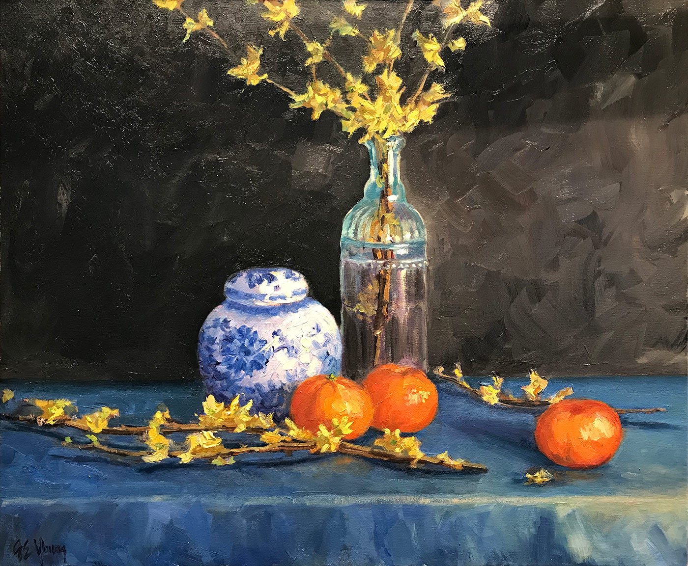
Still life, version I
So, after sanding, scraping and oiling out (as described in my previous post) my first thought was to create a very simple dark background, which is a classical approach to still life painting employed by a lot of painters through the ages. I also got rid of the awkward angle in the lower right portion of the table cloth, and carried the horizon line straight across.
Still life, version II
I actually liked these changes, though without the background distractions it really brought out how evenly divided the painting was by the bottle of forsythias, making for not-so-interesting negative space on either side, only accentuated by the plain dark ground. The dark color also really brought out the remaining texture underneath, even when the paint layer was built up. So, I decided to play with it a bit, knowing I could always come back to the simple dark background if I really wanted to.
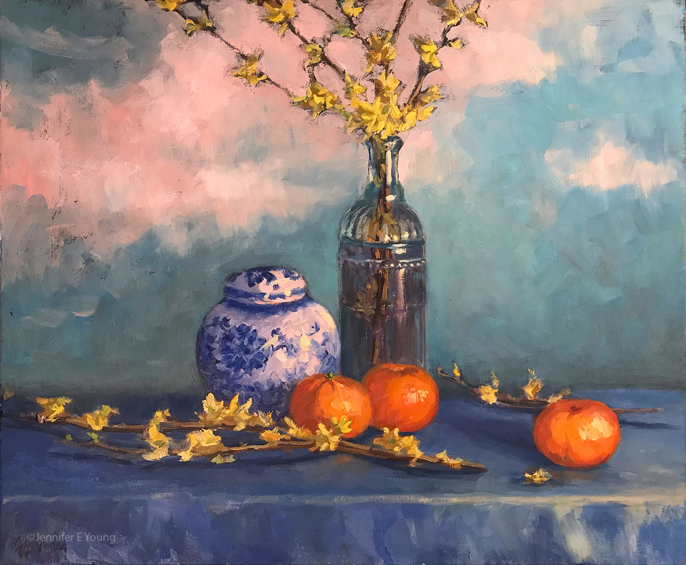
“Forsythia and Delft Blue”, Oil on linen, 20x24" ©Jennifer E Young (click the image for details)
What I arrived upon felt to me to be both whimsical and old world at once. It almost reminds me of an antique screen or stage set of a decorative painted sky. The “clouds” served to break up the background space, and the softer, happier palette made me feel happier too. It can be a little scary to make these kind of changes but I’ve come around to the idea that if the painting is nagging on me, the benefit of change can outweigh the risk. Have I ever “ruined” a painting doing this? Yes indeed. Occasionally my over-zealous scraping can poke a hole straight through the painting. Other times my changes may fail to satisfy me and I end up scrapping the whole thing entirely. But if I’m not satisfied with the painting as it is, it’s probably worth risking it. In any case, if I’m lucky, I have miles of canvas to go before I’m done.