Marinating, then celebrating!

I completed this painting (or so I thought) a short time before we left for our annual summer trek to the beach. I really liked it, for the most part. And having considered it finished, I stuck it up on my studio wall before our trip. After our return though, I started looking at it with fresh eyes. Some things that tugged on me before were now really starting to become more bothersome. But I decided to let it marinate a while longer as I was distracted with other projects. 

surfside1_jenniferyoung

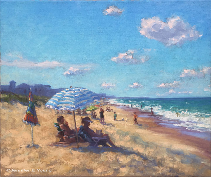
Finally, I decided that while I liked the overall mood in this piece, I did not like the little closed umbrella to the left of my grouping of sunbathers. It kept pulling my eye away from where I wanted to go, and it was sort of an ambiguous object sitting there. Still I wanted something near that spot that would perhaps pull the painting together a little better. So I began flipping through my trip photos for some ideas and inspiration, and came across a snap of a little boy digging intently in the sand. I sketched it out quickly in a nearby notebook and set to work. 

boy_surfside_sketch.jpg

There wasn't a lot of built up texture where the umbrella was, so I only had to scrape it down just a little bit with a razor. Then I proceeded with a little "oiling out"  (in this case with just a little gambol and solvent free fluid) to help the new paint layer adhere to the older but still very fresh under layer. Here is the revised painting with the little boy. I also brightened the sky a bit more as it was feeling a bit intense and heavy.  

"Surfside", Oil on linen, 20x24" ©Jennifer E Young

"Surfside", Oil on linen, 20x24" ©Jennifer E Young

Here's a detail of the figures: 

"Surfside" (Detail) ©Jennifer E Young

"Surfside" (Detail) ©Jennifer E Young

I don't know about you, but I like this much better, and I find it finally worthy of celebrating with a frame and a signature.  :)

Tuscany vineyard W.I.P.

I spent some time late last week and Monday working on the painting I had sketched out in my last post. I will say before I begin, that these photos are not color corrected due to limited time, but hopefully you can still get an idea of how the painting is developing. Sketch in transparent oxide red, with some shading...

Tuscany painting work in progress by Jennifer Young

I usually lay in the sky first, but since there is so little of it in this painting, I have decided to start laying in the ground. More or less, I am working front to back.

Tuscany landscape painting by Jennifer Young
Tuscany vineyard landscape painting
tuscany painting in progress by Jennifer Young

At this point I had to step back and think about the plane trees I had sketched in on the upper right. As much as I love the plane trees, I was afraid they would be too busy in this painting, when there is already a lot going on. You might even be able to tell that I struggled with those trees from the outset, by all the transparent red oxide rubbed into that side of the canvas. I kept wiping them out and putting them back in, until finally I surrendered and took them out for good. Sometimes you just have to accept that you can't say everything you want to say in a single painting.

I still wanted something in the upper right for balance, so instead I massed in a "less interesting" tree. I also changed the skyline slightly so as not to feel so hemmed in. The sky is pretty washed out here but my sky, while very light and simple, has more color (pale golds and blues).

Tuscany vineyard landscape painting

Up to the point pictured is about 5 or 6 hours' work. I started this late Friday afternoon and came back after dinner (and after the baby went to bed) to work on it some more. I just wanted to get it to a point where the whole canvas was brought up to the same level of "finish" (more or less) so that it would be easier for me to pick up again when I returned to the easel.

Once upon a time I was a total night owl and I'd habitually paint late into the night (this was before I started painting landscapes). I haven't done this in a really long time, and I'm not sure it's such a good thing for me. I only meant to work for a couple of hours but it was close to midnight by the time I cleaned up and I was so wound up I couldn't sleep for a while. Maybe I'll get used to it in time, but as it was, every time I'd go to clean up I'd tell myself, "just five more minutes!" Afterwards, I felt like I had had an entire pot of coffee! I kept telling myself it was time to stop, but now that I feel so often on a time crunch, any studio time is a real treat.

Alla prima portrait study

In my previous post I mentioned an out of town trip last weekend. I was over in Colonial Beach VA pursuing one of my main 2009 goals (exploring the figure) by taking another class with painter/portrait artist Robert Liberace. This class was a 2 day workshop on alla prima portrait painting. Since this is the way I am accustomed to painting with my landscapes (particularly smaller works and those done en plein air) I was really drawn to the class. Rob is as enthusiastic and energetic as I remember him to be from my first class with him in figure drawing last semester at the Art League School. I am continually enthralled by his masterful demos, and I found it interesting that the process he set forth for this style of portraiture was very similar to the method I use to paint my landscapes.

The palette we used, however, was quite a bit different and more expansive than what I typically use for my landscapes; burnt umber, cad yellow light, followed by several reds, several blues, two violets and a couple of greens. He also used two different kinds of white, Titanium (a very strong, bright white) and Lead White (the most opaque of the whites.)

Rob began with an imprimatura (toning) in burnt umber on Ampersand panel, and a very quick and sketchy (though amazingly accurate) grisaile. From there he then built his way to layers of color from shadow to mid-tone, halftone and finally highlights. Of course he made it look so easy, but I soon found out otherwise!

The model I painted on this first day was a very stunning young lady who looked to be about 15 or 16. Turns out she was actually only 12. I think for her age and energy level she did exceedingly well sitting for us, and it was a real visual treat to paint her. By the luck of the draw, I found myself setting up in a spot that put the model in complete profile. I'm not normally overly excited with profile views. In fact I find them boring. But the model had a great hairdo and a nice twist to her torso that actually enlivened my view and made it fun to paint:

girlportraitstudy_jenniferyoung

She was wearing a great red satin dress in the Asian style, which went well with her beautiful golden skintone and almond shaped eyes. Unfortunately in the remaining time we had left to work (after Rob's excellent demo) I got none of the dress, save for a brief outline. I did take a photo of her though, in case I decide to work more on the painting. But most times I leave my workshop studies as is, to serve as a reminder of what I learned and in what areas I still need to grow.

In any case, I  learned a lot from this first sitting. First of all, just as in plein air painting, it's important to get your drawing down accurately and commit to your big idea as soon as possible. While the lighting in a portrait studio doesn't change the way the natural light does en plein air, what does change incrementally is the model. It's really hard for a model to get the exact same pose and facial expression after a break. And it's also really hard to hold a pose for any length of time (especially if you happen to be 12 years old!) So while it's tempting to jump right in to color, Rob wanted us to spend a good deal of time first developing a strong grisaille and really fleshing out the portrait in it's proper porportion, placement, light, shadow, and halftone-- BEFORE putting down the first dab of color.

Another very important thing I learned once I moved beyond the grisaille had to do with painting children. As in landscape painting, it is oh so very easy to overdo it by getting lost in details. It's an interesting dance; because while you want to accurately record what you see, too much unnecessary detail can detract from the character of the subject and weaken the overall painting. At about an hour into my painting I was well into color, painting in every shadow I could possibly see on the model's face. I knew the likeness in her profile was pretty accurate, but still  I wasn't getting her character--her "glow".

Then Rob came by and said, "You're aging her." Taking my brush, with literally two sweeping strokes he pulled some of the middle skintone I had put down on her upper cheek and quickly swept it downward, blending away almost all of the shadow work I'd done around her mouth and nose, leaving only part of the cheekbone shadow and the shadow work I'd done under her jaw. I just stood there and chuckled. It was like one of those "miracle line eraser" wrinkle ads you see on the Internet.

"You just took 10 years off of her, " I said. Ah, if only it were that easy in real life!

p.s. The above 20x16" study was after about 2 to 2 1/2 hrs. of work. The sketch in the upper right corner of the canvas was a hands-on instructive from Rob early on, because the initial lines of my grisaille around the eyes were too juicy and lacked definition.

Landscape painting demo of southern France- conclusion!

Well there's nothing like computer woes and an out of town trip to keep up the momentum for a painting demonstration! But at long last, here is the resolution to the demo I started in late April:

When I last left off, I had my concept and composition well planned out, so now I set to work on finishing. This involves painting in the foreground and punching up the highlights of the middle distance and background, where needed.

But something happens at this point. I kind of get too lost in the irises, making them too defined and pronounced. Soon I find my tunnel vision has gotten me so lost in the irises that they start to take over.

Argh! Attack of the irises! They've taken over and are rather too big and too saturated, creating more of a competition with the old abbey. I've also lost the lower wall in the middle distance almost entirely, which I rather liked, as it helped to lead the eye further into the painting.

My solution? Basically I scraped down the entire lower portion of the painting! Eh, it happens. The paint had become too thick to really rework, and sometimes it's easier and less distracting to just scrape it off in order to open it back up. In this case I felt a "do-over" was warrented.

"Irises at Abbaye Nouvelle" Oil on Canvas, 40"x30" ©Jennifer Young

"Irises at Abbaye Nouvelle" Oil on Canvas, 40"x30" ©Jennifer Young

Ahh...better. (At least I think so!) I've gotten my herb-covered wall back, and reworked the irises in the foreground so as to frame but not overpower. I've treated them a bit more impressionisitcally too,  to flow better with the rest of the painting. I also decided to tone down some of the greens and golds in the middle distance to make them "sit back" in the picture plane.

At this point I'll conclude. If I touch it any more it will be only a tweak here and there. I've shot and re-shot the final several times but we are getting such dark days lately with all this rain that I can't seem to get the nuances in the colors quite right in the photo. This picture is close, but I'll likely try another shot once the sun comes out.

Frayssinet Village painting- WIP resolved

I have been doing a TON of painting lately!! Unfortunately the painting I'm speaking of involves latex paint and a roller rather than the oil on canvas variety. The good news though is that I'm getting steps closer to finishing the new studio. (I'll post new pics of the paint colors I've chosen soon, once I've finished painting and had a chance to clean up the debris.) The other bit of good news (to me) is that I carved out a bit of time to steal away to my temporary studio space/closet to finish the French village painting I was working on a short while ago. This is yet another painting I will likely try and re-shoot when conditions are better (Note: Mission accomplished!). The color is definitely truer, but the details are lost. (I know I'm sounding like a broken record about my photography woes, but it's a significant frustration that I completely underestimated when I was planning my "interim" period between moves from old studio to new.  I like to get good photos, both high and low res.,  of whatever I paint. It's one reason why I'm not doing the weekly updates to my website that I'm normally accustomed to (in addition to the fact that I'm just not painting as much due to the current construction project.) But since we're dealing with a lot of ice/sleet/rain here in Virginia with no chance of photographing this outside, I'll quit my whining and post what I have:

"Light and Shadow, Frayssinet, France" Oil on Canvas, 24x30" (SOLD) ©Jennifer Young

"Light and Shadow, Frayssinet, France" Oil on Canvas, 24x30" (SOLD) ©Jennifer Young

As you can see if you compare this to my last version, the main edits were in the focal area concerning the figure. I also decided to shed a considerable number of years from my little lady (if only I could do that in real life.) Grandma looked so tired walking up that hill, so I let her granddaughter take the trek. LOL.

I now consider this painting pretty much resolved to my satisfaction. Thanks to those of you who chimed in on my solicitations for the last round of edits. Whether it's obvious or not, I feel that I took all of your thoughts into consideration, while still holding on to my original intent for the piece. 

By the way, this is the village where I stayed last year during my "artist's retreat" in France, and where I've planned to hold my own retreat/workshop for June. The gateway to the right leads to the courtyard of Le Vieux Couvent, and you can see part of a building on the left (behind the irises.) Sadly, I am now at a point where I'm considering cancelling this trip...or at least postponing until the economy improves. We'll see. More on that when I know more.