Marinating, then celebrating!

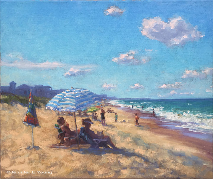
I completed this painting (or so I thought) a short time before we left for our annual summer trek to the beach. I really liked it, for the most part. And having considered it finished, I stuck it up on my studio wall before our trip. After our return though, I started looking at it with fresh eyes. Some things that tugged on me before were now really starting to become more bothersome. But I decided to let it marinate a while longer as I was distracted with other projects. 

surfside1_jenniferyoung

Finally, I decided that while I liked the overall mood in this piece, I did not like the little closed umbrella to the left of my grouping of sunbathers. It kept pulling my eye away from where I wanted to go, and it was sort of an ambiguous object sitting there. Still I wanted something near that spot that would perhaps pull the painting together a little better. So I began flipping through my trip photos for some ideas and inspiration, and came across a snap of a little boy digging intently in the sand. I sketched it out quickly in a nearby notebook and set to work. 

boy_surfside_sketch.jpg

There wasn't a lot of built up texture where the umbrella was, so I only had to scrape it down just a little bit with a razor. Then I proceeded with a little "oiling out"  (in this case with just a little gambol and solvent free fluid) to help the new paint layer adhere to the older but still very fresh under layer. Here is the revised painting with the little boy. I also brightened the sky a bit more as it was feeling a bit intense and heavy.  

"Surfside", Oil on linen, 20x24" ©Jennifer E Young

"Surfside", Oil on linen, 20x24" ©Jennifer E Young

Here's a detail of the figures: 

"Surfside" (Detail) ©Jennifer E Young

"Surfside" (Detail) ©Jennifer E Young

I don't know about you, but I like this much better, and I find it finally worthy of celebrating with a frame and a signature.  :)

La Barchetta Rossa

I had such fun with this little painting that I am thinking of doing it again as a larger piece. My goal in the execution was to keep it loose and not get bogged down in too many details that can happen so often when approaching architectural scenes; especially when working from photo references. 

"La Barchetta Rossa", Oil on linen, 12x9", ©Jennifer Young

"La Barchetta Rossa", Oil on linen, 12x9", ©Jennifer Young

As with plein air painting, sometimes giving yourself a handicap can be very helpful. Squinting, for instance, allows one to reduce visual information down to shapes, patterns, and values. These days taking off my glasses serves a similar purpose (*SIGH*). Another method that I experimented  with here was to "blur it up"  using one of the artistic filters in Photoshop. This has the effect of removing the detail while still providing the shapes and values. I used my blurry image for most of the painting, and then referenced the detailed photo at the end to see what I may have missed and add the finishing touches. What was interesting is that I liked the freshness of my initial round so much that I found very little I wanted to add or adjust once I referenced the detailed photo. I have often used Photoshop to adjust shadows and highlights in my photo references, or to crop for ideas on composition, but this was the first time I have used it to remove detail. I really liked this method and will likely do it again, especially for complicated scenes like architecture where it can really be helpful to turn down the visual "noise".