A Venetian Companion

This week I am working out a companion piece to the little Venetian painting I posted the week prior. I often find that small paintings do well in pairs. Certainly a small piece can stand on its own, but it is often nice for the little guy to have someone to talk to. A pair can flank either side of a large mirror or mantle, or stack together on a tall narrow wall:

outerbankspaintings_jenniferyoung

I love grouping paintings, and while it doesn't work for every piece, I have started to try and think in terms of finding a  buddy for my little friends when it's possible. This is the start for our little Venetian companion:

venetiansepiasketch_jenniferyoung

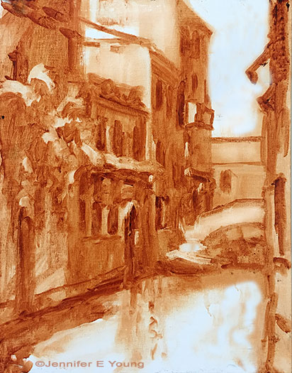
A rough lay-in in burnt sienna gives a first pass at my light and shadow family. When I start to add color, I will keep those two families in mind. First up is the shadow family:

venicepainting_wip_jenniferyoung

You can see that even some of the "white" colors (around the door frames, etc, are still in shadow and will therefore generally be a darker value than anything in the light family. The eye can really trick you once you bring color into the picture, so it is something to be aware of at all times! More to come! Stay tuned.... 

La Barchetta Rossa

I had such fun with this little painting that I am thinking of doing it again as a larger piece. My goal in the execution was to keep it loose and not get bogged down in too many details that can happen so often when approaching architectural scenes; especially when working from photo references. 

"La Barchetta Rossa", Oil on linen, 12x9", ©Jennifer Young

"La Barchetta Rossa", Oil on linen, 12x9", ©Jennifer Young

As with plein air painting, sometimes giving yourself a handicap can be very helpful. Squinting, for instance, allows one to reduce visual information down to shapes, patterns, and values. These days taking off my glasses serves a similar purpose (*SIGH*). Another method that I experimented  with here was to "blur it up"  using one of the artistic filters in Photoshop. This has the effect of removing the detail while still providing the shapes and values. I used my blurry image for most of the painting, and then referenced the detailed photo at the end to see what I may have missed and add the finishing touches. What was interesting is that I liked the freshness of my initial round so much that I found very little I wanted to add or adjust once I referenced the detailed photo. I have often used Photoshop to adjust shadows and highlights in my photo references, or to crop for ideas on composition, but this was the first time I have used it to remove detail. I really liked this method and will likely do it again, especially for complicated scenes like architecture where it can really be helpful to turn down the visual "noise".