Venetian market painting- a progression

It's taken me a while to get to blogging about this painting because after a disastrous automatic update to Windows 10 my computer died. It has actually been grinding to a halt for a while but it finally kicked the bucket for good last week and I have spent the past however many days trying to relocate my data and reinstall my applications. I am still operating on the bare minimum but at least I can blog again! I won't go on about it but just imagine to appropriate amount of ranting and hair-pulling and insert it here. Aaany-hoo, back to art!

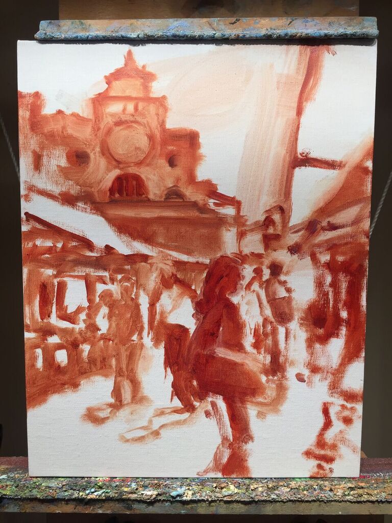
I thought I'd post a little step-by-step demo of this piece because I actually had the forethought to take some progressive shots along the way. This one had a lot of figures and architecture in it, both of which might seem a bit overwhelming at first. But my reference photo also had a really nice value pattern, so by focusing on that first it made my job a lot easier. Here is the composition under way, put to canvas in monochrome with a brush and Gamsol:

mercatovenezianosketch_jenniferyoung

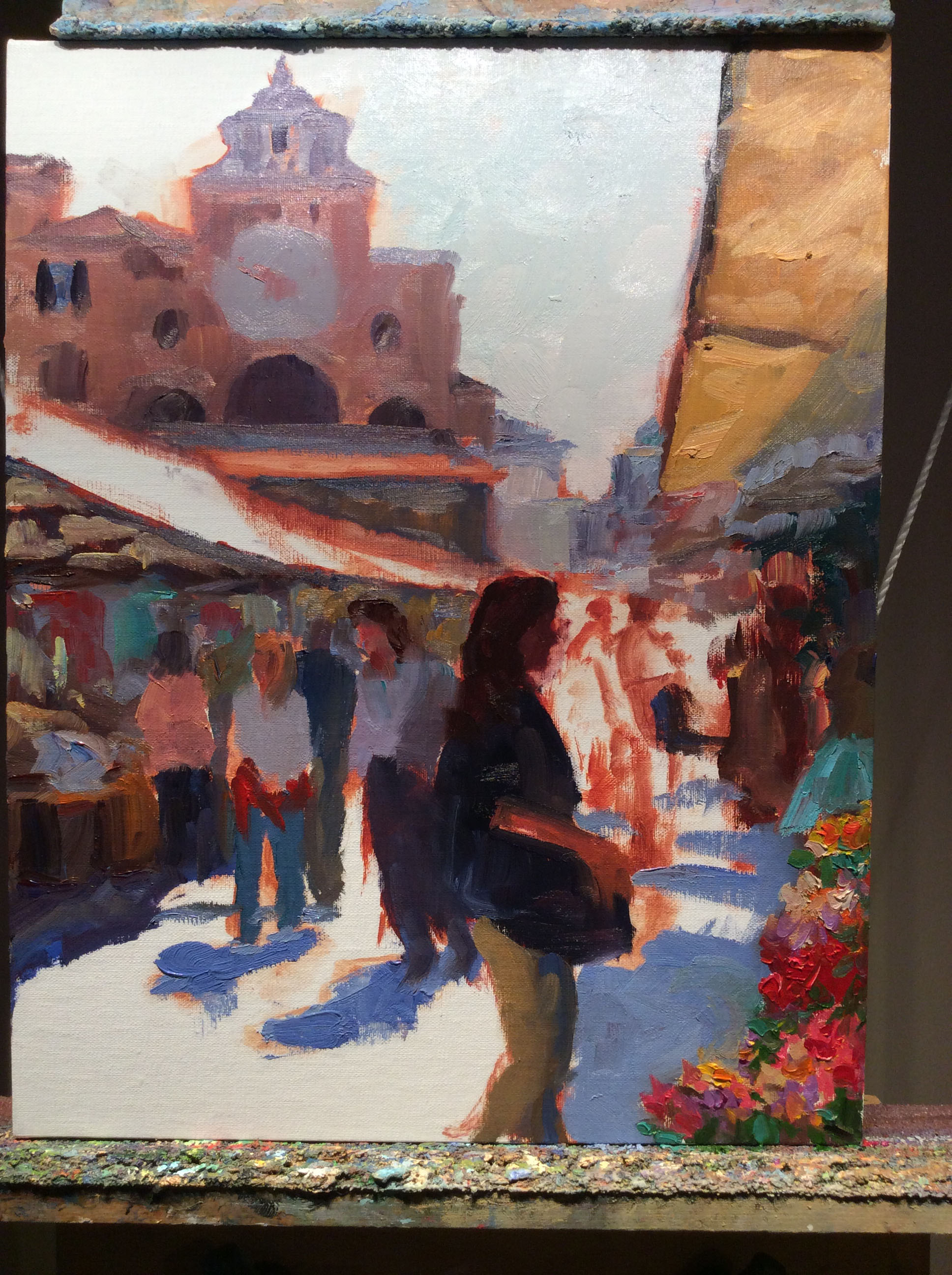
Next, I want to think in terms of light and shadow by separating out which parts of the painting are in the light (the light family) from which parts are in shadow ( the shadow family). I will start with the shadow family first. I learned this terminology from Kevin Macpherson, one of my teachers and a phenomenal painter. Phrasing it this way helps me to organize my thoughts and approach, beyond just saying "lights and darks". It's so helpful to see it this way because in actuality some things in shadow are quite light, though they are never lighter than what's in the light family.

mercato_veneziano_wip_jenniferyoung

I spend a lot of time working in the shadow family because so much of the strength of the painting is here. Only then do I start working in the light.

More stages next time. I hope you'll tune in as I work on lighting this bad boy up!

Venetian Byway

As I've noted previously, I've been enjoying digging into subjects for my paintings by working small to large. Several of the recent studio paintings I've done have had their inception in smaller plein air pieces I have painted on site. Through this exercise I have come to appreciate the method of problem solving in the smaller piece. My latest "small" is this Venice piece I completed yesterday. At this point I'm not sure if I will rework this into a larger size. I will sit with it for a while and see what I can see from it with fresh eyes, as I work on other projects. 

"Venetian Byway", Oil on linen, 14x11" ©Jennifer E Young

"Venetian Byway", Oil on linen, 14x11" ©Jennifer E Young

A Venetian Companion

This week I am working out a companion piece to the little Venetian painting I posted the week prior. I often find that small paintings do well in pairs. Certainly a small piece can stand on its own, but it is often nice for the little guy to have someone to talk to. A pair can flank either side of a large mirror or mantle, or stack together on a tall narrow wall:

outerbankspaintings_jenniferyoung

I love grouping paintings, and while it doesn't work for every piece, I have started to try and think in terms of finding a  buddy for my little friends when it's possible. This is the start for our little Venetian companion:

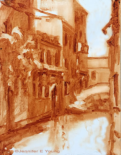
venetiansepiasketch_jenniferyoung

A rough lay-in in burnt sienna gives a first pass at my light and shadow family. When I start to add color, I will keep those two families in mind. First up is the shadow family:

venicepainting_wip_jenniferyoung

You can see that even some of the "white" colors (around the door frames, etc, are still in shadow and will therefore generally be a darker value than anything in the light family. The eye can really trick you once you bring color into the picture, so it is something to be aware of at all times! More to come! Stay tuned.... 

La Barchetta Rossa

I had such fun with this little painting that I am thinking of doing it again as a larger piece. My goal in the execution was to keep it loose and not get bogged down in too many details that can happen so often when approaching architectural scenes; especially when working from photo references. 

"La Barchetta Rossa", Oil on linen, 12x9", ©Jennifer Young

"La Barchetta Rossa", Oil on linen, 12x9", ©Jennifer Young

As with plein air painting, sometimes giving yourself a handicap can be very helpful. Squinting, for instance, allows one to reduce visual information down to shapes, patterns, and values. These days taking off my glasses serves a similar purpose (*SIGH*). Another method that I experimented  with here was to "blur it up"  using one of the artistic filters in Photoshop. This has the effect of removing the detail while still providing the shapes and values. I used my blurry image for most of the painting, and then referenced the detailed photo at the end to see what I may have missed and add the finishing touches. What was interesting is that I liked the freshness of my initial round so much that I found very little I wanted to add or adjust once I referenced the detailed photo. I have often used Photoshop to adjust shadows and highlights in my photo references, or to crop for ideas on composition, but this was the first time I have used it to remove detail. I really liked this method and will likely do it again, especially for complicated scenes like architecture where it can really be helpful to turn down the visual "noise".

Morning Wash, Venice

We have been prepping for a kitchen remodel these last few weeks, so this little studio piece of Venice has been patiently waiting on the "back burner" (pun intended.) Today I got so tired of seeing its mournful state of incompleteness on my easel that I attacked it with the brush. Here is the result:

"Morning Wash", Venice Oil on Linen, 16x12" (SOLD) ©Jennifer E Young

"Morning Wash", Venice Oil on Linen, 16x12" (SOLD) ©Jennifer E Young

  I remember the day I and my traveling companion were taking photos of this little neighborhood. It was our first morning in Venice and we had spent it pretty much as nearly every American tourist does, snapping away with our cameras and ooh-ing and ahh-ing over every nook and cranny of the place. Then we turned the corner and, almost against my will, I blurted out, "Oooh, laundry!" My friend laughed, and of course, I realized immediately how silly that sounded. But to an artist, it has the potential to add both visual interest and an element of the human presence, even on an otherwise empty street. It's a mystery to me how the Italians can make even clothes hanging on a line an intrigue. But I guess it doesn't hurt that those clotheslines are surrounded by beautiful ochre stone, magnificent architecture and, I suspect, a little bit of magic too.

P.S. If you're wondering what happened to the still life I had started  in my last post, I gave it the 86. I will try again at some point, but I think I was a little overly ambitious with the size given my limited time. The flowers croaked before I could get them down, so I had to just chalk it up to one of the ones that got away.