Plein air in the garden
/As I mentioned in my last post, I participated last week in a “call for artists” from Lewis Ginter Botanical Gardens to celebrate National Public Gardens week. You may know from reading previous blogs that I have painted in these gardens many times as a resident of Central Virginia. But somehow, painting in this context, constructed around an “official event,” helped me to see this place with new eyes and renewed excitement.
I decided to challenge myself by painting some gardens that I hadn’t tackled before. The first day I went it was AWASH with tours and school groups. There were so many kids there stopping to give their input. All of it was actually very positive, but also a bit distracting. Now, I love kids quite a lot, (and even have one those cuties myself) but on this day they were messing with my mojo and I had a hard time concentrating on what I was doing😅.
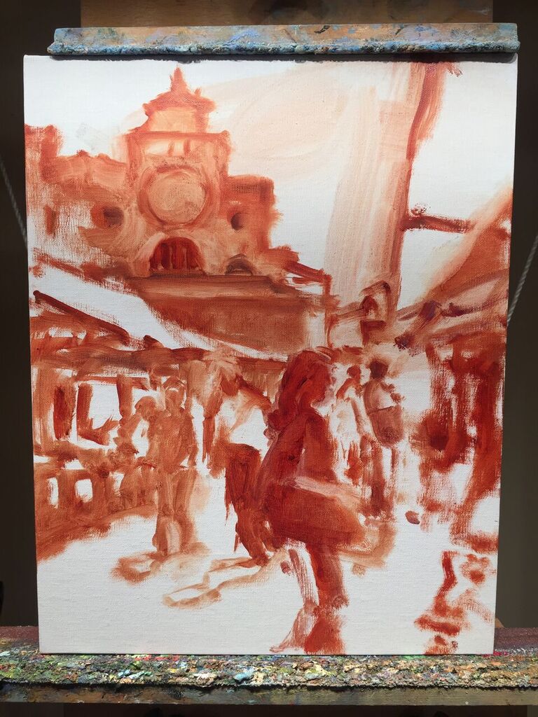
The architectural elements were minimal, but even so, required some concentrated drawing, some sense of proportion and placement to get right, especially since I was fairly close up to my subject and didn’t have a lot of room to manuver. I moved my entire setup several times and wiped it all down, before finally settling on a view that satisfied. It left me less time than I had planned to get everything down before I had to head back to my house in Ashland, but I did a pretty decent job, with only the need for a few final touches in the studio.

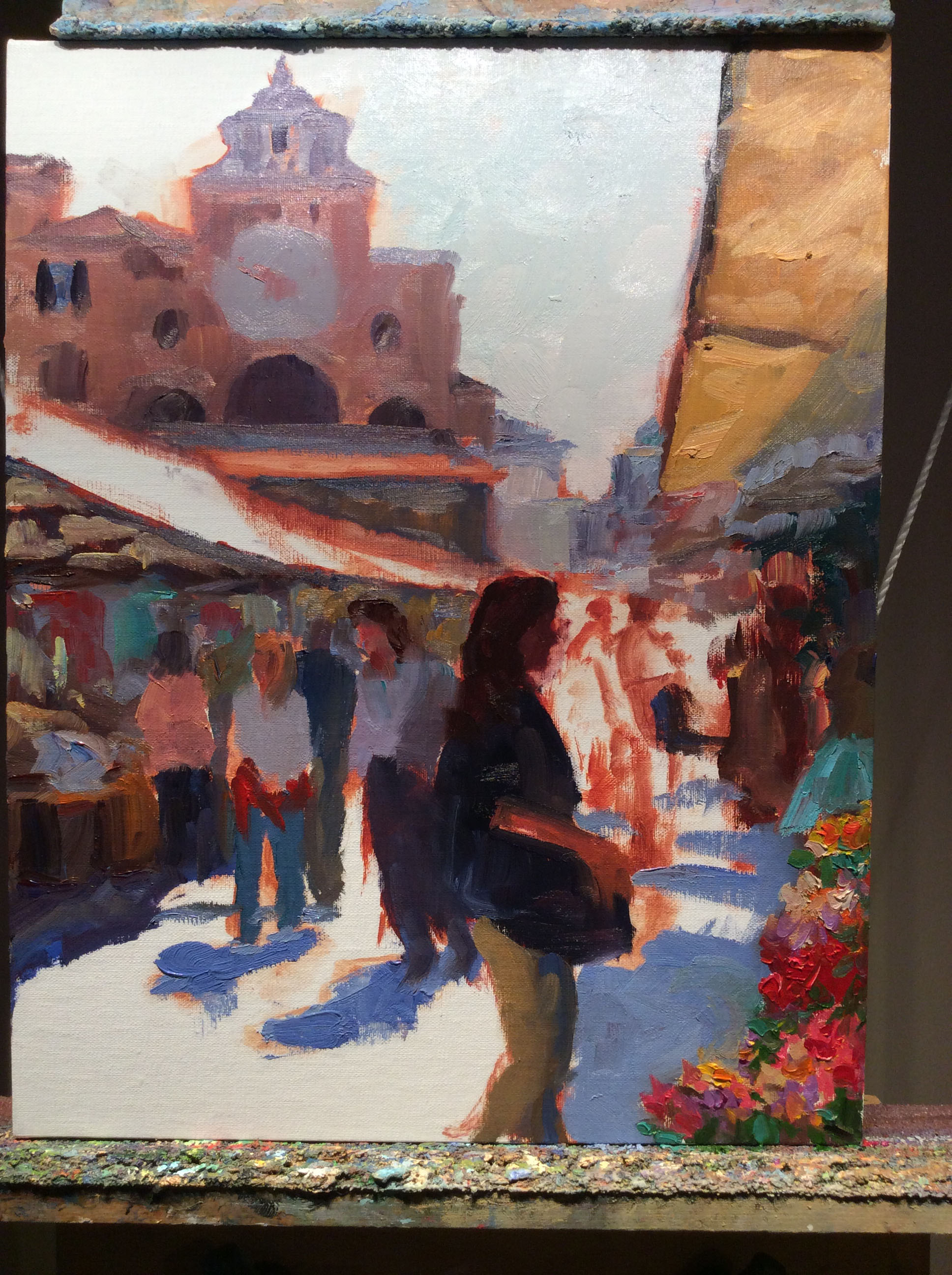
“Illuminated Courtyard, Lewis Ginter Botanical Gardens”, Oil on linen, 12x16” ©Jennifer E Young
When I was (finally) in a pretty good place with my painting, a kid came by to examine my progress. I estimate he was around my daughter’s age (3rd or 4th grade) . He studied my effort with seriousness, alternately looking at my painting and the scene, my painting and the scene. Finally he gave me a decisive and approving nod. “You’ve done your homework,” he said.
And that, my friends, is the beauty of painting outdoors. It’s filled with its share of frustrations to be sure, but the moments of spontaneity are pure gold.