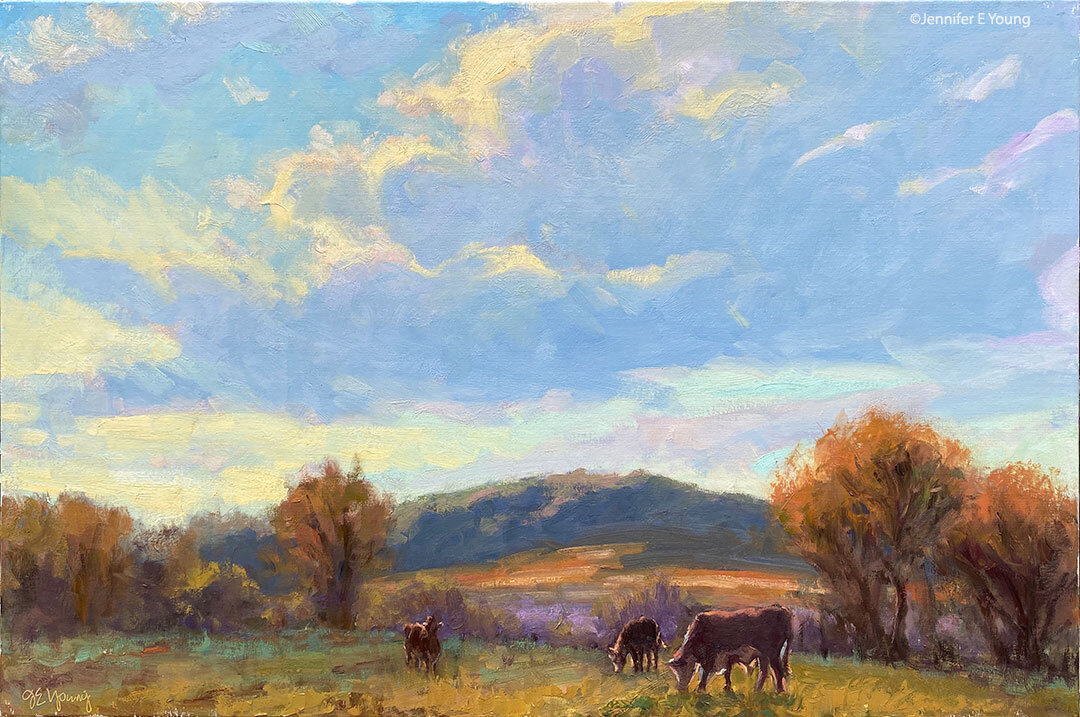
Tuscany vineyard W.I.P.

I spent some time late last week and Monday working on the painting I had sketched out in my last post. I will say before I begin, that these photos are not color corrected due to limited time, but hopefully you can still get an idea of how the painting is developing. Sketch in transparent oxide red, with some shading...

Tuscany painting work in progress by Jennifer Young

I usually lay in the sky first, but since there is so little of it in this painting, I have decided to start laying in the ground. More or less, I am working front to back.

Tuscany landscape painting by Jennifer Young

Tuscany vineyard landscape painting

tuscany painting in progress by Jennifer Young

At this point I had to step back and think about the plane trees I had sketched in on the upper right. As much as I love the plane trees, I was afraid they would be too busy in this painting, when there is already a lot going on. You might even be able to tell that I struggled with those trees from the outset, by all the transparent red oxide rubbed into that side of the canvas. I kept wiping them out and putting them back in, until finally I surrendered and took them out for good. Sometimes you just have to accept that you can't say everything you want to say in a single painting.

I still wanted something in the upper right for balance, so instead I massed in a "less interesting" tree. I also changed the skyline slightly so as not to feel so hemmed in. The sky is pretty washed out here but my sky, while very light and simple, has more color (pale golds and blues).

Tuscany vineyard landscape painting

Up to the point pictured is about 5 or 6 hours' work. I started this late Friday afternoon and came back after dinner (and after the baby went to bed) to work on it some more. I just wanted to get it to a point where the whole canvas was brought up to the same level of "finish" (more or less) so that it would be easier for me to pick up again when I returned to the easel.

Once upon a time I was a total night owl and I'd habitually paint late into the night (this was before I started painting landscapes). I haven't done this in a really long time, and I'm not sure it's such a good thing for me. I only meant to work for a couple of hours but it was close to midnight by the time I cleaned up and I was so wound up I couldn't sleep for a while. Maybe I'll get used to it in time, but as it was, every time I'd go to clean up I'd tell myself, "just five more minutes!" Afterwards, I felt like I had had an entire pot of coffee! I kept telling myself it was time to stop, but now that I feel so often on a time crunch, any studio time is a real treat.

Alla prima portrait study

In my previous post I mentioned an out of town trip last weekend. I was over in Colonial Beach VA pursuing one of my main 2009 goals (exploring the figure) by taking another class with painter/portrait artist Robert Liberace. This class was a 2 day workshop on alla prima portrait painting. Since this is the way I am accustomed to painting with my landscapes (particularly smaller works and those done en plein air) I was really drawn to the class. Rob is as enthusiastic and energetic as I remember him to be from my first class with him in figure drawing last semester at the Art League School. I am continually enthralled by his masterful demos, and I found it interesting that the process he set forth for this style of portraiture was very similar to the method I use to paint my landscapes.

The palette we used, however, was quite a bit different and more expansive than what I typically use for my landscapes; burnt umber, cad yellow light, followed by several reds, several blues, two violets and a couple of greens. He also used two different kinds of white, Titanium (a very strong, bright white) and Lead White (the most opaque of the whites.)

Rob began with an imprimatura (toning) in burnt umber on Ampersand panel, and a very quick and sketchy (though amazingly accurate) grisaile. From there he then built his way to layers of color from shadow to midtone, halftone and finally highlights. Of course he made it look so easy, but I soon found out otherwise!

The model I painted on this first day was a very stunning young lady who looked to be about 15 or 16. Turns out she was actually only 12. I think for her age and energy level she did exceedly well sitting for us, and it was a real visual treat to paint her. By the luck of the draw, I found myself setting up in a spot that put the model in complete profile. I'm not normally overly excited with profile views. In fact I find them boring. But the model had a great hairdo and a nice twist to her torso that actually enlivened my view and made it fun to paint:

portrait study by Jennifer Young

She was wearing a great red satin dress in the Asian style, which went well with her beautiful golden skintone and almond shaped eyes. Unfortunately in the remaining time we had left to work (after Rob's excellent demo) I got none of the dress, save for a brief outline. I did take a photo of her though, in case I decide to work more on the painting. But most times I leave my workshop studies as is, to serve as a reminder of what I learned and in what areas I still need to grow.

In any case, I  learned a lot from this first sitting. First of all, just as in plein air painting, it's important to get your drawing down accurately and commit to your big idea as soon as possible. While the lighting in a portrait studio doesn't change the way the natural light does en plein air, what does change incrementally is the model. It's really hard for a model to get the exact same pose and facial expression after a break. And it's also really hard to hold a pose for any length of time (especially if you happen to be 12 years old!) So while it's tempting to jump right in to color, Rob wanted us to spend a good deal of time first developing a strong grisaille and really fleshing out the portrait in it's proper porportion, placement, light, shadow, and halftone-- BEFORE putting down the first dab of color.

Another very important thing I learned once I moved beyond the grisaille had to do with painting children. As in landscape painting, it is oh so very easy to overdo it by getting lost in details. It's an interesting dance; because while you want to accurately record what you see, too much unnecessary detail can detract from the character of the subject and weaken the overall painting. At about an hour into my painting I was well into color, painting in every shadow I could possibly see on the model's face. I knew the likeness in her profile was pretty accurate, but still  I wasn't getting her character--her "glow".

Then Rob came by and said, "You're aging her." Taking my brush, with literally two sweeping strokes he pulled some of the middle skintone I had put down on her upper cheek and quickly swept it downward, blending away almost all of the shadow work I'd done around her mouth and nose, leaving only part of the cheekbone shadow and the shadow work I'd done under her jaw. I just stood there and chuckled. It was like one of those "miracle line eraser" wrinkle ads you see on the Internet.

"You just took 10 years off of her, " I said. Ah, if only it were that easy in real life!

p.s. The above 20x16" study was after about 2 to 2 1/2 hrs. of work. The sketch in the upper right corner of the canvas was a hands-on instructive from Rob early on, because the initial lines of my grisaille around the eyes were too juicy and lacked definition.

Landscape painting demo of southern France- conclusion!

Well there's nothing like computer woes and an out of town trip to keep up the momentum for a painting demonstration! But at long last, here is the resolution to the demoI started in late April:

When I last left off, I had my concept and composition well planned out, so now I set to work on finishing. This involves painting in the foreground and punching up the highlights of the middle distance and background, where needed.

french landscape painting demonstration by Jennifer Young

But something happens at this point. I kind of get too lost in the irises, making them too defined and pronounced. Soon I find my tunnel vision has gotten me so lost in the irises that they start to take over.

painting of the french countryside

Argh! Attack of the irises! They've taken over and are rather too big and too saturated, creating more of a competition with the old abbey. I've also lost the lower wall in the middle distance almost entirely, which I rather liked, as it helped to lead the eye further into the painting.

France landscape oil painting by Jennifer Young

My solution? Basically I scraped down the entire lower portion of the painting! Eh, it happens. The paint had become too thick to really rework, and sometimes it's easier and less distracting to just scrape it off in order to open it back up. In this case I felt a "do-over" was warrented.

Landscape painting of southern France by Jennifer Young

"Irises at Abbaye Nouvelle" Oil on Canvas, 40"x30" Click here for more info!

Ahh...better. (At least I think so!) I've gotten my herb-covered wall back, and reworked the irises in the foreground so as to frame but not overpower. I've treated them a bit more impressionisitcally too,  to flow better with the rest of the painting. I also decided to tone down some of the greens and golds in the middle distance to make them "sit back" in the picture plane.

At this point I'll conclude. If I touch it any more it will be only a tweak here and there. I've shot and reshot the final several times but we are getting such dark days lately with all this rain that I can't seem to get the nuances in the colors quite right in the photo. This picture is close, but I'll likely try another shot once the sun comes out.

Frayssinet Village painting- WIP resolved

I have been doing a TON of painting lately!! Unfortunately the painting I'm speaking of involves latex paint and a roller rather than the oil on canvas variety. The good news though is that I'm getting steps closer to finishing the new studio. (I'll post new pics of the paint colors I've chosen soon, once I've finished painting and had a chance to clean up the debris.) The other bit of good news (to me) is that I carved out a bit of time to steal away to my temporary studio space/closet to finish the French village painting I was working on a short while ago. This is yet another painting I will likely try and re-shoot when conditions are better (Note: Mission accomplished!). The color is definitely truer, but the details are lost. (I know I'm sounding like a broken record about my photography woes, but it's a significant frustration that I completely underestimated when I was planning my "interim" period between moves from old studio to new.  I like to get good photos, both high and low res.,  of whatever I paint. It's one reason why I'm not doing the weekly updates to my website that I'm normally accustomed to (in addition to the fact that I'm just not painting as much due to the current construction project.) But since we're dealing with a lot of ice/sleet/rain here in Virginia with  no chance of photographing this outside, I'll quit my whining and post what I have:

vibrant landscape painting French village by Jennifer Young

"Light and Shadow, Frayssinet, France" Oil on Canvas, 24x30" Sold!

As you can see if you compare this to my last version, the main edits were in the focal area concerning the figure. I also decided to shed a considerable number of years from my little lady (if only I could do that in real life.) Grandma looked so tired walking up that hill, so I let her granddaughter take the trek. LOL.

I now consider this painting pretty much resolved to my satisfaction. Thanks to those of you who chimed in on my soliciations for the last round of edits. Whether it's obvious or not, I feel that I took all of your thoughts into consideration, while still holding on to my original intent for the piece. 

By the way, this is the village where I stayed last year during my "artist's retreat" in France, and where I've planned to hold my own retreat/workshop for June. The gateway to the right leads to the courtyard of Le Vieux Couvent, and you can see part of a building on the left (behind the irises.) Sadly, I am now at a point where I'm considering cancelling this trip...or at least postponing until the economy improves. We'll see. More on that when I know more.

Reclining nude sketch

Last night I joined a local figure drawing group. This group met for two hours-- slightly shorter than the usual 2 1/2 to 3 hour sessions I've been to before. The time flew, but I was still there long enough to be reminded again of how out of practice I am! This was my best attempt --a 25 minute pose (one of the longest of the evening).

figurative life drawing reclining nude

I really liked the model...she was very dramatic, which made drawing her lots of fun. She was also quite the trooper, lying on what looked to be a very uncomfortable low bench, with her head supported by a wedge-pillow thingy. I felt happy that I at least started to get some of the weight of her pose. But not much else in the way of detail. I think I'll be sticking to charcoal on newsprint paper until I can get myself to a point of more speed and accuracy, which is only going to come with practice and understanding.

 To that end, I'm studying proportion and human anatomy as best I can on my own for now, through books. I picked up a book by Andrew Loomis at the library called "Figure Drawing for All It's Worth". The book was originally published in 1943, and is one of a series of books by the author on similar topics. Loomis was a well known illustrator back in the day and is still referenced by a lot of figurative artists today as a good source for basic and accessible information on human proportion and figure drawing in general. Sadly, his books are now out of print, but you can still find some of them online (another resource is here  ) and possibly at your local library.

Loomis makes some interesting opening comments in the book about "Beginner's Work". There are several telltale signs he lists, but I took note of this one, as I definitely see this occurring in my own figure drawing:

"An overabundance of small fuzzy line:  Do not "pet" in your line, draw it clearly with a long sweep. Do not shade with a multitude of little "pecky" strokes. "

Ya. So in addition to all of the other stuff on anatomy and proportion, one of the things I want to work on is quality of the contour and line. I think the sketchiness comes in part from a lack of confidence/familiarity with the subject. It's much easier to make sketchy marks as you try to find the right placement and proportion. It's something else altogether to put meaningful, lyrical marks in just the right place!

Crop happens

....Or at least sometimes it should. I went down by the river at Great Shiplock Park this morning to paint this little view looking out towards Rocketts Landing:

Plein air painting James River Richmond VA

I had a frustrating morning.  

I didn't finish because I began to have problems with the composition. The canvas panel is a 9x12", and while there are things I like about it, I'm not too excited about the near equal width of the sky and water framing the skyline, where the real interest is. 

I think this was an editing problem. I liked too many things about the scene and I was trying to fit them all in. I liked the hazy sky. I liked the purplish skyline. And I liked the reflections in the water too. I guess it just goes to show how very important it is to put a good deal of thought into the orchestration of a piece before rushing in.

Well, we learn from our mistakes, right? So with a little trickery in Photoshop, I am able to see what a better compositional choice may have looked like:

James River painting Rocketts Landing by Jennifer Young 

Well, I can't exactly glue a new top to this panel. But look what happens when I cut this down to approximately 6x12":

Jennifer Young plein air paintings James River Richmond VA 

Better? My kingdom for a table saw.

Scenes from the painting workshop

I'm baaaack! Fell in a black hole of the blogosphere for a while and am slooowly recovering from a very busy and intense workshop at my studio this past weekend. Church Hill Photography took some great environmental shots of one of the demo portions  of the class on the first day, so I thought I'd share them here. (BTW, Elaine Odell of Church Hill Photography also made the excellent portrait of me in my studio, so be sure to check out her website if your looking for a photographer who really knows her stuff!) While I've taught off-site at other hosted locations, this was the first time I've actually hosted a workshop myself, and preparing for it was quite a bit more work than I'd imagined because I had to prep both my lessons and the space itself.  The participants did some great work though, and were enthusiastic and so much fun. And it was really exciting for me to share ideas about color, shape, values, and composition. Hopefully everyone felt like they learned a lot. I know I did!

After a brief discussion of color mixing (and especially mixing greens) I did a little landscape demo. This is a good long shot that shows me sketching out my composition at my setup, as well as the studio beyond. The participants worked in the front two rooms, so we had to configure the space in a way that would protect those beautiful wood floors. Hence the lovely blue spill-resistant floor coverings!

Jennifer Young painting demo landscape

Here's a cool shot  through the easel. There's a large mirror to my back, which I use to check my compositions in reverse. It really does help to give me a "fresh look" at my work. That cutie just over my shoulder in the gray tee is my talented niece Molly, a fine emerging artist who I was delighted to have come all the way from Texas to take the class and visit. The "man in black" looming in the doorway is my husband and partner Dave. As always, he was a HUGE help to me, keeping everything running smoothly.

landscape painting workshops with Jennifer Young

This shot shows the demo piece, coming right along.

Landscape painting workshop Jennifer Young

The workshop was pretty action packed, but by being in the studio we were able to really focus some of the more important elements of painting as they pertain to the landscape, in conditions that were controllable. I hope to do some plein air classes too in addition to the studio intensive, as this "takes it to the next level" and throws a whole other slew of concerns into the pot (watch this page for future workshop listings). Luckily I hadn't planned a plein air class for this past weekend though, as we had some really varied weather ranging from cloudburst thunderstorms to overcast damp chill.

On Monday Molly and I took a road trip up to Charlottesville so that she could see Jefferson's Monticello. Wow! What an absolutely gorgeous day--the redbuds, fruit trees, dogwoods and tulips were going crazy. I hope I can get up back up there some time soon to paint some of it-- and paint some local plein air scenes as well. Right after I take care of a few neglected household and business matters, that is. Whatever I paint, I'll be sure to post here first, so stay tuned....

Thanks to EmptyEasel.com for featuring my landscape paintings!

A few weeks ago, Dan at Empty Easel was kind enough to feature my plein air painting demo on his art site. I'm thankful to him again, because today he's given me a very nice a write up about the latest landscape paintings I've created for my current show  about the luminous landscape. If you have an interest in the arts, do check out his site. He regularly features the works of artists he's reviewed from around the internet, plus he has wonderful tips for art and painting as well as Internet art marketing. If you're an artist, consider submitting your work or an article yourself for a possible feature.

...And if you're in the Richmond area, my show "Luminosity" is still on view until December 1st, so come by my studio/gallery this Friday during the art walk if you can,  or just contact me to visit the gallery at another time.

Fog landscape painting- Work in Progress (cont'd)

I decided to let the fog painting rest for a day or two to do a little plein air painting, and think about what I wanted to do next with the studio piece. When I came back to it, the surface had "set up" a bit, which made it easier for me to make adjustments to the color temperature. I decided I didn't want to wait to make changes to the overall warmth of the painting, so I jumped right in: fog landscape painting demo  landscape painting of mountains  

 painting demo landscape fog  fog landscape painting by jennifer young

As I'm going along I am restating shapes, doing a kind of push and pull with the foreground and background. I've reintroduced the telephone poles, which right now I rather like. More work to do but it is starting to take shape.

My plein air demo featured on EmptyEasel.com!

Just a quick note of announcement to say that my plein air painting demonstration is being featured today over at Empty Easel.com.  Thanks so much to Dan for the feature! I've referred to  this site before, and I'll say it again...If you haven't yet visited this content-rich website, I highly recommend a visit. Empty Easel has a lot of great articles, tips and features especially useful to the artist.  His section on selling art online  is unlike anything I've seen elsewhere. Dan takes a serious and in-depth look at different online venues, with side-by-side comparisons of features, costs, ease of use, etc. Lots of data to mull over here and elsewhere on the site. Check it out!

Painting is a response (so move the $%#! tree).

I was talking to a non-painter about painting recently and she said, "The kind of art I like is imaginative. I don't care much for a copy of a photograph or a copy of a scene even in life. It's far more interesting to me to see a painting that came from the artist's head." Well, I couldn't agree more. But I hate to break it to her; all art comes from the "artist's head." The artist is painting in response to something, whether it be a concept or idea, a story, or an observation. Even in landscape painting (or any kind of painting even remotely related to realism) I think that true artistry occurs when the artist is not copying, but painting her response to a subject, and is fully able to communicate that response in a way that is original and distills the subject to its essence.

The reasons behind my choice of subjects vary. Sometimes it is the sheer beauty of a place that triggers an emotional response. Sometimes the scene evokes a memory. Sometimes it is the light. Sometimes I respond to something as simple as lines and planes. But it is all about my response or my interpretation.

Copying a scene so that it looks like a photo, or even looks like the view in front of me in the open air, is not nearly as important to me as expressing my response to the subject. As I heard artist Kenn Backhaus say once, "I'm not interested in making historical paintings." Backhaus paints en plein air, but he also uses many different combinations of his own photos at times to inform his studio paintings. He uses these resources in order to express his unique vision, frequently with masterful results.

I work in a similar manner (but still working on the mastery part.) ;-) Sometimes one scene says it all. Other times I may combine several different elements from varying photos and studies to relay the idea or feeling about a place or experience. Even in realism, the subject matter is the jumping off point. It is subordinate to the idea --just one vehicle for the greater goal of artistic expression.

Painting on location is important for the simple reason that there is more to respond to in life than in a photo. But even painting en plein air, artists can fall into the trap of subordinating their art for the sake of historical accuracy. I was out painting with a fellow artist once and we set up in different locations to paint the same scene. I took a break from my work and inquired about my friend's progress. "It's going okay," he said. "But I wish that tree was in a different place." "Then for heaven's sake," I said. "You're an artist! Move the $%#!  tree."

Painting successfully from photos offers its own set of challenges, because you are responding to a frozen moment in time. That is not how the eyes see and not how we respond in life. In addition to painting en plein air, I do work from photos. But they are my own photos, usually taken from travels where I have made a point to also do some painting or sketching (accompanied usually by long spans of sitting and sighing and blissfully observing) on location. So even working from my photos, it is always about my experience, except that I am also having to rely more on memory than from life in the moment.

As an artist I've worked using many different approaches. Sometimes it all does come "from my head", and at other times I use nature as my inspiration. There are times when I am so seduced by a scene that I find it perfect, and I try to capture it just as I see it. But even then, I try to keep in mind my ultimate goal to make a strong painting that communicates my unique response. I may not always find success, but it's something to move towards. And if a tree gets in my way, I have no qualms about moving the $%#! tree.

Plein air painting; St. Michaels Boat House

I'm back in the studio now and assessing the work I did last week on location in Easton Maryland. In some cases I will clean up these pieces up or make some other adjustments, but first I will just prop them up in my studio and study them for a while. This is a little 8x10" study I did at the Maritime Museum in St. Michaels. This was done in the morning, on the same day as the afternoon painting of the "Delaware" tugboat I mentioned in an earlier post.

Coastal painting of boats Maryland Eastern Shore


Judging art

I've been having a great visit with Mom and siblings these past two weeks, so I have been away from the studio and consumed with matters other than painting. I don't know how other artists manage, but I am a bit of a one-trick pony. I have to either visit or paint. I am too distracted with one to attend to the other, even if alternating days. In any event, last week I did manage to do one art-related activity. I was invited to jury an all media show at one of the local art centers in town. I was delighted to see such a large array of talent in the entries. The down side is that it made it that much more difficult to narrow things down.

As I explained to the entrants the night of the opening, there were several factors that played a part in my process as juror. First, I don't care how impartial one tries to be, a certain amount of personal preference influences what a given juror will select. Believe me, I tried to be as objective as possible but art for me is often an emotional experience and I am sure my own tastes played some part.

Second, I looked for a certian amount of mastery in technique. This can be a bit more objective, as you are looking for mastery in the use of materials, composition, color mixing, drawing, etc.  There were several pieces that found their way into the show that were not my favorites personally, but I could not deny the technical ability achieved by the artist.

Third, I looked for the overall statement of the piece. What was the intent or statment and was the artist successful in relaying that message, intent, feeling or statement to the viewer?  Did the handling of the materials support or distract from the intent? This is tricky because while intent is important, you also want to avoid a "message" that is so heavy-handed that it hits you over the head with a two-by-four.

And finally I looked for how all of the pieces would work together as a show. While I wasn't involved in hanging the show, I acted as if I were. I imagined how the work might flow and dialogue together so that the guests would have an interesting overall experience.

Juried shows can be quite a hodge-podge of styles, subjects, and mediums, but overall I think the show turned out very well for one of this nature. It was interesting to see my own reaction to the way the work was hung. It was very well done, though in certain instances I imagined different works hanging together. But that is the fun of art! Everybody has their own interpretation and creates their own dialogue which only adds to the experience.

Coincidentally, today I came across a great article entitled "How to Judge Art: Five Qualities You Can Critique," which reinforces my ideas and adds some very good additional food for thought. It comes from a blog I just recently discovered and know I will revisit many times called EmptyEasel. The author, Dan provides some wonderful info and resources for artists.

Speaking of empty easels, I'm looking forward to remedying my own case of that syndrome when I return to the studio next week!

Plein air painting demonstration: Conclusion

Note: This is a four part plein air painting demonstration of my painting "Vineyard Patterns".  If you'd like to see this demonstration from the beginning, click here. 8. I really have to look hard to see the subtle variations in the green shades, but once I start painting in the ground and the vineyard, my picture begins to take shape.

Landscape painting of mountains by Jennifer Young

Plein air painting by Jennifer Young

9. The clouds called off their threats so I was able to relax a little and put the finishing touches on my painting right there on the spot.

Vineyard landscape painting by Jennifer Young

"Vineyard Patterns" Oil on Canvas, 12x16"

My process for painting in the studio is very similar to my process on location. The exceptions are that I don't have size limitations, nor do I have to deal with the changing light, bugs, and sunburn! On the other hand, painting on location is an exhilarating challenge and helps me to develop my observation and decision making skills. It also gives a far better understanding of the play of light on the landscape.

Depending on the lighting conditions, color temperature changes dramatically. In a session of  changing light like the one I had, I needed to make a decision early on about which lighting condition I wanted to go with, and then commit that to memory in case the sun went away completely!

Painting on location, (or "en plein air", as the Impressionists used to say) is a wonderful complement to my studio work. I often use my plein air sketches and studies along with the many, many photos I take on site, to develop larger paintings in the studio.

Note: This is a four part plein air painting demonstration of my painting "Vineyard Patterns".  If you'd like to see this demonstration from the beginning, click here.

Plein air painting demonstration: Part III

Note: This is a four part plein air painting demonstration of my painting "Vineyard Patterns".  If you'd like to start at the beginning, click here. You can see the rest of the demo at the following link:  Part IV (conclusion). I look again at my subject and notice a little tree in the field. To be honest, I am not sure that I had noticed it before. I decide to play up this element and use this as my focal point or center of interest:

Plein air painting by Jennifer Young

The light is really changing a lot now. Sun shines intermittently on my scene, but behind me there are some pretty threatening clouds. I decide I had better not dawdle around any more if I want to get this painting finished!

Plein air painting demo Jennifer Young

6. To help my process along, I try and pre-mix large piles of the various colors I see in the rest of the landscape.

Oil painting demonstration by Jennifer Young

7. I add a little more detail to the focal point tree than I do the background trees, which will help to push the little tree forward in the picture plane.

Landscape painting demonstration by Jennifer Young

Stay tuned for the conclusion!

Note: This is a four part plein air painting demonstration of my painting "Vineyard Patterns".  If you'd like to start at the beginning, click here. You can see the rest of the demo at the following link:  Part IV (conclusion).

Plein air painting demonstration- Part II

Note: This is a four part plein air painting demonstration of my painting "Vineyard Patterns".  If you'd like to start at the beginning, click here. You can see the rest of the demo at the following links:  Part III, Part IV (conclusion). 3. Lay in the sky: I like to lay in the sky as early as possible in my process. The sky is the source of light and generally it appears to have the lightest tonal value in most landscape paintings. By laying in the lightest value first I can more easily judge value relationships (the relationship between lights and darks) for the rest of the painting.

Plein air painting demo by Jennifer Young

4.  With my sky in place, I can now judge how dark the mountain range should be. I begin to block in the distant mountains and trees, still with very little detail.

Painting demonstration en plein air

Plein air painting instruction Jennifer Young

5. After I've blocked in the distant trees I step back and begin to reassess my composition. What is my focal point? The eye tends to like to zoom in on something when looking at a composition, and up to this point I've been focusing more on the abstract shapes of the vineyard to move the eye around the painting. This is good, but is there something more? I'll let you know what I decide in the next installment!

Note: This is a four part plein air painting demonstration of my painting "Vineyard Patterns".  If you'd like to start at the beginning, click here. You can see the rest of the demo at the following links:  Part III, Part IV (conclusion).

My Approach to Painting on Location (a demo)

Note: This is a four part plein air painting demonstration of my painting "Vineyard Patterns".You can see the rest of the demo at the following links: Part II, Part III, Part IV (conclusion). 1. Step one: Choose a scene.

I often head out to the Virginia mountains to do some plein air painting, and on a morning last week I visited Veritas Vineyards in Afton Virginia. This is a beautiful winery and there are many possibilities for painting subject matter. However, my umbrella broke and I hadn't yet purchased a new one, which can make painting on location in an open field a bit difficult. If the sun is shining directly on your canvas, all you see is a bunch of glare and your paintings end up turning out way to dark and muddy as a result.

Having said that, I can't stress enough how important it is to take the time to choose a scene that excites and interests you. You have a better chance of producing a much better painting as a result. Luckily I came upon a nice shady spot in a private area off of the main road past the winery's tasting room and became excited about this scene:

jennifer young landscape painting demo

Okay, so it loses something in my photograph, perhaps! But what I liked about this scene was the abstract shapes and patterns formed by the sweeping lines of the vines and ground. The light was constantly going back and forth behind cloud masses, making painting with consistent lighting very difficult. But that is the fun challenge of painting on location!

2. Lay out the design.

My paintings usually begin very inauspiciously, I'm afraid! All I want to do at this point is plan my layout and get the elements of the scene down in very abstract shapes.

painting demonstration Jennifer E Young

As you can plainly see, I have to work quickly with the changing light, so I don't do a lot of detailed drawing. In fact, I'd say I do far fewer details in the plein air drawing stage than I do in the studio, and if any one were to come upon my painting at this stage they would hardly be impressed! But the marks mean something to me, and I guess that's what matters. In the coming days I will continue to unfold this plein air painting demo, so stay tuned!

Note: This is a four part plein air painting demonstration of my painting "Vineyard Patterns". You can see the rest of the demo at the following links: Part II, Part III, Part IV (conclusion).

Autumn Afternoon at Lake Lure

 Autumn painting of water

This was another plein air painting I did on my mountain trip. I did this painting during John Budicin portion of the workshop. I was in full sun but it was windy so I didn't want to mess with my umbrella. John commented that I'd better shade my painting from time to time or else the values would be too dark. I tried my best, but when I got inside and looked at my painting it was indeed darker than I had expected. I may yet touch this piece up a bit, but I'm not sure. I do like the way the water looks, so I wouldn't want to mess with it too much.

In some ways John's style was very different from Ken's. John used little #3 round brushes, where Ken used #8 filberts. John had a more expansive pallete and Ken's was pretty limited. I found this interesting and it also confirmed to me that there is no one "right way" approach. What the two had in common, though, was an emphasis on design, value, and seeing everything in shapes and planes. I think these ideas were starting to solidify with me especially during the days when we painted outside.

This painting measures 9x12" and is done in oils on canvas mounted hardboard. I haven't uploaded it to my main website yet, so please contact me if you would like more information.

Fall Harvest

autumn landscape painting by Jennifer Young

Well, my workaround for posting to my blog while painting in the mountains was short-lived. In fact two of my previous posts were lost in the internet ethers, so I'm having to "retro-post" after the fact. This is one of the paintings I completed en plein air while at the workshop. I felt like I was finally finding a groove with this one, and thankfully we had a lovely mild day to work with!

The model posed only in brief intervals for us, so we had to work fast to get her "attitude" AND get the color notes and values that surrounded her. It was fun and challenging, but I am really happy with my results. There is something about painting en plein air that really helps to inform the light. I love backlit scenes like this one, even though it can be hard on the eyes if working in this way for a while. Ken's only critique when I was done was to say that the background trees might compete with the figure, leading the eye away from the center of interest. While this may be true, my feeling was that the fall colors helped to "set the tone" of the painting. Plus I am a color fiend and that fall foliage was too seductive to overlook. I did end up toning it down a little though.

This painting was done in oils on canvas-mounted hardboard. It measures 11x14". For more information please click on the image or contact me.

Model in Green

I finally figured out a workaround for posting pictures! Here is the model we painted couple of days ago, still wet and on the easel:

We only had about 45 minutes to work with him in this pose. The assignment was to lay in the larger shapes and values as quickly but as accurately as possible. On top of that we had to get the proportions down and make a statement about what we wanted the point of interest to be. For me it was the direction of the light in this pose. The model was nearly full frontal from where I sat, so it made getting the perspective a bit difficult. Even so, the time limit was great because it made me focus on what I felt was important,much as I would have to do when painting en plein air.