Balbianello Gardens (W.I.P complete)
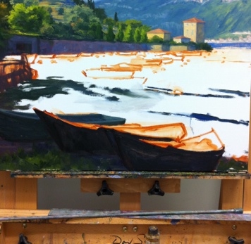
/Well, it just hasn't been my couple of weeks. Between family sickness, election day, and bracing for hurricane Sandy (which thankfully turned out to be the hurricane that wasn't for us in Richmond) my daughter missed some preschool, which meant no painting or blogging for me. Finally I am back to it, though, and happily share the completion of the Lake Como painting I blogged about in my last post:

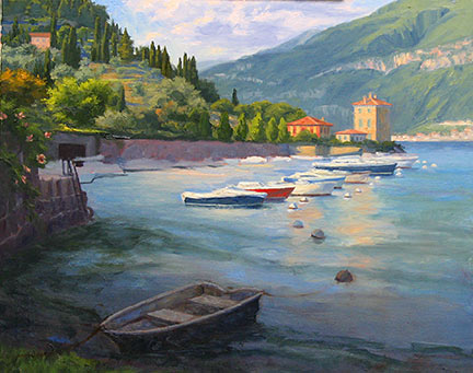
"View From Balbianello Gardens" Oil on linen, 16x20" (SOLD) ©Jennifer Young
This painting places the viewer at the edge of the gardens of the famous Villa Balbianello. A procession of Baroque statuary lines the garden's perimeter and looks out across blue waters to the distant harbor of a neighboring village. When I returned to the easel today, I decided something was needed in the middle distance to anchor the right side of the painting and create some balance. And so a sailboat was born.
I like this addition very much. It creates some interest for the water and pushes the distant village and mountains back through the use of overlapping form. I also felt like the line of statues led the eye to that spot, and the fact that there was nothing there troubled me. It's funny how one little thing like that can bring a painting to a satisfying resolution.