New Lake Como painting in progress

School's out this week due to snow, so my painting time is catch as catch can. Nevertheless, we have been conspiring with other desperate parents to arrange play dates here and there, which allows a little painting and blogging time. So I thought I'd share the Bellagio painting I have my easel this week. This is a promenade on the outskirts of bella Bellagio, leading to the stunning grounds of the Villa Melzi.  This view however, looks back towards the town. Apologies in advance for the poor quality photos and the cast shadow of part of my easel on the painting. I don't have a lot of time to photo edit anything but the final these days, so I hope you will bear with me. I start in the usual fashion, with a loose sketch of my composition in Burnt Sienna:

Lake Como painting demo by Jennifer Young

Next I lay in the shadow family and darkest notes.

Lake Como painting demo by Jennifer Young

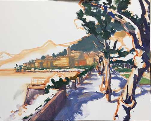
At this point I'm laying in some general blocks of color. Still no highlights yet...

Lake Como painting demo by Jennifer Young

And here's my starting point this morning:

Lake Como painting demo by Jennifer Young

Next I will continue blocking in, including the water and distant village. I'm still working up the nerve to paint outside while there's snow on the ground, but we will see. Not much of a fan of the cold, but that snow sure is pretty.

Still life...trying again

The last time I attempted a floral still life painting, it all went south. But, since I have been wanting to build a more regular practice of painting and drawing from life, and since it is nothing but brown and gray outside right now in Virginia (not to mention that I don't tolerate the cold too well) I decided not to let a little past  failure hold me back. And as they say, it's in the failures where we have great opportunity to learn and grow. It sounds a bit cliché but it's also actually true, especially if you don't let the failures wig you out. I have to admit, at first I did duke it out with the old psyche a bit, but upon reflection I realized that I really did learn a few lessons from my last effort. For one thing I learned that I didn't really set myself up for success to begin with. I basically walked in, put some flowers in a vase, set them on a table and went to it. How hard could it be? Wellll....

The first problem was that there is actually quite a lot that goes into setting up a nice still life. I figured since it had been a very long time I would keep it simple by focusing on just the flowers and a vase, and no other extraneous objects. Only extraneous objects were all around my prior "setup" (if you could call it that.) The utility sink was in the background, as well as pictures hanging on a wall, art supply bins nearby, etc.  It's not impossible to paint that stuff out, but it is pretty distracting.

Secondly, in my previous attempt, the lighting was completely flat and non directional. That's great for studio lighting in general, but it makes it harder to create form and good color without that definitive light and shadow. I felt like it was kind of akin to painting outside on a gray day.

So the first order of business was to remedy these issues, and create an environment where I would be "set up" for success.  Once I found a solution to my setup issues (which I will share in my next post) I felt like I had more control.

Here's how it went down, in various stages:

Initial design in a wash of cobalt blue, burnt sienna, and chromatic black:

Still life floral painting demo by Jennifer E Young

Blocking in; shadows first, then midtones:

Still life floral painting demo by Jennifer E Young

Fleshing it out:

Still life floral painting demo by Jennifer E Young

And the final:

"Tulips and Mandarins" Oil on Linen, 14x11" ©Jennifer E Young

"Tulips and Mandarins" Oil on Linen, 14x11" ©Jennifer E Young

Week-long study with Kevin Macpherson

Jennifer with Kevin Macpherson

Jennifer with Kevin Macpherson

Last week I did something I haven't done in a very long time...devote myself to the art mistress from morning to night for an entire week. And it was a week studying with the talented Kevin Macpherson at that! As you may have read from my previous blog posts,  I am a big fan of his paintings and his books. He is truly one of the best teachers I have encountered so far. Not only is he a highly skilled painter, but he has a way of honing in on and distilling essential information that actually penetrates my rock-hard noggin.

The workshop took place in a beautiful new space called Chesapeake Fine Art Studio, run by artist Hai-Ou Hou in Stevensville, MD (great location- about 20 mins. away from Annapolis). If you are an artist on the east coast,  it would behoove you to check out her site. Hai-Ou is quite the painter herself, and also appears to be drawing some of the best and brightest painter/instructors in the plein air and traditional/representational painting movements.

I really wish I had time to delve into all I learned during my workshop experience, but life is slamming me pretty hard right now. This week marked a return to the "real world" (insert the sound of needle scraping across a record here) with kitchen renovation, school activities, and doctor's appointments commanding most of my time and energy.

But my biggest takeaways from Kevin's instruction had to do with value and composition. He spoke a lot about light and shadow, and how one can create much stronger paintings by clearly indicating which elements belong in the light family and which belong in the shadow family. (This sounds simple in theory but it isn't always so easy in practice.) He stressed seeing and painting "shapes, not things", with the idea that if we are too wrapped up in painting a "thing" we lose the ability to really see it accurately and how it relates to the rest of the painting as a whole. We spent a good deal of time really learning how to see the true value of things (er, shapes, that is!) He stressed using a color isolator in the field to identify true value and color, determining and laying down your darkest note of color first, followed by the rest of the shadow family, and finally the values in the light family, keying everything up from that very darkest note, so that you really can get a handle on color and value relationships.

In essence, how dark you key your darks will determine how light you key your lights. I use the analogy of playing "Chopsticks" on the piano. You can play low on the scale or high on the scale, but the arrangement of notes and their relationship to each other are the same no matter how high or low you move along the keyboard.

Kevin Macpherson's workshop

His demos didn't disappoint. In addition to demos in the field, mid-week during his opening he did a remarkable demonstration in the studio (from a photo) on a canvas sized at about 20x24" . During that opening he also presented an inspiring and highly entertaining lecture. This lecture, I understand, was very similar to the one he presented at the Plein Air Convention. Not being able to travel as much as I used to, I really appreciated having the opportunity to see this presentation, in a much more intimate setting.

Though we were meant to work largely out of doors, we had our share of rain and wind. When the weather didn't cooperate, it gave us the opportunity to study (in the gorgeous and spacious studio) some of the more pertinent points Kevin was trying to drive home. We spent a good deal of time studying value relationships among the "light family and shadow family". On another occasion we delved into "The Golden Mean" or "Golden Section" (the informal subdivision of space) and he presented a fascinating slide lecture with many, many inspiring examples of  how it has been used by painters throughout history.

Kevin Macpherson's painting demo

Here are a couple of my plein air paintings done during the workshop that actually reached a level of finish:

"Silo Shadows" Oil on panel, 10x8" ©Jennifer Young

"Silo Shadows" Oil on panel, 10x8" ©Jennifer Young

"Docked on a Gray Day", Oil on canvas, 10x12" © Jennifer E. Young

"Docked on a Gray Day", Oil on canvas, 10x12" © Jennifer E. Young

At the week's end, I left feeling completely exhausted and totally exhilarated at the same time. I didn't leave with many "finished" pieces, but that wasn't my goal at all any how. What I did leave with was a wealth of knowledge and insight, as well as a good deal of creative spark. Whether that spark ignites a fire, is now totally up to me.

Matt Smith workshop

Oh yeah, I have a blog! ;-) Actually, I didn't forget; I've been doing a little traveling up north to the New Hope School of Art to take a workshop from the very talented painter Matt Smith. The trip was noteworthy for a number of reasons. First, it was the first time I have been away from my daughter for more than a night. (That part was hard.) But second, it was also the first time I've had in 4 years to do nothing but paint and immerse myself in "art stuff" for four days straight. (And that part, my friends, was luxurious!) I haven't taken a workshop in a very long time. But now that my daughter is getting a little older, I really feel like it's time to amp up my art life in some significant way and infuse my work with new insights. So when I heard Matt was coming east to teach (he's based out West, so that's something I'd not caught wind of before around here) I knew it would be an excellent opportunity to do just that.

Please excuse the poor photo quality but this was shot with my iPhone in low light. Here you can see the very light way Matt holds his brush to apply paint and manipulate edges.

Matt hails from Arizona, and is best known as a painter of the Sonoran desert near his home, as well as the snow capped Canadian Rockies and other places out west that epitomize the classic western landscape. What initially attracted  me to his work though was not his subject matter, but the sensitivity in the handling of  his brushwork and edges. They are both bold and delicate at the same time.  But after seeing him demo and talk about his approach, I was equally impressed by the purposeful way he composed his paintings and orchestrated his compositions to createpowerful statements. I won't get into a blow by blow description of day 1-4 of class, but I will share some of the significant things I took away from it personally, most likely in more than one post.

The interesting thing about this workshop was that even though Matt is best known among artists as a plein air painter, the class was held entirely inside, in the studio. I'll be perfectly honest here and say that when I signed up for the class I was mildly disappointed that the format would not include at least part plein air painting, especially since Matt himself is a seasoned field painter and the area where the workshop was located was very scenic. (It was the birthplace, in fact, for an entire movement of landscape painters, known as The New Hope School and Pennsylvania Impressionism.) Largely though, that disappointment was entirely personal. My studio is my workhorse, but plein air painting is more exciting to me. Also with my life situation at present, I just don't get the longer stretches of time needed to trek out in the field as often to paint.

When I asked about the reason for the indoor class, Matt's response was that in his years of teaching, he has seen the same problems pop up again and again, whether in the field or in the studio. Maybe he felt it's better to address these fundamental issues in a controlled environment rather than adding another layer of difficulty with the environmental factors that plein air adds. In any event, the format turned out to be fine. In fact, there was plenty I needed to work on just with my studio work,  the studio environment definitely allowed Matt to get to each student several times a day with valuable feedback. As it turned out, the weather was not great any way, and we probably would have needed to seek shelter for at least two of the four days due to rain and wind.

Matt did several very good demos (using his photo references). He used a Strada easel, which I think was a rather new purchase for him. He talked a lot about equipment and painting gear, which, as any regular reader of my blog may have surmised, is a topic of great interest to me. The Strada is made of metal and looked like a neat little box (I think his was the mini, which is presently sold out.)

The Strada Mini Easel

But even without the two winged accessory attachments added to provide more workspace, it was a very heavy box for its size. Matt said he liked it because of its compact size (it easily fits into a backpack) and durability for travel, but personally I could not deal with the heft. A Gitzo travel tripod was also part of his setup, which looked great for its ease of use and small size when folded (also easily fitting into a backpack), but a quick Google search soon told me this item was way out of my price range. (Wowsa!)

Matt, by self-definition is not a colorist. In fact, of the fundamentals he sites as essential to a good painting (Drawing, Value, Design, and Color) the most expendable he says, is color. Even so,  I found his palette fairly wide, with four blues, two earths, two yellows, an orange, one red, a violet, and a couple of greens (plus, of course, white.) He used no medium other than his oil paint and a very tiny amount of Gamsol to thin his paints.

His start consists of a very light sketch, soon followed by masses of color, working broadly to get his main elements and shadows down. He then builds from there, thin to thick, dark to light, broad to more detailed. One thing I found interesting is that he almost always left his sky a white canvas until close to the very end of the process. Obviously this is working to his great advantage, but try as I might, I couldn't resist my normal method of putting the sky in early on. This was especially the case if there was any water in the landscape, as I find  I need that sky information to know what's being reflected.

I've a lot more to say on the subject but I should probably try and paint something now! In my next post I'll share of few of my studies done in the workshop, as well as some valuable take-aways that I received from Matt's feedback.

Sunlit Harbor, Varenna (painting complete)

Happy Spring everyone! It's been a looong winter, and I honestly don't think anyone could be much happier about a change of seasons than I am! Any way, to kick off the new season I will wrap up my painting of the Varenna Shoreline. Below you will see I've gotten the buildings of the village fleshed out and am just launching into addressing the water:

Varenna landscape painting in progress by Jennifer E Young

Next I work on getting the boats laid in, and adding a little more detail and highlights to the shrubs and trees perched along that wall.

Then the final touches of the masts and buoys are laid down. I use a liner brush to lay in the delicate lines of the masts, starting from bottom to top. A mahl stick really comes in handy here to steady my stroke. At this point I am nearing completion. I may go into it again, but I am going to sit with this a while and start in on something new. If it's not 100% done, it is close.

"Sunlit Harbor, Varenna" Oil on linen, 24x36" ©Jennifer Young

"Sunlit Harbor, Varenna" Oil on linen, 24x36" ©Jennifer Young