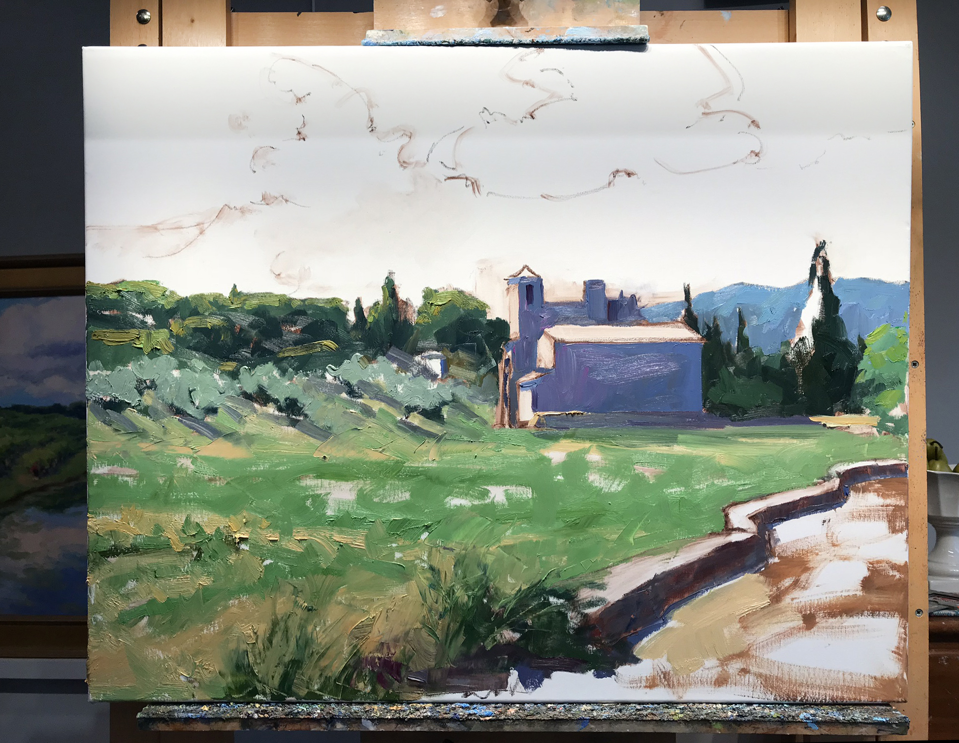
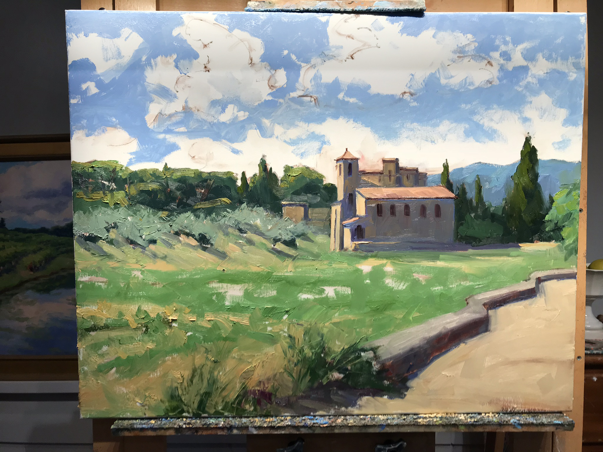
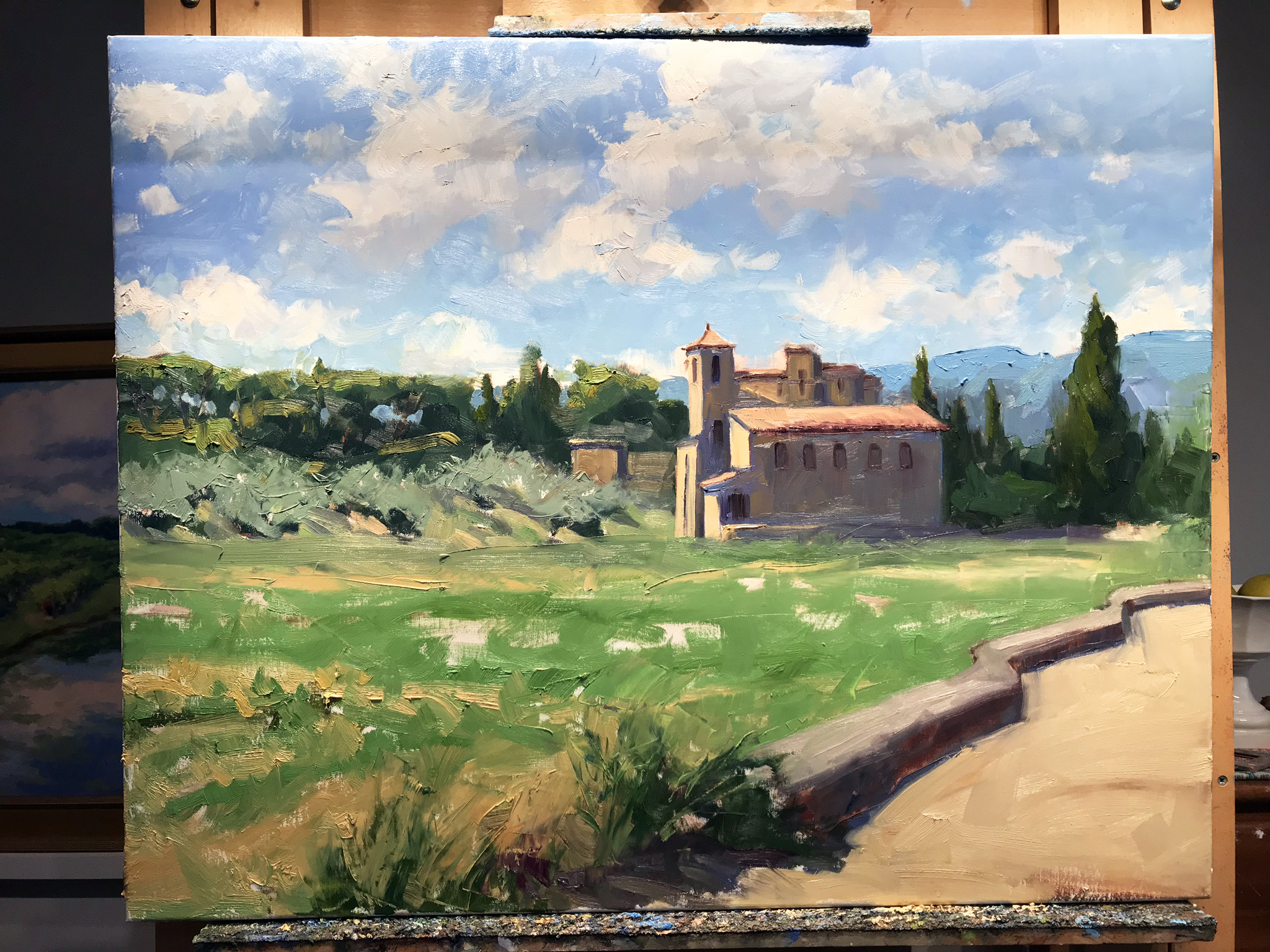
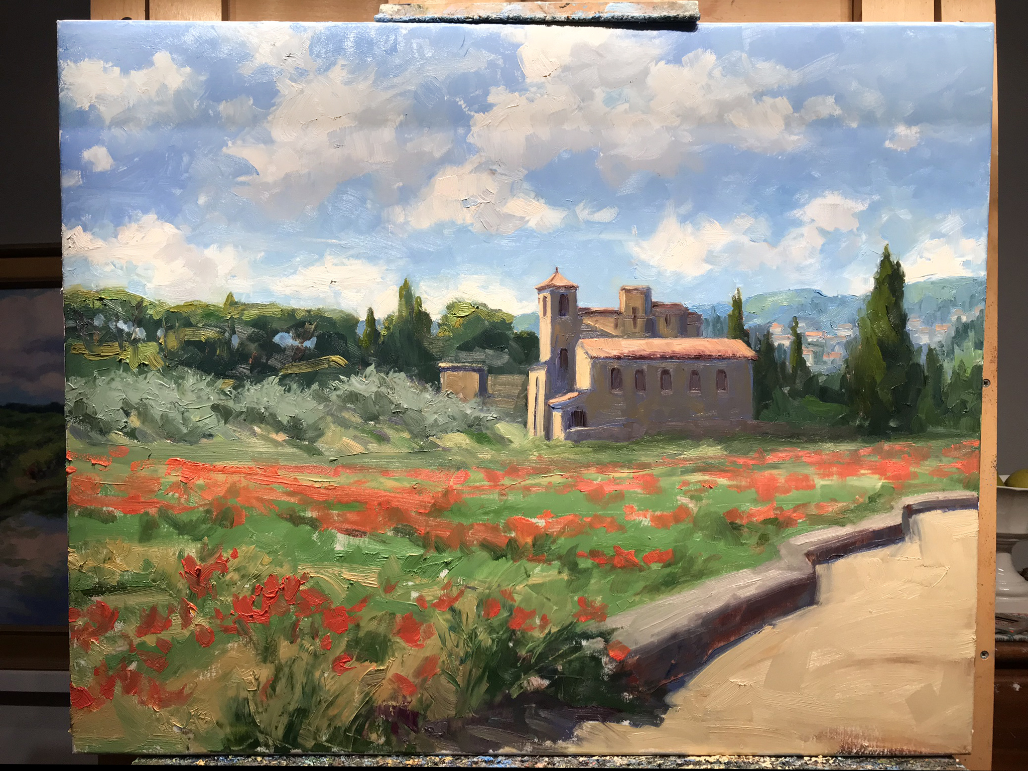
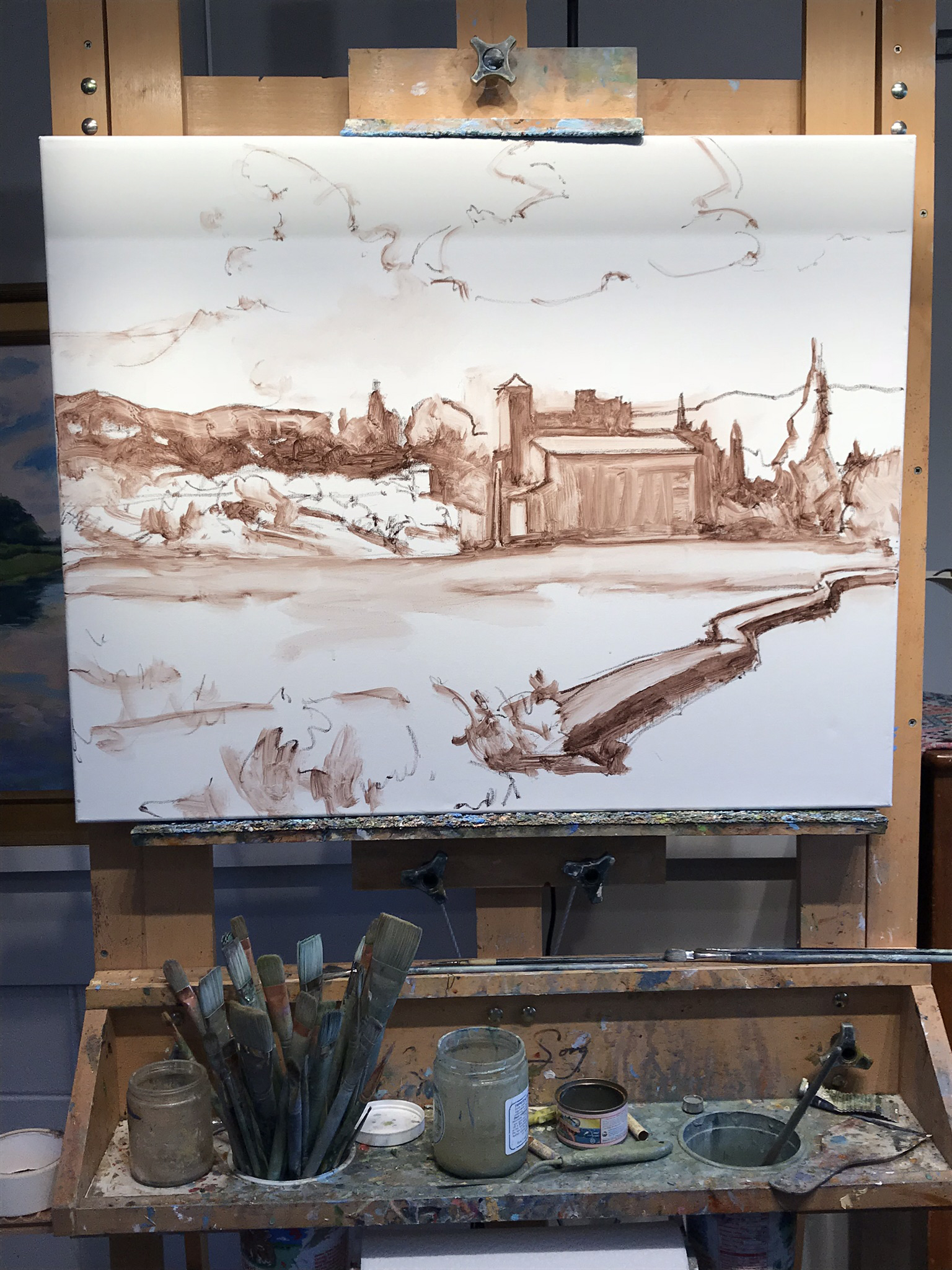
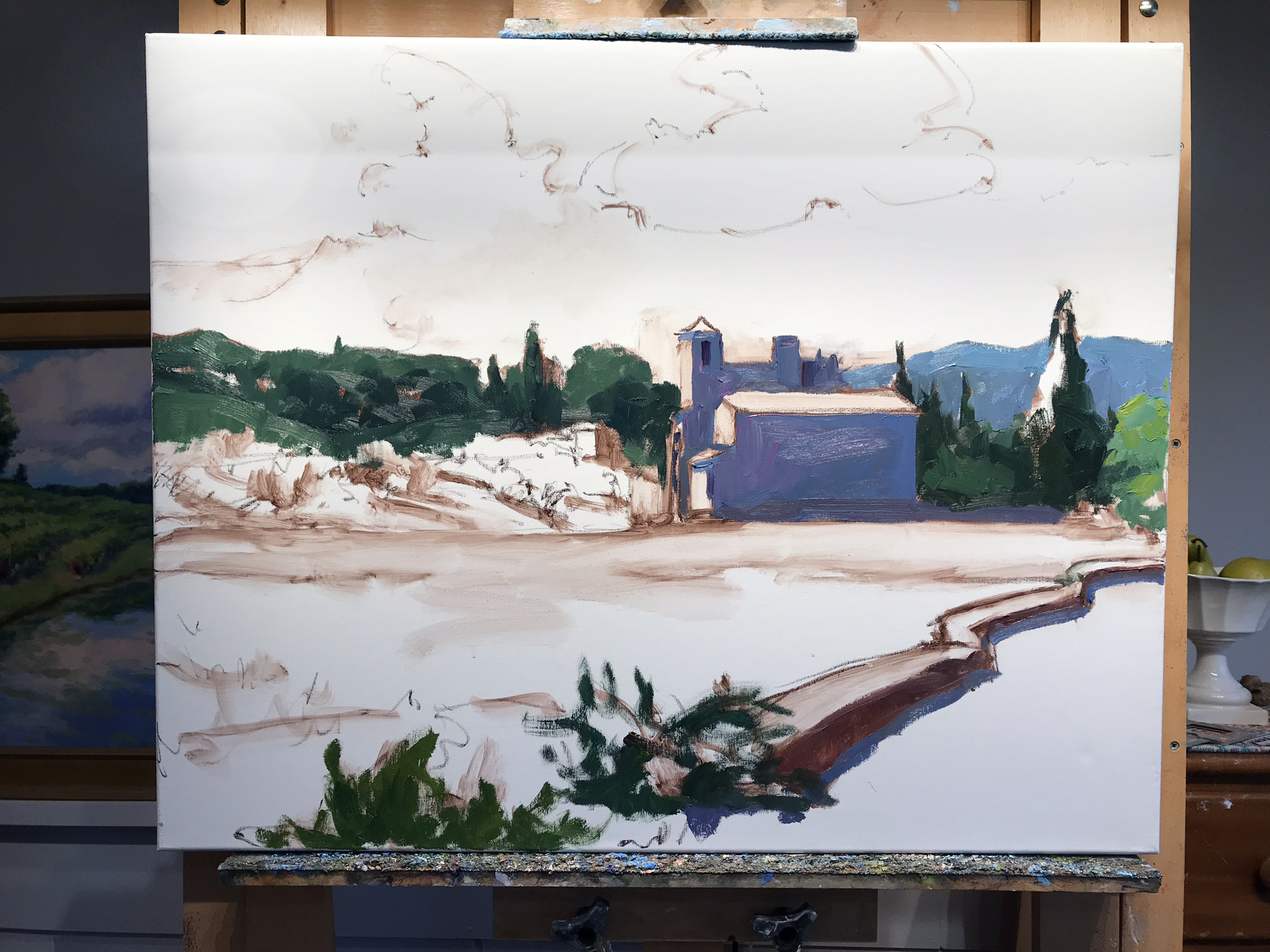
Escape to Provence! A Step by Step Demo

Over Christmas break as everything was pretty brown and exceedingly soggy outside, I decided to mine my many photos of sunnier times from my trips abroad. I will never forget my trip to Lourmarin, painting and eating my way through this beautiful part of Provence. I still long to go back, and am determined to do so, hopefully this time sharing it’s magic with my daughter. In the meantime I can always revisit the experience through paintings. So let’s get started, shall we?

“Le Printemps, Temple de Lourmarin”, Oil on linen, 24x30” ©Jennifer E Young

“Le Printemps, Temple de Lourmarin”, Oil on linen, 24x30” ©Jennifer E Young

Above is the completed work, photographed outside for correct color and no glare! This Protestant Church, Le Temple de Lourmarin, is simple and austere on the inside but it has a wonderful exterior and adds a sense of history and tradition as it sits like a sentry at the edge of town. Click through on the final image to read more or purchase this piece.

Irons in the Fire

It's been a busy week here at the Young/Webb household and I have lots of irons in the fire. I've been hustling this week to provide work for an interior design project, as well as finalizing a commission and framing and shipping for the upcoming Coral Bay Club show at City Art Gallery in Greenville, NC. (One of the paintings I'm sending is featured below.)

"Sunny Provence", Oil on linen, 12x12" ©Jennifer E Young

"Sunny Provence", Oil on linen, 12x12" ©Jennifer E Young

In addition, my most exciting news of the week is that we are in the drawing/planning stage of building a new art studio on our Ashland property! Hurrah! After operating my art business out of closets and storage sheds and the garage, plus a small rented work space, it will be so, SO nice to have all of my art stuff under one roof!

Right now the plan is to start breaking ground in August, but if you've ever had anything built, you know how that goes. Meanwhile I have to get all of my ducks in a row to identify and order fixtures, figure out the flooring and lighting, windows, etc. etc. So today is a bit of a #TBT as I find myself mining my own research, beginning with the all-important question of studio lighting. This post, written at the inception of my last studio build, is a good starting point for consideration, though I have a few more options to throw in the mix this time around. 

Back in the day I had a lot more time on my hands than I do currently, so I doubt I will be able to journal in a manner that is quite so in-depth. But rest assured I will be just as obsessed inside, and  I will be sure to post as best I can about the progress as things unfold.

Commissions, part III; wrapping it up!

In my last two posts, I took you through the proposal process of one of my recent commissions. If you wish to read this series from the beginning, start with Part I, followed by Part II. Today I'd like to share with you how the commissioned paintings turned out. I also have a few thoughts on commissions in general; both what to expect if you are a collector, and how to consider going about them, if you are an artist.

After having submitted my proposals for both of the paintings, I have now received the go-ahead to proceed. Here are the two completed paintings:

"The Potted Garden II", Oil on linen, 16x12" (SOLD) ©Jennifer E Young

"The Potted Garden II", Oil on linen, 16x12" (SOLD) ©Jennifer E Young

"The Corner Shop, Roussillon", Oil on Linen, 16x12" (SOLD) ©Jennifer E Young

"The Corner Shop, Roussillon", Oil on Linen, 16x12" (SOLD) ©Jennifer E Young

I’m very glad to say that the client expressed great satisfaction with the two paintings and they are now framed and in their new home.

Commissions are great experiences for artists because they push us to think about our art from a new perspective. Yes, as artists we all want our work to stand on its own. At the same time, nothing exists in a vacuum, and I am ok (and in fact, really flattered) with the knowledge that my paintings will coexist with other art in a collection, as well as other family heirlooms that will be important and valued by a family, possibly for generations.  So it’s a great honor to even be asked about commission work and I am always happy to discuss that possibility and to converse in-depth about not only the art but the environment where the art is intended to be placed. With this in mind, here are a few things to note that make commissioned work a special animal, worthy (apparently) of three blog posts!

1) The Conversation

The conversation ( usually more than one) is probably the single most important element of any commission. This is the artist’s opportunity to gather all of the relevant information about size, environment, and (very important) color preferences. Color, in fact, is the one topic that comes up rather emphatically in nearly every conversation I have with prospective commission clients. It’s understandable, as color elicits so many varying emotions.

Ideally these conversations would be done face-to-face, but that is usually either not possible or practical. Most of my commissions have actually been negotiated, in fact, via email and phone. In these cases, Photoshop is definitely my friend!

2) The Proposal:

This is where I do my best to incorporate the ideas and desires of the client into a work of art. Sometimes, as in the examples I’ve provided in these last couple of posts, I have studies or compositions already worked out. In these cases, I just use my old buddy Photoshop.  More often, though, I am creating something from scratch. In these cases I will submit asketch with color notes, as well as a few of my photo references that I will use to incorporate some elements into the composition. The more visual examples given at this stage, the better.

3) The Approval:

The next step is to await the feedback of the client, or, if things go really smoothly, await the client’s approval to proceed.

3) The Deposit:

This topic is often one that people don’t like to talk about, but it’s an essential part of many artists’ working methods, so I am going to throw this horse right on out there on the middle of the dining room table. As artists, we need to decide for ourselves our best practices so that we feel good about the work we are doing.

Earlier in my career, I did not ask for a deposit for most of my commissions. As long as I felt like I was able to sell the work in a gallery if needed and that it didn’t stray too far from the rest of my body of work,  I felt okay about working on speculation. Times change though and though the vast majority of my experiences were excellent, an odd one or two “hiccups”, as well as certain life experiences (like having a child)  helped to shape my perspective on the boundaries I should set for myself and my work.

Nowadays, with few exceptions I require a deposit to proceed. This would occur once my proposal has been approved by the client.  The amount is either 1/2 down, or, if it is a very large and involved commission, 1/3 down, 1/3 at approval half-way, and 1/3 prior to delivery. Most collectors are okay with this arrangement and understand the whole working -for-compensation thing. I also think they appreciate that that it is to everyone’s advantage that there is a commitment made to secure the agreement.

A deposit doesn’t just cover an artist’s materials, by the way. It also covers her time. Keep in mind that a proposal already commands a good deal of time and effort to prepare. Time is the most precious commodity I have. It is up to each individual to determine how they wish to work and what they want to spend their time working on.

4) Art Direction

Some artists are more ok with art direction than others. Having had a taste of the heavy-handed variety, I can most definitely state that I am not in favor.  [;-)]  This is not to say that I am adverse to hearing client’s preferences and feedback!  This is the whole point of “The Conversation”, and I do welcome it if a minor adjustment is desired. However, I can’t start over with a new concept, (which would mean a new painting) make profuse alterations, or do anything that I feel would greatly compromise the integrity of the painting.

Most clients understand, and I do my best to clarify in advance,  that any painting I make is going to be unique,  nota copy–either of my own work or anyone else’s . Beyond preference in color and subject, a collector commissions an artist because the artist has his or her own voice, and it’s up to the artist, ultimately, to determine the best expression of their idea. In other words….Nobody puts Baby in a corner!

All joking aside, most people are really very happy to let the artist do her thing.  In fact, “that thing she does” is the whole reason the client was attracted to her work to begin with. Nevertheless, it’s good policy, and indeed it’s the artist’s responsibility to clarify all of that with the client so that expectations are managed. Of course, every commission is unique and there are definitely nuances thatcan vary my approach to a certain degree. The key is to keep communication lines open and to be open to honest feedback.

This just about wraps up my commission process, or at least the highlights. If there is anything I have missed, or if you have any questions, please feel free to leave your thoughts in the comments. If you are an artist, feel free to share how you handle your own commissions. I would most especiallywelcome the thoughts of collectors (or potential collectors) also. Have you ever commissioned an artist? What was your experience? Let me hear from you!
Commissions part II

This post is a continuation of a prior post I've written on my commission process. If you missed it you can find that post here. Having secured the final approval for the first commission I wrote about yesterday, I needed to do it again for the second painting.  During my image archives search for a complementary composition I came across this 20x16" painting, done some years ago from my own photo references and sketches done on site. I felt this composition was similar enough in feel to relate to the first painting, and yet different enough to add some visual interest:

"Little Shop on the Corner" (SOLD) ©Jennifer E Young

"Little Shop on the Corner" (SOLD) ©Jennifer E Young

Because I wanted the  two little commissioned paintings to "talk to each other", I reversed the above painting, and scaled the image to 16x12". Like the first painting, this one also scaled really nicely to the new format:

grayscaleprovencepainting_jenniferyoung

Using my photo-shopped mock-ups, I provided a this shot below to show how the two paintings would look side by side:

Vibrant paintings of French and Italian villages ©Jennifer E Young

Vibrant paintings of French and Italian villages ©Jennifer E Young

There were a few color notes to keep in mind. The client wanted these to pieces to go in a room with an open floor plan where other artwork was already present. There was one painting in particular, a large pastoral with a red barn, that I needed to be cognizant of when creating my pieces. I didn't need to "match" the red, but I needed to be aware of it so as not to clash. This painting had a mid-to-cool temperature red focal area, so I'd steer away from anything too orangey. There were also some lovely aubergine and turquoise accents  in the shadows of the large painting that I noted and would attempt to riff off of in the paintings I was about to create.

My collector gave a big thumbs up to the ideas I had proposed. Whew! Awesome! Now for the fun/hard part of creating them! In my next post I'll show you how everything came together in the final paintings, and provide some thoughts to keep in mind about commissions in general, which I think will be of interest to the collector and artist alike.

Dordogne Breeze

Here is the final version of the painting I posted in progress yesterday:

"Dordogne Breeze" Oil on Linen, 20x16 ©Jennifer E Young

"Dordogne Breeze" Oil on Linen, 20x16 ©Jennifer E Young

The fun thing about this painting is that I used a lot of paint, which made working the edges really easy and enjoyable to manipulate. Truth be told, I had originally planned to have more elements in the painting, (sheep, additional buildings in the distance) but in the process of painting it I decided I liked the simplicity of it with just a very few dominant shapes. Those other elements can wait for another composition, another day. This has been a good reminder to myself that I do not need to say everything in one painting, and to just let the brushwork speak for itself.